The long and venerated art of the movie poster is a time-honored method of teasing upcoming film releases - getting audiences salivating for whatever drama, laughs, or explosions are headed their way to the silver screen.
Some are unforgettable, like the oversize shark heading in torpedo-fashion for a hapless swimmer for the unforgettable Jaws poster. Of course, we all know that liberties were taken with that one – the shark’s proportions would be more akin to the extinct gigantic ocean predator coming soon in the movie Meg than a modern great white.
But unlike today, 1975 audiences didn’t have a Discovery Channel to educate them on shark sizes. Today, that poster looks ridiculous. They got away with artistic license then. Today, Shark Week fans would know better and laugh at the poster.
We may be more sophisticated these days, but plenty of movie posters are still depicting inaccurate, overly stylized images which, upon closer examination, reveal mistakes that can ruin some of our favorite movie moments – even in 2017.
Here are 15 2017 Movie Poster Mistakes You Can’t Unsee.
Kong Skull Island – Chopper Trouble

There’s a bunch of really great and instantly iconic posters for Kong: Skull Island. One of them famously pays homage to the classic Apocalypse Now design, which perfectly captures the madness of humans getting into some serious jungle fever trouble.
Another of the posters seems aimed not at such symbolic stylization, but a more direct correlation between the big ape’s size and just how puny and small we are next to the King. In it, a single helicopter hovers by Kong’s eye. It doesn’t look allegorical. It looks like it could be a still from the movie. And the helicopter is way too small in proportion to the gargantuan gorilla.
In a scene where Kong is actually smashing a helicopter, we can see it's a lot larger compared to the sizable simian than it is in the poster. In short, you’re big, you old monkey, but you’re not that big!
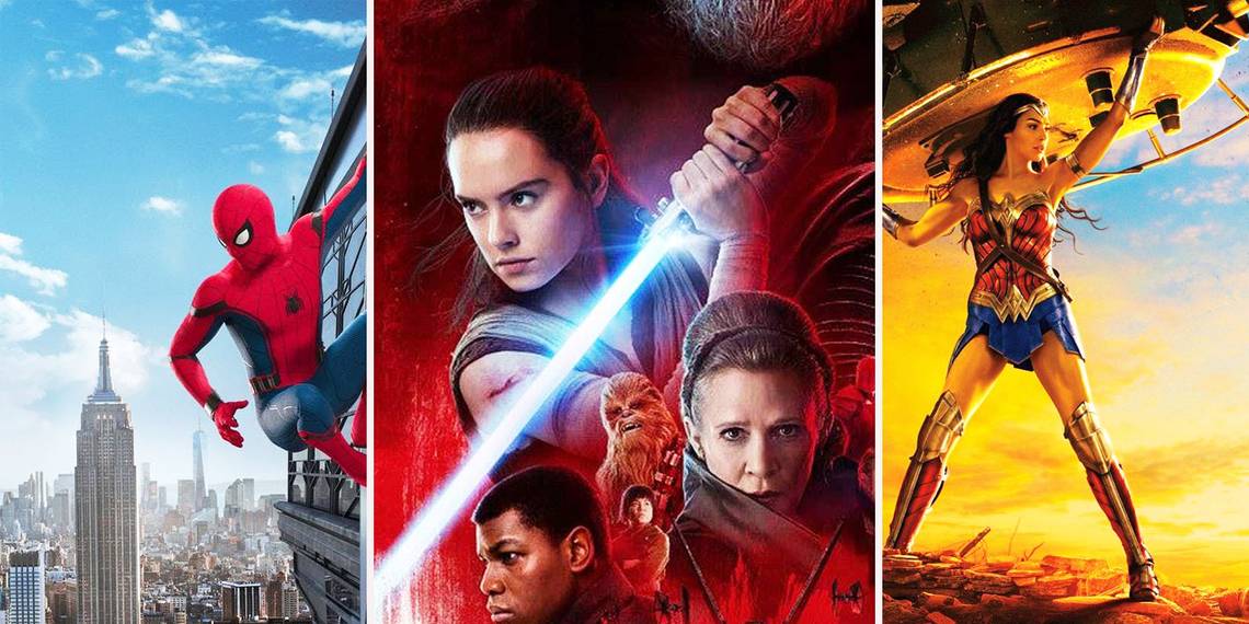
Wonder Woman – Tanks for Nothing!

Undoubtedly the most exciting superhero movie in years, Wonder Woman exploded onto 2017 screens and straight into our hearts. This wonderful woman not only kicked ass - she showed real compassion, extreme courage, and an ability to go beyond fantasy and into serious questions about the nature of war and conflict.
In one unforgettable scene, our powerful heroine literally flips over a tank - she holds it above her head and is tempted to use it to crush Doctor Poison. But in her movie poster, it’s not the same tank. Besides being a clearly different model from the film’s wartime vehicle, the poster is missing the identifying WWI-era Iron Cross symbol on the turret. Maybe the marketing team was worried about alienating German audiences?
Pirates of the Caribbean: Dead Men Tell No Tales – Hey, My Skull Is Up Here!

Let’s just call this a serious design fail. There are a lot of great character-focus posters for 2017’s entry to the Pirates of the Caribbean franchise, Dead Men Tell No Tales. Three of them feature Johnny Depp as Captain Sparrow, Javier Bardem as Salazar, and Geoffrey Rush as Barbosa. They are really great images. Except for one thing: whatever graphic designer worked on these may have had an unhealthy obsession.
As it happens, they chose to place the iconic skull & crossbones (the trademark for the franchise) right on top of each of the actors’ junk zones. No, these aren’t gaudy hipster belt buckles, these are bad Photoshop choices, drawing our eyes right to the private parts of these privateers. Sorry, we just ruined this for you.
Alien Covenant – He Slimed Me – or Did He?

Is there any scarier monster design than the xenomorph from the Alien franchise? Even in the last video game version – Alien: Isolation – that creature is terrifying (try hiding in a locker from it, see what happens). The latest film from the storied mythology, 2017’s Alien: Covenant has some pretty weird posters, including one that kind of looks like a murderous orgy. One poster, however, has a mistake that may seem petty, but changes the whole equation.
In the “standalone xeno” design, one of the homicidal beasts appears to be lunging at the camera. It’s a very powerful image. Except that if this guy is coming at us, why are the creature's long strands of dripping mouth slime bending forward instead of backwards?
Maybe it’s not lunging at us at all. Maybe it’s a shot from an upcoming “Alien on the beach” pictorial and it’s just a warm tropical breeze making the goo flutter in our direction. A lounging seaside monster isn’t quite as scary, now, is it?
Beauty and the Beast – A Thorny Mistake

Ah, love in a glass jar. It's what makes romance fancy and super-symbolic. That single, iconic, cut flower from Beauty and the Beast, displayed within a transparent gilded cheese dome, really tells the story, right?
The Beast’s beautiful soul is trapped in a case, which only Beauty can see and help him release it from its cage of outwardly hideous appearance. The whole motif of the rose stands out in this classic tale. But be careful – a rose has thorns, after all. Or does it?
In one poster for the 2017 movie release, the rose clearly has no thorns. In another one, it clearly does. Are we nitpicking? Yes, we are. And unless there is some big, important scene where a florist comes in and manicures the petaled prop, we are sticking to it. This poster image is a legit mistake!
Colossal – A Big Meeting That Never Happens

This weird little gem of a giant monster movie flew under a lot of people’s radar, but Colossal is a movie every geek needs to see. Without spoiling too much of the very surprising plot, the main premise is that a Korean kaiju appears to mimic the actions of protagonist Anne Hathaway from half a world away in America. When she puts her hand on her head, it does too. When she stomps her foot on a rock, it crushes a house with one step, and so on.
Amazing twists in the story ensue, but for one Spanish movie poster, the movie’s own rules are broken. The image is great: Hathaway meeting her oversize avatar face-to-face among the ruins of Seoul. Trouble is, that can’t happen, and it never does in the film.
Why? Because the movie rules are that the human and the creature are always on opposite sides of the world. This makes an in-person encounter impossible, but hey, they can always Skype.
Mother! – The Heart of an Anatomy Fail

Since at least that organ-plucking moment in Indiana Jones and the Temple of Doom, Hollywood has been doing "ripping-a-heart-out-of-your-chest" wrong. Look, we all love a sick and gross bit of gore, but come on! Can’t somebody out there pick up an anatomy book?
First of all, the heart isn’t in the center of the chest, it’s to the left. And it’s not just under the skin like a cyst. To get to this muscle, one needs to get past the sternum and rib cage, which makes the beautiful and powerful poster for Darren Aronofsky’s controversial film Mother! a little too inaccurate.
There’s Jennifer Lawrence, holding her ticker in front of a gaping hole in her chest – which only has soft tissue below. Make no bones about it – since there are no bones to speak of in her wound – that’s not what you would look like inside. Hopefully we’ll never need to see that for ourselves!
Spider-Man Homecomin - Avengers Towers’ NYC Skyline Snafu

New Yorkers are a proud bunch. If you try to pass off an inferior pizza slice or mistaken subway line onto the citizens of the Big Apple, you’ll get called out with a Bronx cheer. But the Los Angeles-bound creators of Spider-Man: Homecoming must have missed the memo.
See, in this film, the skyscraping Avengers' Tower is definitely not legit. The fictional geolocation fix of the Tower's address corresponds to a particular spot in Midtown Manhattan, a domicile that the MCU has made sure jives with our world perfectly. Except that the view Spidey has in this image makes a mockery of NYC landmark locations.
From his perch in this poster, no way the real-life Freedom Tower would be where it is in relation to the Avengers' HQ. Sorry, MCU, but disbelief can no longer be suspended, not even from a spiderweb.
XXX: Return of Xander – Serena’s Amazing Disappearing Tattoo

With the latest entry of everybody’s favorite gravely-voiced, sometimes reluctant hero in 2017’s XXX: Return of Xander, fans should also expect a nice long list of gun-toting supporting characters. New to the team is the character of Serena, played by Bollywood superstar Deepika Padukone, who joins the fun in an explosive manner.
Serena’s character has some intricate wrist tattoos that really stand out, especially when she's squeezing off round after round of bullets. Except that in this particular movie poster, they've been airbrushed out. Or forgotten. Or something. What’s going on? Is there some international market where body art is a big no-no? Whatever the deal is, it can be said for sure that not everything in the movies is inked in stone.
The Belko Experiment – How’s That Shirt So Clean?

Did you survive The Belko Experiment? This nifty little tale of workplace terror takes the basic premise of The Hunger Games and transfers it to a modern-day office building, where the employees are forced to fight to the death in order to survive. Co-workers go from water cooler gossip to homicide very quickly, using whatever they can get from the supply closet to bash each other’s brains in.
It’s a hell of a bloody affair, to say the least. Which, naturally, is reflected in this splattered image from the movie poster. But, um, why isn’t that crisp white corporate dress shirt at least a smidgen red with bloodstains? Was this guy so meticulous he made sure to use Oxiclean between brutal murders?
The Last Jedi – Rey’s Lightsaber Should Be Burning Her Arm

Okay, so what are lightsaber rules in the Star Wars franchise anyway? We knew from the New Hope get-go that you can use this "elegant" weapon to slice off limbs or hands like a hot knife through melted butter, or even just split a torso in two. The Phantom Menace taught us that, used properly, they can get hot enough to melt solid metal bulkheads. So, maybe Rey should be a little more careful how she holds the weapon.
On this poster for 2017’s Start Wars: The Last Jedi, our heroine strikes an epic warrior pose – with a lightsaber pressed right up against the skin of her arm. Yeah, like half a centimeter shy of her skin, but this thing melts steel, remember? One would expect an accidental auto-branding incident is about to happen. Honestly, shouldn’t the Jedi all be using oven mitts as a safety precaution?
Murder on the Orient Express – Snow Trouble for This Train

One of Agatha Christie’s most famous stories is being made into a film again for 2017. And like its predecessors, the cast is top notch. Murder on the Orient Express boasts actors such as Kenneth Branagh, Johnny Depp, Daisy Ridley, Michelle Pfeiffer, Jude Dench… and it goes on. It’s sure to be a lot of fun, as the sleuth-master’s tale of terror on a train never gets old.
Central to the plot is that the murder happens on a very long stretch of tracks, during a journey interrupted by a mounting snowdrift, stopping the locomotive cold in the middle of nowhere. This device is vital as it allows the Detective Hercule Poirot time to solve the mystery while preventing the killer from escaping. In this poster for the movie, quite clearly, the train tracks are not snowbound and the train should be in motion. Unless Poirot is running very, very fast ahead of the engine, perhaps training for an upcoming marathon?
The Shape of Water – Aqua Lighting

Oh, we hate to ruin this absolutely stunning image, but hey, that’s what we do! The much-anticipated Guillermo del Toro film The Shape of Water is a love letter to Universal’s Creature from the Black Lagoon franchise and all of geekdom has great expectations for the film.
This poster image, though, is a tad problematic. Check out the light source. It’s a spotlight from above the surface of the water. It starts off correctly, but once it hits the characters, the light dissipates arbitrarily, forming almost a flower-like image between fish-man and woman-woman.
While the stylized approach is obviously serving a purpose, it’s really a little too obvious and so pulls us out of the murky depths of our watery fantasy.
Resident Evil: The Final Chapter – Alice's Invincible Hairstyle

Following a tradition trademarked by the James Bond franchise (how did Roger Moore’s hair always stay that way?), 2017’s Resident Evil: The Final Chapter has a poster image which many a salon operator may be raising their eyebrows at.
Our super-powered Alice is back for one last battle (really, this is the last one, they promise) against the forces of – what is it again? An evil corporation? A sentient disease? A cult of both? Well, whatever, she fights zombies, mutated freak beasts and corporate CEOs.
Alice does this a lot on the back of a very fast motorcycle. Those speeding winds, in the case of this image, have no ability to make Alice’s hair fly around. Her hairdo is in a frozen stasis. That’s got to be some powerful holding spray she’s using.
Justice League – Blundered Woman

Sorry, but we’re still gushing about Gal Gadot! She’s truly an inspiration to a whole new generation of Wonder Women, both real and fictional. We certainly don’t want to cut her down to size, but the fact is that Gal Gadot stands at 5 feet, 10 inches tall.
Her co-stars in 2017's Justice League are all taller than her, and that reality is not properly reflected in this poster image. Thse aren't small differences we are talking about here. Both Jason Mamoa and Ben Affleck are half a foot taller than her, each standing at 6 feet, 4 inches. The rest of the guys go from 6’3” down to 5’11”. Yes, we know Wonder Woman wears heels, but not that high. And those Batman boots likely add an inch at least. This makes the lineup in this poster highly unlikely.
---
Did you catch any other mistakes in 2017 movie posters? Share them in the comments!