Some would think that the highest honor any creative mind could obtain would be massive piles of money and loads of fame. Ask any creator, however, and the majority of them will probably say that the proudest moments of their careers is when they = inspired others to make their own works of art.
Regardless of the medium, being an influence on someone's artistic expression truly makes one feel like their own work has touched somebody's heart and positively impacted their life.
In video games, there is an ever blooming subculture of people who tirelessly pay homage to their most beloved games and franchises.
Specifically, they often imagine their favorite characters and worlds with a different aesthetic. The changes made to the original design can be subtle or drastic, but the love for the source material always shines through.
For this list, we scoured the internet for fan redesigns of famous video games that are so impressive they could easily stand toe to toe with the original look that so many people, including the artists themselves, fell in love with in the first place.
Some of the examples are complete overhauls of the look and tone, while others prove that small changes can make all the difference.
All of these examples help shine a new perspective on the original design of the game, making one appreciate the artist's fan design, as well as helping people further appreciate the inspiration.
Hopefully all of these artists are already employed in their passion, because they are all talented enough to make a living from it.
Without further ado, here are 20 Video Game Fan Redesigns Better Than What We Got.
Wario And Mario

Mario has starred in a few weak titles, most of which can be found in the Philips CD-i catalogue, but the character himself has never faded into obscurity.
If the beloved plumber did fall on hard times and went the way of a reboot, it would probably look a little something like this graphic from artnerdx.
The artwork gives a quick flash of an almost David and Goliath type struggle between Mario and Wario.
Of course, instead of a well aimed rock slingshotted towards Wario's eye, it would probably be meticulously timed jumps after avoiding the yellow-themed giant's attacks.
Even if the look of Mario became more realistic, some game play elements would never change.
Link

The green tunic was thought to be one of Link's most signature pieces of clothing. Breath of the Wild, however, did away with that and proved that a Legend of Zelda title can retain the essence of the series while still changing so much of what players were use to.
The blue shirt he dons in the most recent entry is practical for comfortably traversing arduous terrain, but what about when he needs a fashionable suit of armor for the real fights with big monsters and even Calamity Ganon itself?
This is where pokepetter's armor design for Link succeeds so marvelously.
It manages a subtle homage to his trademark tunic while giving the hero more protection from devastating blows.
Cloud

Final Fantasy VII's turn into science fiction was a huge departure from the first six entries. While the new vibe was embraced by many, some fans were resistant to the change.
For the latter, this redesign of Cloud Strife from OathBinder123 should make them feel better.
Gone is the purple shirt, and in its place is a real suit of armor that looks like it could take a serious beating.
Along with a cape and scarf is a new sword that appears just as unwieldy as the Buster Sword. The look is topped off with a shield.
Like the earlier titles, the costume looks to be from an antiquated age that still possesses some futuristic technology like airships.
Kingdom Hearts

Sora's journey, despite dealing with darkness and losing friends, is a dream-like trek through numerous worlds.
Humanoid characters possess unrealistic proportions, such as enlarged heads and feet. This is done so that the main characters mesh well with the places they visit, which are usually based on animated movies.
Miyukiko's piece keeps the three central characters of the Kingdom Hearts franchise in the dreamy world while making them ever so slightly more realistic. The clothing is also altered slightly.
It is not entirely grounded, however, with the faces being reminiscent of Japanese animation.
There has yet to be an anime adaptation of the beloved series, but if there was, the characters may looks something like this.
Mass Effect

Before completely jumping over the edge with Andromeda, the Mass Effect series upset nearly its entire player base with the first trilogy's controversial ending.
Players were given three simple choices for the fate of the galaxy, and the decisions made over the course of three epic games were ignored.
Eddy Shinjuku's interpretation of Commander Sheppard's send off simply conveys the emotion of a hero giving up everything in order to save everyone.
Most of the best science fiction, like Blade Runner, Stalker, and 2001: A Space Odyssey, tells their stories largely through visuals.
Mass Effect 3's conclusion probably would have fared better if it had done something more poetic than exposition and a simple decision.
Skyrim

The Elder Scrolls series favors a first person perspective. More recent titles have allowed players to roam around the world in third person, but it has always felt like an after thought whose only allure was the ability to see the player character decked out in the awesome armor.
Mrrainbowwj's stylish fan art shows Skyrim's Dragonborn absorbing a recently slain dragon's soul while eyeing two more far out in the distance.
The way the soul oozes out of the dragoon and seeps into the player is simply astonishing.
Hopefully future titles will put more focus into making the third person action more appealing, such as putting in special magic effects, attack animations, and even letting people climb ladders.
Beatrix Russell

Fallout: New Vegas is a solid hybrid between the first two numbered entries and the third and fourth game. It may not be the most popular one, but courier's adventure through the post apocalyptic south west is a favorite of many veterans of the series.
Beatrix Russell stands out even among Mojave Wasteland's countless colorful personalities.
This piece by chriskuhlmann aims to portray her before her time working for the Followers of the Apocalypse, and the attempt succeeds wonderfully.
The new look matches the tone of her sometimes flippant lines of dialogue.
It's understandable that the original designers could not make such a unique model for Beatrix because of the game's grand scope, so it's fortunate that fans took the liberty of doing it themselves.
Zelda

On the surface, Princess Zelda appears no different than any other member of royalty who occasionally gets abducted in video games. Fans of the series, however, are well aware of her nuances, importance to the games' plots, and the actual powers she possesses.
EranFrowler's depiction of the legendary video game princess sheathing a sword while standing on top a mounting of skulls should clear up any confusion.
Only a true warrior strikes this kind of pose in such an intense situation.
The tatters at the bottom of her dress reveal leg armor, proving that she is always ready for a fight even when dressed for elegance.
The image begs for a Zelda led title that isn't The Wand of Gamelon or Zelda's Adventure.
Mercy

Despite being a nigh pacifist in a first person shooter, Mercy has managed to become one of the most popular characters in Overwatch.
Much of this can be attributed to her design and lore, or to the fact that she may be slightly overpowered.
Either way, the character is instantly recognizable even to those who don't partake in the multiplayer shooter.
AnatoFinnstark's captivating image of the character shows her as more of a literal angel.
It is appropriate considering that she has wings and the ability to revive fallen comrades. The new appearance is also a touch frightening, but most people would probably be scared if they saw a real angel.
Yoshi

Link has Epona, The Wanderer has Agro, and Mario has Yoshi as his trusty animal sidekick. The green lizard is always there for the plumber, even helping out Mario when he was at his most vulnerable - a baby in Yoshi's Island.
While the lizard is traditionally cute as a button, Timooon takes an alternate approach to the look.
With this design, Yoshi looks like it would be more at home roaming the Earth with dinosaurs.
Would Mario still be as willing to jump on the back of his buddy if this is what Yoshi looked like? If anything, Yoshi would help in his quest to save Peach by scaring all of the Goombas and Koopas away.
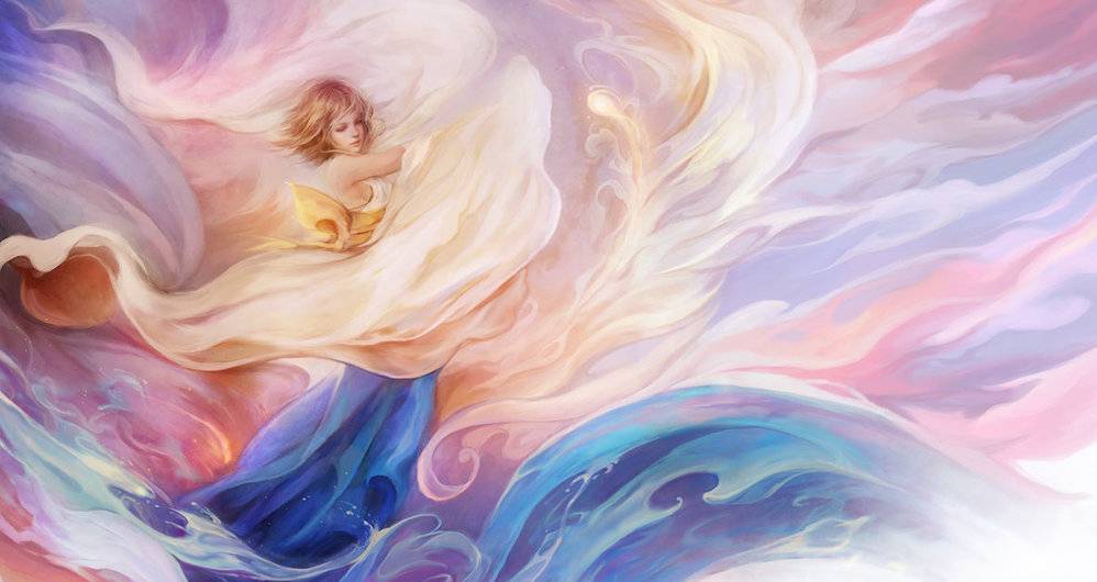
Yuna

Every Final Fantasy is beautifully represented with art crafted by the divinely talented Yoshitaka Amano. These pieces sparked player's imaginations in the eight and sixteen bit eras when graphics were unable to visually flesh out their worlds.
Even after the transition to three dimensions, the pieces still set the often melancholy tone of most Final Fantasy titles.
This ethereal depiction of FFX's Yuna by muju merges the surreal style of Yushitaka's work with the advanced and more realistic look of the 2001 title.
Yuna has almost divine powers, and this image drives home this fact.
The sky, her clothing, and the ocean all meet and almost unify, akin to much of the art that Amano is famous for.
Samus

Players everywhere were surprised beyond belief when Samus Aran was revealed to be a woman at the end of the premiere Metroid title. One cannot get much cooler than being a female bounty hunter decked out in an incredible, futuristic suit of armor.
Robaato's design of the legendary heroine, however, proves that it can indeed get a little cooler.
The artist does this by imagining her armor as still from the future, but with distinct medieval influences.
Taking a glance at this suit really makes the mind wonder what the rest of Samus's world looks like if the whole environment takes its ques from the medieval era.
Maybe one day the artist will let viewers know.
Mega Man

The Blue Bomber came to prominence in an era when nothing in video games looked realistic. The look is charming, but ultimately runs incongruous to the story about an evil scientist using robots to take over the world.
Luis Filipe Araujo puts a spin on the iconic character that sees him as a serious science fiction hero.
It brings to mind The Protomen, an underground rock band whose records are a loose retelling of the Mega Man games. Similar to the art, the Protomen's songs treat the story as serious as a heart attack
With video game graphics the way they are today, it is possible for Capcom to produce a Mega Man title with a grounded art style and a narrative that holds more weight.
Zelda and Link

The Legend of Zelda series has been made pretty much exclusively in Japan, and as such, there are numerous eastern Asian influences.
Pertheseus's reimagining of the two central characters is pretty much fully inspired by Japanese culture.
While radically different from the clothing that the two characters don in the long running franchise, there are still plenty of homages to the original design.
The colors, the Triforce, and several other elements all hearken back to the Hero of Time's tunic and the Princess's dress.
Traversing the world of Hyrule may prove slightly more difficult in this type of garb, but it is all worth it to look like the main character of an Akira Kurasawa movie.
Earthbound

Even by today's standards, where video games cover all topics and styles, Earthbound is a weird and unique story. The RPG takes place in a world not unlike Earth, but with heavy science fiction elements and countless strange and inane events.
The sixteen bit graphics do a good job of representing the world, but JPipe's image of the main characters really brings home just how bizarre the game is.
On the Super Nintendo it is easy to forget that the characters are supposed to be real people. This picture is a reminder that all of Earthbound's weirdness happens to regular human beings.
If the world ever sees a new Mother game, hopefully it looks something like this artwork.
Sub-Zero

NetherRealm studios (and Midway Games Chicago before that) has always been vigilant at listening to fan comments and requests and trying to please them in the following releases.
They are so in touch with the community that a couple of alternate costumes for characters in Mortal Kombat X originated as fan art.
Hopefully they see this picture of Sub Zero by Azlaar, because it certainly is worthy of being a costume in the iconic fighting franchise.
The dark ages influence brings something new while still feeling completely appropriate for Mortal Kombat.
It would also be one of the only times a fan would be happy seeing their creation being ripped limb by limb by the very people who inspired it.
Crash Bandicoot

The iconic platforming marsupial is a lovable buffoon. He's not too bright, but he always manages to best his longtime nemesis, Neo Cortex.
With bright fluffy orange fur, he looks like he'd be the perfect cuddle buddy.
Strixic shines an entirely new light on Crash as a scary monster creeping up on the frightened mad scientist.
Cortex is responsible for Crash's creation, so he is ultimately responsible for his own demise.
In this scenario, the outcome is the same, but instead of creating a bumbling Bandicoot, he makes a freakish demon.
Had Crash been given this look initially, maybe the first game wouldn't have been so unbelievably difficult. He would have just rampaged his way through all of the enemies.
Bowser

Audiences have sort of seen a realistic interpretation of Bowser with Dennis Hopper's performance as King Koopa in the 1993 Super Mario Bros. movie. However, only those who enjoy punishing themselves with mental anguish like to remember that film.
Thankfully, Daviddleonluis treated the world to a grounded Bowser that still stays true to the original design.
Everything that makes the green and yellow villain recognizable is there, from the colors to the spiked shell.
The principle difference is that this Bowser will put the fear of God into anyone who looks at it.
The Mario Brothers deserve all the respect in the world if this is how they see Bowser and still valiantly face off against him time and time again.
Monkey Island

The old Monkey Island games utilized an art style that the creators felt clashed with the comedic tone of the game. Later games then went with a cartoon-inspired style to match with the humor and overall vibe of the series.
TheOneCalledNio delivered an image based off of Tales of Monkey Island that brings realism to the world while still miraculously feeling like Monkey Island.
It's no small feat, but the execution is nearly perfect.
The future of the series is uncertain, with Ron Gilbert currently attempting to get the rights back from Disney. If the series were to continue someday in some shape or form, hopefully the design will take some inspiration from this particular piece.
Spyro

The lovable purple dragon who popped onto the scene during the Play Station One era has the typical nineties attitude.
He's also super cute, which is probably why he acts like a snotty teenager and constantly disrespects his elders.
If Spyro looked like how DanteFitts imagines him, he probably would not feel like spiting the world for being so adorable. This look is less '90s gaming mascot and more like something from a fantasy novel.
Of course, a design of this nature would probably not have been marketable to kids like he is today.
However, children of the '90s are adults today so they could handle frying sheep and beating Gnasty Gnork as a scary looking dragon.
---
Which of these fan redesigns is your favorite? Tell us in the comments!