Box art is a surprisingly important piece of a video game. Even with the advancements of digital distribution, the key art for a game is still the very first thing a player sees. This was even more important with past generations, as a piece of box art needed to grab player's eyes while they wandered store shelves.
A good piece of video game box art needs to have an eye-catching visual, while also giving a bit of a summary as to what the game is about. It's not always an easy balance to hit, for games of every genre.
There's a handful of great games that simply didn't stick the landing with their box art, whether it's because of questionable art or some head-scratching design decisions.
BioShock Infinite

BioShock Infinite follows in the footsteps of the other games, creating an engrossing world to explore, on top of a gripping main story. While BioShock is a shooter series, it's never just been about gunfights and big set pieces. Unfortunately, BioShock Infinite's box art says otherwise with a horrendously generic box art of mad looking fan with a gun looking at the camera. This is the same style of art used in countless shooters, and at a first glance, it makes BioShock Infinite feel far too generic.
Binary Domain

Binary Domain is a fascinating game from the makers of Yakuza, taking place in a future where global warming has made most of the planet uninhabitable, and humanoid robots have been outlawed. Storywise, Binary Domain has some really fascinating themes about humanity and technology, and the gameplay has a unique squad mechanic. The box art, on the other hand, does nothing to convey the unique vision of the game. This is yet another victim of the angry man with a gun trope, but past that the box art is simply way too busy. There's a ton happening between the fancy logo design, squadmates, robots, background, and more.
Amnesia: The Dark Descent

It's hard to find a piece of box art that feels cheesier than Amnesia: The Dark Descent, from the ridiculous monster's face to the overwhelming use of blur. Amnesia is a fantastic horror game that has an anxiety-inducing atmosphere, but this box art has the opposite effect and feels more comedic than anything.
Ico

Talk about a change in art style; Ico's box art feels like it's for a completely different game. Without even mentioning how these characters look totally different, the art makes it feel like Ico is more of an action-oriented experience, rather than a game that revolves around exploration and puzzle-solving. It's all made even worse when you compare the North American art to the Japanese version, which is a masterpiece in minimalism.
Yakuza 3

Yakuza 3's North American box art is probably the worst the series has seen, simply because it feels so static and boring. This is especially true considering it was the first game on PS3 and had the task of attracting new players to the series. Yakuza 3's art doesn't give any hint as to what the game is about, and doesn't even give a proper look at Kazuma Kiryu. The Japanese box art, on the other hand, feels moody and evocative. It's baffling that Sega would opt for such a wild change in tone.
Super Street Fighter II Turbo

The box art for Super Street Fighter II Turbo pretty much speaks for itself, just look at it. The art style creates some seriously ugly versions of these iconic characters, and Akuma in particular looks like a bootleg version of the real character. Super Street Fighter II Turbo was a great update to the original, but Capcom would have been better off sticking to the original art.
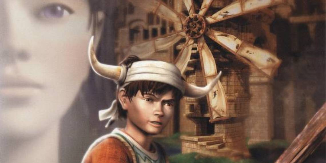
Breath of Fire III

The biggest sin committed by Breath of Fire III's box art is just how generic it feels. Breath of Fire is a legendary JRPG series that had a real impact on the genre as a whole, but the box art seen here feels like something you'd see on scores of generic fantasy novels. It tells players literally nothing about the game and does nothing to even draw an ounce of interest.
Castlevania: Symphony of the Night

Castlevania: Symphony of the Night deserves a special mention, simply because of how ridiculous the whole thing is. At first glance, it's not terrible, although the castle doesn't look all that grand. The hilarious thing, however, is that the castle features on the cover is simply a darkened version of Mont-Saint-Michel, a famous island and monastery in France. Now the whole thing just feels a bit lazy and lame, especially for such a genre-defining iconic game.