When it comes to the superhero business, looks are important. Your heroes need to be bold, colorful, strong, dynamic symbols that people can get behind. On the flip side, your villains need to be representative of something much darker and look mean and intimidating.
Obviously, this isn't always the case, but in general, we want our heroes to be awesome looking bastions of justice and want our villains to look like they pose a significant threat to a do-gooder's wellbeing.
This is all well and good for the printed page, but when it comes time to adapt these characters for the big screen, what works for a comic book may not necessarily work for live-action.
It should be no surprise then that there are scores of artists hired to do just that.
Concept art is a great way of throwing out potential ideas to the director and give them a clearer idea of what they want the final product to look like, especially in this era of computer effects, where entire costumes and characters are added in post-production.
With that in mind, we decided to raid the archives on some of the biggest productions around and find some of the interesting, great and maybe not-so-great pitches for beloved characters.
Here are the 8 Terrible (And 7 Amazing) Unused Superhero Character Designs.
15. Hockey Mask Deadpool

When the original Deadpool movie finally came out, it was a breath of fresh air. After an embarrassing appearance in X-Men Origins: Wolverine, audiences finally got to see a much more faithful and recognizable version of Wade Wilson right down to his signature red suit.
In a genuine masterstroke, the designers/CGI team put realism to one side and created an expressive mask that gave Deadpool a full range of expressions and emotions to help sell the movie's many, many gags.
It's surprising then that one of the original concepts for Mr. Pool was to give him a suit that featured an expressionless goalie mask.
According to the filmmakers, the designs above were meant to be suits that Wade had cobbled together from old motorcycle gear before he got his proper duds.
However, even if they weren't intended to feature for very long, it's hard to fathom quite how it would have worked in the grand scheme of things. We're going to say they made the right call on this one.
14. Space Bug Parallax

It's no secret that 2011's Green Lantern is considered a massive misfire by most.
It had way more problems than simple design tweaks could have fixed, but looking at the concept art for the final showdown between Hal Jordan and Parallax, we could have had something better than the weird, muddy cloud thing that attacks Coast City at the climax of the movie.
People familiar with the comics will know that Parallax doesn't look anything like this. Parallax's true form is more of an alien insect creature, with spindly limbs and a demon-like head filled with razor-sharp teeth.
A cursory glance at the movie's concept art will show that whilst not completely comic accurate, the filmmakers were considering something a lot closer to this at one point in time.
The concept is infinitely cooler than the final outcome and the fact that we never got to see it realized is a real shame. Whether it was for aesthetic or budgetary reasons, we got the sewage cloud instead. Hooray?
13. Alien/turtle hybrid Teenage Mutant Ninja Turtles

Redesigns of the Teenage Mutant Ninja Turtles have always been controversial. Lately, there has been fan outcry over the latest Nickelodeon reboot, but this isn't the first time people have complained that the TMNT lacked turtle power.
In the 2014 live-action movie, the Turtles underwent some serious aesthetic changes that proved to be erm...divisive, to put it mildly. However, it really could have been a lot worse.
Concept art for the first Michael Bay produced movie showed a much more drastic redesign, looking like a cross between actual turtles and Salarians from Mass Effect.
As we see the characters grow up in the movie, these designs could have simply been to illustrate an awkward phase and not the final look of the heroes in a half shell, but it's still hard to imagine the Turtles' quips and personality quirks coming from characters that look like B-Movie rejects.
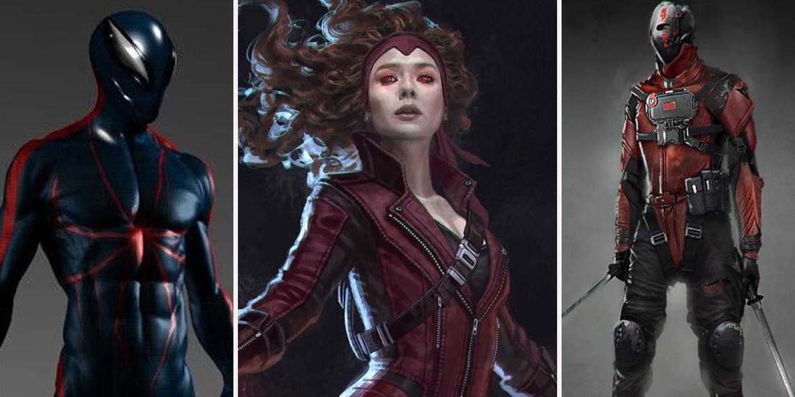
12. Blue cyborg Spider-Man

Even detractors of The Amazing Spider-Man 2 have to admit that the movie's Spidey suit is probably one of the best versions of the Spider-Man costume we've seen on screen.
The primary colors pop and whilst the eye pieces are stationary, the huge white lenses contrast with the rest of the suit perfectly.
So quite why a predominantly blue, futuristic tech Spidey suit was considered, we'll never know. The suit isn't bad in and of itself, sharing some similarities with the awesome Spider-Man 2099 suit, but it would have been an ill-fitting look for present day Peter Parker.
Perhaps most glaring change is the eyes which aren't nearly as pronounced as they are in other designs.
Spider-Man is meant to be a colorful hero with expressive, open eyes, but this version looks more villainous than anything else, especially with the thin, elongated eye pieces that make him look more like an evil cyborg than a friendly neighborhood Spider-Man.
11. A masked Baron Zemo

Not being able to see an actor's face under a mask is a problem. It causes a disconnect between the audience and the character.
You could have Daniel Day-Lewis or Meryl Streep acting their hearts out, but if they're in some kind of face-covering get up, you're only going to get a fraction of the performance. Having said all that, it might have been cool to see Daniel Brühl's Helmut Zemo mask up like his comic counterpart at least once.
Concept art for Captain America: Civil War shows that the creative team had considered giving Zemo his trademark purple face mask/hood, but decided against it.
The decision to leave this element of the character out is understandable, but it could have been a cool shout-out to Zemo's comic book appearance. Still, there's always room for it in future MCU movies. It's not as if we're going to be running out of those any time soon.
10. A scarier Ares

Most fans seem pretty happy with how Wonder Woman turned out. Director Patty Jenkins crushed it be all accounts and it's the highest rated DCEU movie by a large margin.
Despite being known to an entire generation as the cuddly Remus Lupin from the Harry Potter movies, David Thewlis manages to pull off surprise rug pull villain Ares rather well.
The idea that Ares builds himself a suit of armor, a helm and weapons from the twisted metal and shrapnel around him is awesome, but he could have looked even more intimidating.
If early concepts are to be believed, Ares was originally intended to look a lot more menacing. The art has gone for a more traditional take on the character, but there are so many great details. For starters, let's talk about the demon skull helmet, which looks all kinds of awesome.
The sketches also have the character's hallmark glowing red eyes, which certainly help make the character look more threatening. The version we got was great, don't get us wrong, but after seeing this, it's hard not to wish for several elements from it to have made it to the final cut.
9. The Superman: Flyby suit

Superman has arguably one of the most iconic superhero costumes ever. The blue suit with the red cape is a classic look and it seems pointless to try and reinvent the wheel too much when it comes to bringing him to the big screen.
Whilst we don't know that much about J.J. Abrams' scrapped Superman: Flyby, several pieces of concept art have made it online, giving us a sense of Abrams' vision.
The proposed costume is a great mix of new and old. We have a nice, big version of the famous S Shield on his chest and the cape sits majestically on his shoulders and doubles as an elegant collar.
The “red underwear” issue is avoided by giving him a stylized belt of sorts to break up the blue body suit. It's a real shame that we never got to see it become a reality, but as it stands, it's a great take on the Man of Steel.
8. The Falcon exosuit

It would have been difficult to translate the Falcon's traditional bird suit to the movies without the whole get-up looking distractingly goofy. Modernization was needed and thankfully, the MCU version manages to strike the balance between comic book origins and something that could feasibly exist in the real world.
The preliminary designs for Falcon's Winter Soldier debut were less than promising. It's a full exosuit, complete with face-covering helmet and a weird jet propulsion system on his back.
The wing motif isn't nearly as strong as in the final design and Falcon looks more like Metal Gear Solid's Psycho Mantis than the hero we know and love.
Perhaps seeing it in action would have answered some of these misgivings, but thankfully the decision was made to go a different direction.
7. Darren Aronofsky's Batman

Of all the cancelled Batman movies, Darren Aronofsky's take on Batman: Year One is probably the weirdest and most intriguing. Whilst the movie never came to anything, several early designs for the all-important Batsuit made their way online and many fans were less than impressed.
It's worth noting that this is meant to depict an early version of the Dark Knight, but even so, the design is pretty out there considering what we're used to.
The suit is closest in look to the Victorian-era Gotham by Gaslight in which the World's Greatest Detective pits his wits against the legendary Jack the Ripper.
In a recent interview, Aronofsky described his vision as a “duct tape MacGyver Batman” who didn't even drive the Batmobile, opting for a souped-up Lincoln Continental instead.
We'll never know if audiences would have accepted this version of Batman or not, but if the online reaction to the concept art is anything to go by, it doesn't bode well.
6. A more traditional Scarlet Witch

It's amazing what a small tweak to a costume can do. On the surface, the above preliminary design for Scarlet Witch in Captain America: Civil War looks pretty similar to the version we got. However, there is one very noticeable difference- the inclusion of a tiara-esque headpiece to cap the costume off.
This is obviously a reference to the character's distinctive red headpiece in the comics and it looks pretty great when coupled with Wanda's more modern look.
As the MCU movie costumes have evolved over time, there's still a chance that it may yet be incorporated in a future Scarlet Witch appearance, but as Marvel are notoriously secretive about every aspect of their plans for the future, we won't know for sure until it actually happens.
If it was included, it'd be a nice mix between the old and new and make for a slightly more faithful take on Wanda's iconic look.
5. A very different Harley Quinn

Despite the mixed reception Suicide Squad earned, one of the elements most people can agree on is that Margot Robbie's Harley Quinn was a stand-out. Her look was a bold take on the classic Harley costume and definitely struck a chord with people, with the costume instantly becoming one of the most popular Halloween outfits for 2016.
Things could have been very different. In some of the earliest designs for the character, Harley looks like a recovering junkie with some very, very questionable body art.
If you thought the Joker's “damaged” forehead tattoo was too much, then the chances are you wouldn't have reacted well to Harley's full torso tattoo of Joker's face complete with erm... chest eyes.
Had David Ayer gone with this design, it's pretty safe to say there would have been significantly fewer people dressing up as her for Halloween, no matter how good Robbie's performance ended up being.
4. Spider-Man: Homecoming's Scarlet Spider

Despite being reviled by fans and critics alike, the Spider-Man Clone Saga did give us some positive things. One of them was Ben Reilly's Scarlet Spider, who rocked an incredibly '90s cut off hoodie with the spider logo emblazoned on the front.
It's very unlikely that Marvel Studios are eager to adapt the convoluted mess of a story, but the Scarlet Spider was given a nod in concept art for Spider-Man: Homecoming.
Spidey's homemade suit looks the part in the movie, but there's something to be said for this take on the Reilly look. The eyes are haphazardly painted on and the spider logo was clearly drawn on freehand, judging by the inconsistent quality and wonky lines.
It would have been all kinds of awesome to see this suit on the silver screen, but it's perhaps wise that Marvel went a different direction entirely and fleshed out the suit briefly glimpsed in Captain America: Civil War.
3. An alternate Joker

Jared Leto's Joker proved to be a divisive presence in Suicide Squad. Some love his Marilyn Manson-esque pimp look and others, well, a cursory glance at any comments section related to Suicide Squad will give you all the answers you'd ever need. Love it or loathe it, it's certainly a brave take on one of the most iconic villains of all time.
Plus, it could have been a lot, lot worse. If rough designs and mood boards are anything to go by, the Joker would have looked even less like his printed counterpart than the version we got.
The tattoos are toned down considerably and Leto's Mr. J looks more like the Joker's less-successful cousin than the Clown Prince of Crime himself. Joker rocks many different looks throughout the movie and we have to say we're relieved this wasn't one of them.
2. Grimy Guardians of the Galaxy

James Gunn's Guardians of the Galaxy movies are bursting with color and personality. It's one of the main things that has helped the movies differentiate themselves from the rest of the MCU canon.
However, before that very specific tone was set, it's apparent that early versions of the Guardians were way more grounded than the bunch of vibrant misfits we were eventually given.
Granted, these aren't particularly bad designs by any stretch, but they do seem weirdly at odds with the tone and humor that the Guardians movies are now world-renowned for.
Perhaps weirdest of all is Rocket, who looks less like a raccoon and more like a filthy sloth rocking some impressive firepower.
We'll never know how this grittier take on the Guardians would have panned out had it been taken forward, but luckily James Gunn went a more interesting route with our gang of loveable oddballs.
1. A proper Galactus

Fantastic Four: Rise of the Silver Surfer remains a sore spot for many fans of Marvel's First Family. We've had three movies so far and none of them have come close to capturing what makes the Fab Four special.
A sort-of Galactus appearance in Rise of the Silver Surfer was the least of the movie's problems, but in a movie that has all sorts of wacky superpower switching and hijinks, the fact that a planet eating colossus with a fabulous purple outfit was deemed too much is legitimately disappointing.
In a move that Green Lantern would repeat years later, the main villain was changed from a tangible being to a nebulous destructive force.
This wasn't always the case. Concept art shows Galactus in his humanoid form, looming over New York menacingly.
It's possible to argue that a proper close up on this version of the character would have maybe changed the movie into even more of a farce, but it's definitely way more interesting that a swirling energy cloud that threatens to envelop the Earth.
If the FF do eventually make their way to the MCU, we'll be intrigued to see just how (if at all) they bring the Eater of Worlds to life.
---
Can you think of any other unused superhero character designs? Let us know in the comments!