As sad as it might make you, we have to point out that this season of The CW’s Supernatural has presented you with the final title card you’ll see. These intros have become one of the most favored aspects of the show, as we get to witness an entirely new style that hints toward the season’s story.
Now that we’ve seen all the title screens there were to see, it only makes sense that we rank which season pulled off the most visually pleasing and aesthetically appropriate intro. With this in mind, here are all of Supernatural’s title cards ranked from worst to best.
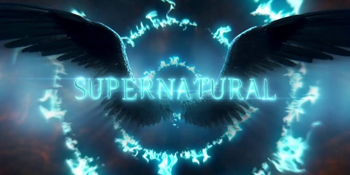
Season 11

There’s no need for explanation needed as to what this title meant, as the Darkness was back in the universe. The screen went completely dark, but with the idea that the darkness wasn’t just coming about; it was engulfing everything.
Unfortunately, the presentation of this idea was the worst, seeing as the title card was just so dull with nothing other than the murky atmosphere. We get that’s what it meant, but it could’ve been presented much more effectively.
Season 1

The first season’s card went the simplest route, with nothing other than the Supernatural title appearing onscreen. There were some accompanying effects, though, with the words phasing in and out in succession.
The idea behind this was to show how ghosts could appear and disappear, although in hindsight this title card hasn’t aged well because the subsequent ones have made full use of their season’s theme. For its time, the title screen did do the job that was required of it.
Season 8

With the Word of God tablets being the center focus for Season 8, it’s a no-brainer what this screen is meant to entail. The backdrop is that of the tablets, with this seemingly being the one for the demon tablet.
As we know, Crowley was the main villain for this season and his concern was the tablets meant for demons. Along with the previous two cards, Season 8’s one just wasn’t expressive enough to capture our interest.
Season 3

This was when Supernatural started being more showy with its title cards, as we saw a symbol come upon before demon smoke went all sides as the words threw themselves on the screen. Since this season was where demons were the main antagonists, it was an appropriate theme.
What wasn’t all that great was the rather over-the-top presentation, as it seemed as if too much was happening at the same time. Had it just been the demon smoke, then this would’ve been a killer title card.
Season 12

Like the season itself, the title screen seems like it’s about to do something exciting but simply ends. The Men of Letters symbol plasters itself on the screen in a flash, but that’s pretty much it as the sequence ends.
All that was there was pretty good, as the background and the effects do a good job; we still would’ve liked that one explosive effect to have been added that would’ve made this title card memorable.
Season 2

Had there been one more special effect added, then this title screen would’ve been in the top-5. As it happened, though, the awesome and beautiful effect of the Supernatural title blazing onscreen was the only thing we saw.
The intention to communicate with the audience that this season would be about Hell was delivered right for sure, although there’s a rather empty feeling when the flames are the only thing you see. Something more should’ve been added.
Season 4

There have been multiple interpretations for Season 4’s title screen, with some claiming the wings that flapped belonged to crows in a graveyard. However, the most accepted interpretation is that these are angel wings.
With the addition of a scream in the background, this title did a good job in signaling something foreboding like the coming of Lucifer was afoot. The drawback, though, was that this title doesn’t have that in-your-face quality that following seasons perfected.
Season 14

In what appears to be a bit of rehash from Season 9’s title card, this one has angel wings pop up onscreen, with rather cartoonish effects. What it does good, however, is adding the presence of angel grace around these wings.
These are clearly the wings of Apocalypse World Michael and the title card is a reference to him taking control of Dean. While this didn’t come across as an original idea, there’s no denying it still is a good looking title screen.
Season 13

With the Apocalypse World heavily featured in Season 13, and Jack’s presence being the focal point behind everything that went on, here we have the title reflect how both Jack and the Apocalypse World manifested.
It’s an insightful title card, no doubt about that, as we have a 2-in-1 representation of the season’s theme. The drawback would be the absence of an amped-up soundtrack to accompany this sight.
Season 7

Never has a title screen been more appropriate for a season’s content, as Season 7 made it clear that the Leviathans were the Big Bad with this beauty of a title card where Leviathan blood exploded onto the camera.
The presence of the signature heartbeat sound to go along with the Leviathan blood was a nice touch, as one would feel that time was running out with Leviathans about to take control.
Season 15

The final season’s title screen threw everything in there, as we can see subtle hints of angel wings, the burning up of Hell, the escape of souls from the underworld, and the presence of a black-like substance that nods toward the Empty.
It’s a great sendoff for the tradition of unique title screen, as Supernatural left no stone unturned. The presentation wasn’t the most crisp, though, despite it being a killer backdrop.
Season 10

How do you make a devil’s trap look even more interesting than it is? You add in a mixture of demon smoke and angel grace. This is how Season 10’s title card appeared, although the white light has also been interpreted as magic from Rowena, the season’s villain.
Its effect is mesmerizing enough that we overlook the absence of a hard-hitting effect in the title card, as the previous season had us used to seeing the words jump onscreen.
Season 9

Who would’ve thought burning wings could look so beautiful? With the angels having fallen, this season made it seem as if someone as pure as Captain America had lost their grace, with the effect of blazing wings from the sky.
Making it better was the voice the true voice of an angel piercing into our ears, as the title screen then blew up right in the eyes of the viewer. This title screen was popular enough for it to be parodied by the show itself on a couple of occasions.
Season 5

Going with the heart-pumping theme of this season, the title reflected the spilling of demon blood into a pure setting, pointing toward Sam Winchester’s thirst for demon blood leading into the apocalypse.
This title card was also one of the best to go along with a scary intro, as the arrival of blood spreading quickly everywhere was just how monsters devoured their prey. It was also a reminder that there would be blood to come for the heroes.
Season 6

While this wasn’t the best season for sure, there’s no beating Season 6’s title card, which is far ahead compared to the rest. Nothing can be better than the sight of exploding glass and the accompanying demonic roar that punched its way toward the viewer.
There were many interpretations for this as well, with some convinced the glass belonged to the destroyed Impala, while others argued it was supposed to represent the wall behind Sam’s mind being shattered by Castiel. Whatever it might be, this is easily the coolest intro Supernatural came up with.