Superhero movies are not always the easiest to make. Unlike standard movie dramas, superhero movies have to make the impossible seem completely possible.
In the real world, people can’t fly, they can’t turn into giant green men, and they certainly can’t save the galaxy while teaming up with a raccoon and a tree.
Despite this glaring fact of reality, superhero movies still manage to make these fantasies appear completely real on screen. How do they do this?
One big factor in creating a realistic superhero movie is by planning things out, and this includes creating concept art.
Superhero concept art will regularly be made before production of the movie begins, both to help the costume department know what to make, and also for reference when it comes to visual effects.
It’s no secret that characters like Rocket Raccoon and Groot were not actually on set for Guardians of the Galaxy, but the concept art created for both characters helped for creating their appearances in post-production, and also helped the cast so they had an idea of what it was they were interacting with.
Of course, with all good concept art, there also comes some pretty bad concept art that makes its way to the trash. Unfortunately, sometimes the good concept art of superhero movies will also be cut.
This is normally decided upon due to the budget or due to the narrative, and other times tossing out this concept art is just an overall bad decision from the filmmaker. It all depends on the scenario.
With that in mind, here are the 13 Worst (And 13 Best) Unused Superhero Concept Art That Would Have Changed The Movies.
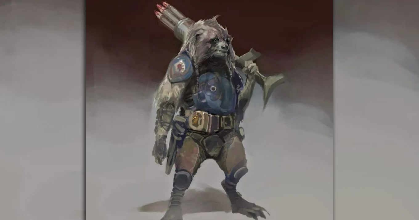
26. Worst: A Thick Rocket Raccoon
The Rocket we have grown to love in movies like Guardians of the Galaxy and Avengers: Infinity War looks pretty realistic, with the appearance of an actual raccoon dressed in a cool vest. However, this was not always the plan that Marvel Studios had for the character.
Some concept art from Guardians of the Galaxy revealed that Rocket initially was, for lack of a better word, fat. He also had a lot longer hair that was actually braided.
The appearance looked more like a mutated rodent than an actually realistic raccoon, which really just didn’t work.
Fortunately, this was not the Rocket that we saw in Guardians of the Galaxy. However, it can be theorized that this was the possible look for Rocket Raccoon had he been voiced by Danny Devito, who was considered for the role. Instead, Bradley Cooper got the part, which was a truly brilliant casting decision.
The confusing part about this concept art of Rocket Raccoon is that it doesn’t even look like Rocket Raccoon in the comics.
Even in the comic books, Rocket was thin and had rather short hair, so there’s really no telling where the idea for this appearance of the raccoon superhero came from. All in all, we can count our blessings that this particular piece of concept art never came to be.
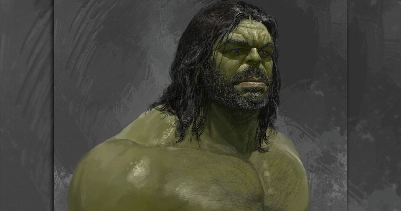
25. Best: Bearded Hulk In Thor: Ragnarok
Thor: Ragnarok introduced a new appearance for Hulk that fans have been asking to see for quite some time: Gladiator Hulk. Ragnarok showed what would happen to Hulk if he didn't turn back to Banner for years at a time. He became something of a celebrity on Sakaar, but as this new concept art revealed, he almost looked a lot different.
After years of being the Hulk in the comics, the beloved green giant would regularly grow a large beard, which is why it was rather confusing not to see Hulk with a beard during the events of Thor: Ragnarok.
Fans initially speculated that maybe Hulk just can't grow facial hair, but then the posters for Avengers: Infinity War featured Hulk with a five o'clock shadow, seemingly disproving this theory.
Not only would a bearded Hulk have been cool to see, but it also would have made quite a bit of sense.
It's rather strange to imagine one of the Sakaarans working for the Grandmaster shaving Hulk's beard in Thor: Ragnarok, so there's really no rational explanation for Hulk having such a smooth chin in the movie.
However, we guess the only logical reason for Hulk's appearance is that he did indeed have a barber who was both stupid and brave enough to pluck the hairs from Hulk's mighty face.
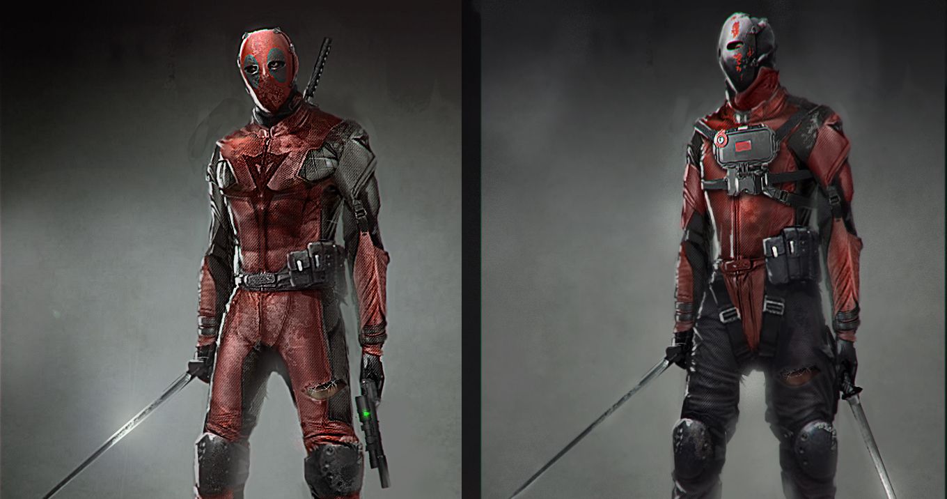
Worst: Deadpool With A Hockey Mask
In 2013, before 20th Century FOX actually considered a stand alone Deadpool movie a viable option, Kick-Ass 2 director Jeff Wadlow pitched his own Deadpool movie.
For his pitch, Wadlow teamed up with well known concept artist Kelton Cram to come up with a cool new design for Deadpool to match the tone of his movie.
"We wanted to try a completely new direction with the suit," Cram said about the concept art. "More of an origin suit — a self-made, makeshift suit made from motorcycle gear.
As with most origin stories, this suit would go through a transition, eventually becoming something closer to the one he wears in the comics... we think Jeff Wadlow was going for a more gritty/realistic approach."
While the eventual Deadpool movie that released in 2016 did include a montage of the superhero's suit coming together, no hockey mask like the one above was included.
Fans are most likely pleased with that creative decision, because the Deadpool shown above is just not as appealing as the Deadpool we got.
The suits above may look kind of cool, but they don't really fit the tone of Deadpool's character. As Deadpool himself would say, this concept art belongs "in the DC Universe."
Best: A More Severe Batman v. Superman Fight
It's no secret that a large number of audiences were disappointed with Batman v. Superman: Dawn of Justice.
One of the biggest issues people had with the superhero movie was that, despite the movie being called Batman v Superman, the events included very little fighting between Batman and Superman.
Instead, the movie just featured one short fight between the two iconic heroes before they immediately decided to start working together for the greater good.
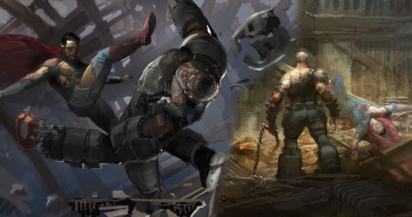
The concept art shown above revealed that the fight between the two heroes was almost a lot more intense. Clearly, if the events shown above went into effect, neither hero would have been able to walk away unscathed like they actually did in the movie.
Batman's suit was completely destroyed, and Superman's costume was ripped to shreds, with his iconic "S" emblem coming off at one point.
Had director Zack Snyder actually gone with this concept for the movie's titular fight, it's quite possible that a number of the movie's audience members would not have had such an issue with it.
Unfortunately, this concept did not pan out for this comic book movie, leaving millions of DC fans disappointed with the brief, low stakes fight that we actually got.
Worst: A Completely Different Falcon
In 2014, Captain America: The Winter Soldier introduced a new Avenger: Sam Wilson / Falcon. While the Falcon we saw in the movie was radically different looking from the Falcon in Marvel comics, his design was almost a lot worse.
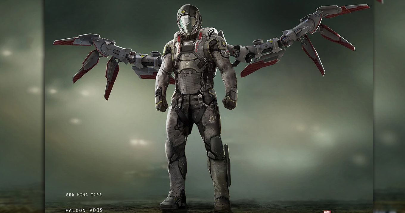
Above is one of the original concept designs for Sam Wilson's flying suit.
While it certainly does have some cool elements, it does not stand as strong as the version that we got.
The most glaring issue with this design is its unrealistic wings. The wings shown above are incredibly thin and would not be able to allow Falcon to glide safely. While the wings look cool and technical, they are most certainly not practical.
Furthermore, this suit takes away the human element from Sam Wilson. His face is completely covered. At least Iron Man's mask still looks like a face, whereas this one make Falcon look like a robot.
The best part of Sam Wilson in the Marvel movies is his portrayal by Anthony Mackie. Mackie makes this forgettable character unforgettable with his fun and lively performance, and this costume would have ruined that aspect of the Sam Wilson.
While the design is cool and technical, it would have failed to show the essence of Anthony Mackie's character.
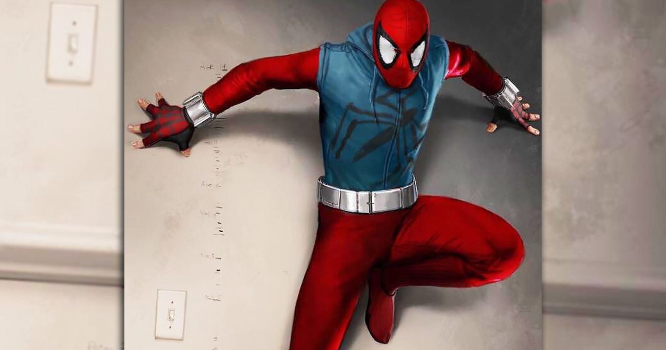
Best: Scarlet Spider In Spider-Man: Homecoming
Last year's Spider-Man: Homecoming gave an up-close look at Peter Parker's first homemade Spider-Man suit. As a number of Marvel fans noticed, his homemade suit was incredibly similar to Scarlet Spider's suit from the comics.
In multiple Marvel comic book universes, Scarlet Spider was another Spiderling character who would sometimes fight alongside Peter Parker's Spider-Man.
As some early concept art from Spider-Man: Homecoming revealed, Peter Parker's homemade suit was almost completely identical to Scarlet Spider in the comics. The entire outfit was almost identical to the other Spiderling character, which is a design that a number of Marvel fans are actually quite fond of.
This Spider-Man outfit would have been a welcome addition to Spider-Man: Homecoming. Unfortunately, things just did not work out for this design, instead leaving us with the homemade suit that showed up in the movie.
While the homemade suit we saw wasn't really from the comics, it was still rather cool looking and appreciated by many fans.
It is quite possible that this costume decision for Spider-Man: Homecoming was actually a set-up for an eventual Spider-Verse movie down the road. Scarlet Spider was a rather important character during the Spider-Verse events in the comics, and it would be great to see this character on screen should the opportunity ever arise in the MCU.
Worst: A Clunky, Superman-Fighting Batsuit
Batman v. Superman: Dawn of Justice showed Bruce Wayne developing a Batsuit designed specifically to take on Superman. The design that we saw in the movie was certainly pretty cool looking, but this concept art revealed how bad it could have looked.
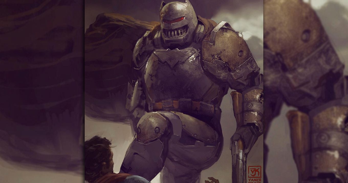
Rather than being smooth and strong looking like the Batsuit we actually saw on screen, the version shown above looks clunky and horribly made.
It appears to have been made out of scraps with a blatantly awful paint job. While it is possible that it could have gotten the job done in taking on the Man of Steel, it would not have looked great on screen.
The strangest part about this suit is Batman's single eye, making him look like Cyclops from the X-Men. That and the rusty design really just make this Batsuit design stand out in a negative way.
Another glaring aspect of this concept art is the fact that Batman is holding a shotgun. While we did see Batman wielding guns in Batman v Superman, they only really shot trackers and grappling hooks.
He also had one gun that shot out Krypotine gas, and it's quite possible that this was an early model of that gun. While it certainly fits the aesthetic of the rest of the suit, this Kryptonite shotgun just doesn't really work for the Caped Crusader.
Best: The Iron Legion In Infinity War
Iron Man 3 introduced Tony Stark's Iron Legion to the Marvel Cinematic Universe, and his robot army returned again (with consequences) two years later in Avengers: Age of Ultron. Unfortunately, that was the last we saw of Tony Stark's army of Iron Men in the movies.
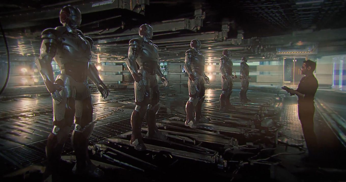
Early concept art for Avengers: Infinity War that was released over a year before the movie came out showed Tony Stark once again setting up his Iron Legion.
Sadly, this did not make the final cut of the movie, as the Iron Legion made absolutely no appearance in the third Avengers movie.
It's quite possible that this aspect was cut from the film due to budgetary issues. One Iron Man is expensive enough to create on screen, so a whole army of him would have been a financial nightmare on the visual effects side of things.
There were already so many CGI characters in the movie, Marvel certainly didn't want to add at least five more.
It's also possible that the concept art shown above is actually being held off for next year's Avengers 4. Without spoiling the events of Infinity War, the Avengers will need all the help they can get in the next chapter of their adventure. Perhaps the Iron Legion will be an integral part of the next movie's plot.
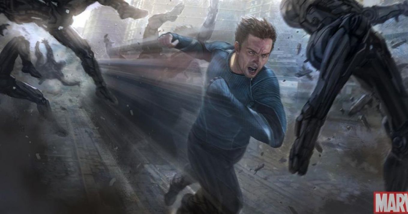
Worst: A Darker-Haired Quicksilver
2015's Avengers: Age of Ultron briefly brought the comic book superhero Quicksilver to the Marvel Cinematic Universe.
While many Marvel fans were disappointed with the Quicksilver we got in Age of Ultron compared to the version of the character in X-Men: Days of Future Past, the early concept art for the character revealed he could have looked quite a bit worse.
While the costume shown above is rather similar to the blue and lined outfit the speedster superhero had in the movie, his face is certainly a lot different.
The version of Quicksilver we saw in the movie had a silver-ish blonde hair style, whereas the original concept of Quicksilver shown above had a dark brown head of hair.
Additionally, the version we saw in the movie was a lot more shaggy looking. He had a layer of facial hair to add detail to his face, in addition to some rather long hair. This is quite different from the version of the superhero shown above, who had short hair and seemingly no facial hair whatsoever.
While this seems like a small change to Quicksilver's appearance, it was still a vital change to his character.
The face is the part of the superhero audiences look at most, and Quicksilver's detailed and grizzly face we saw on screen certainly carried a lot more personality than the face shown above.
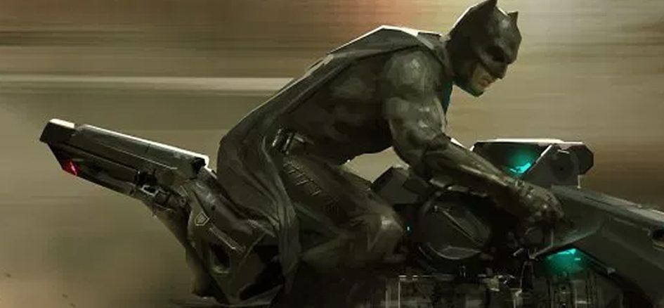
Best: A Floating Batcycle
While the DCEU has brought many fans a great version of Batman, it has failed to bring us one vital piece of Batman's weaponry: the Batcycle.
The Batman motorcycle was most notably seen on screen in The Dark Knight, but it has yet to appear in the current DC movie franchise.
Early concept art of last year's Justice League revealed that we almost did see the Batcycle on screen, but this version of Batman's famous bike would have had a few modifications.
This time, the Batcycle could fly, which is a version of the vehicle we have yet to see on screen.
The most likely reason for this cool Batcycle not appearing in Justice League is that the Batcycle never actually floated in the comics. This change could have been rather off-putting to a number of DC fans. However, it does not explain why we never saw any version of the Batcyle whatsoever in the movie.
Surprisingly, a number of Batcycle toys were released under the Justice League movie emblem, leading a lot of DC fans to anticipate seeing it in the movie itself.
Unfortunately, this never came to be, leaving us instead with more scenes with the same Batmobile from Batman v. Superman.
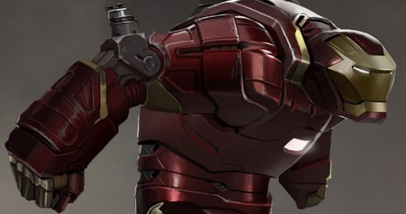
Worst: Hulkbuster In Iron Man 3
Iron Man 3 featured nearly 40 new Iron Man suits created by Tony Stark, all becoming part of his Iron Legion. Many of them were seen towards the beginning of the movie, and then all were revealed during the climactic final fight.
One iconic Iron Man suit, the Hulkbuster, was almost part of this Iron Legion, as some concept art revealed.
At this point, every Marvel fan is now very familiar with the Hulkbuster suit, which appeared in Avengers: Age of Ultron and Avengers: Infinity War.
The suit almost appeared two years sooner, with a design for it being created in Iron Man 3. It's quite likely that Marvel decided not to use this concept so that they could save it for the later movies, are we are certainly glad that they did.
The version of the suit above looks less like the Hulkbuster armor from the comics and later movies and more like the Igor Iron Man suit, which did appear in Iron Man 3.
The Igor suit essentially looked just like the concept above, but with a blue and silver paint job rather than red and gold. All in all, the concept above is a pretty inaccurate depiction of the Hulkbuster that we are glad Marvel scrapped.
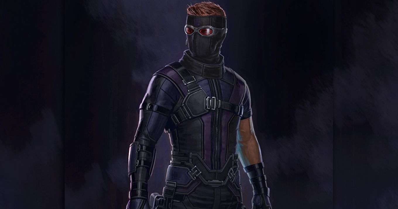
Best: Hawkeye With A Mask
When Clint Barton / Hawkeye showed up in Captain America: Civil War, he didn't look much different from his usual on screen appearances.
While his outfit was a bit more purple than usual, there still wasn't much of a difference. However, some of the movie's concept art revealed that his look almost had one major change.
Hawkeye finally received a mask in the movie's concept art. While it was still significantly different from the classic pointy mask Hawkeye had in the comics, it was still a rather cool mask with the perfect goggles for Clint to see out of.
However, it would seem that the people at Marvel Studios understandably preferred just seeing Jeremy Renner's face over a black mask with red goggles, so the mask idea was scrapped.
One theory about Marvel's decision to scrap Hawkeye's mask may actually have a bit of truth to it, though. In the comics, Clint Barton later became the vigilante Ronin after the loss of his family, and the mask shown above is at least slightly reminiscent of Ronin's mask.
It's quite possible that Marvel scrapped the mask in Civil War so they could save his transition into Ronin for Avengers 4.
Leaked set photos from next year's Avengers movie seemed to prove this theory right, with Jeremy Renner bearing a radically different hairstyle very similar to Ronin's.
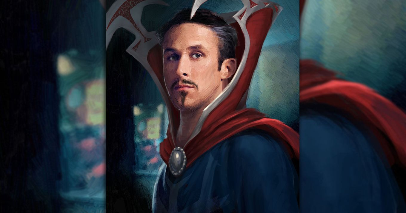
Worst: Ryan Gosling As Doctor Strange
Before Benedict Cumberbatch was perfectly cast as Doctor Stephen Strange, back when the people at Marvel Studios were looking for an actor to play the Sorcerer Supreme, there were a number of rumors that The Notebook star Ryan Gosling was being eyed to play the part.
Some time later, this rumor was confirmed to be true when official concept art from Marvel Studios was released showing what their vision of Ryan Gosling's Doctor Strange would have looked like.
His costume would have featured a much taller collar with a thick silver outline.
Not only can we imagine that Gosling's performance as Doctor Strange could have been completely different to Cumberbatch's, but even the costume is rather off-putting.
It's safe to say that a majority of Marvel fans are rather pleased that both this casting decision and this costume design were scrapped for the 2016 movie.
While it's possible that Ryan Gosling could have given a stellar performance as Doctor Strange, a majority of fans are pleased with Benedict Cumberbatch's portrayal of the character. What we got from the current appearance of Doctor Strange seems to be enough for most Marvel fans, and if it ain't broke, don't fix it.
Best: A More Accurate Bane
While The Dark Knight Rises may not have lived up to the quality of The Dark Knight, a majority of DC fans still enjoyed it.
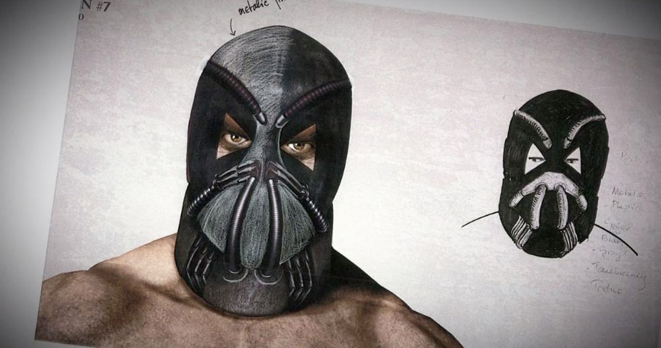
However, there were a few people who were displeased with the film's portrayal of Bane, who was seemingly a lot different from his comic book counterpart. Shockingly, as some early concept art revealed, Bane's appearance was almost a lot more accurate to the comics.
The concept art showed Bane with a wrestling-type mask, similar to his mask in the comics and in Batman & Robin.
This could have been a lot better than the mask we ended up seeing in the movie itself, which only featured the gas part of his mask, leaving the rest of actor Tom Hardy's face bare.
It's quite possible that director Christopher Nolan decided to scrap the mask concept shown above in order to give Bane some more human qualities.
The Dark Knight Rises did a good job of giving the villain some seemingly relatable characteristics, and giving his character a mask that would have covered his whole face could have ruined that.
However, even if it went against the human side of Bane, there are certainly a number of DC fans who would have appreciated this visual approach to Bane over the version we actually got.
Worst: Steppenwolf With A Hammer Head
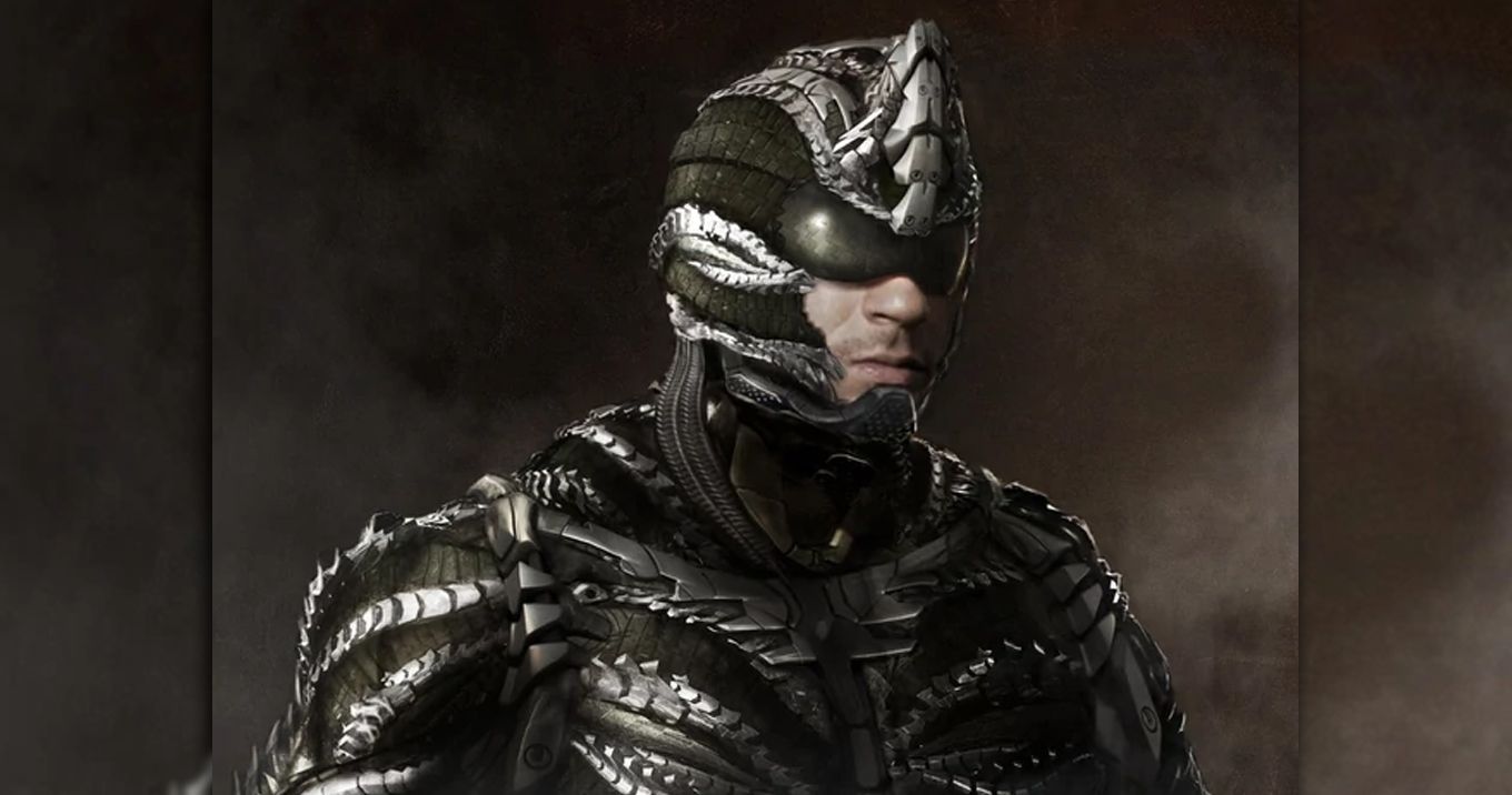
Justice League had a lot of problems about it, and one of the most glaring issues of them all was its villain Steppenwolf.
Not only were his characteristics and motivations completely formulaic, but his CGI appearance was very cringe-worthy (not as cringe-worthy as Superman's mustache, but that's besides the point).
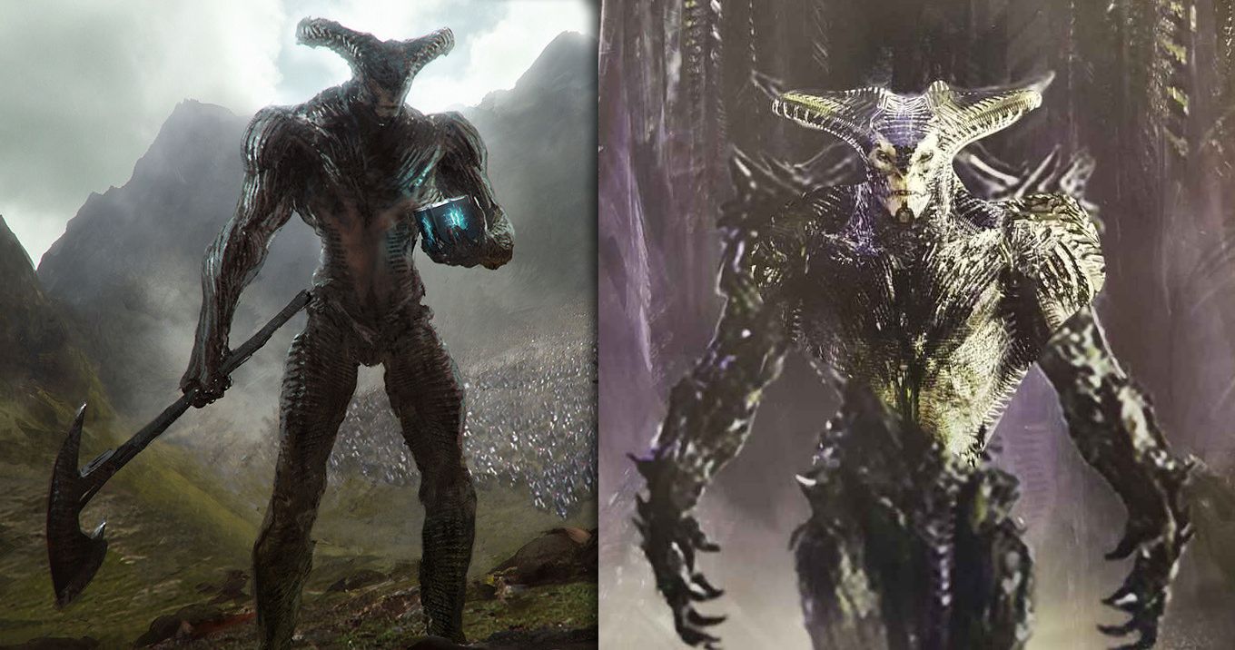
As it turns out, the original design for Steppenwolf was almost a lot worse. One of the cooler parts of Steppenwolf was his horned helmet. However, early concept art of his character revealed that his head was not originally horned. Instead, he had a hammer head, which is much, much worse.
In all honesty, it is safe to say that most DC fans would have preferred the original design for his character that was supposed to appear in Batman v. Superman: Dawn of Justice. The "Ultimate Edition" of Batman v. Superman included a deleted scene where Lex Luthor encountered a brief glimpse of Steppenwolf aboard the Kryptonian ship.
The appearance of the Batman v. Superman version of Steppenwolf was actually a cross between the horns and the hammer head, which gave him a much more menacing look.
While we may not have gotten this version of the character in Justice League, we at least got a happy medium, because the concept art shown above proved his appearance could have been a lot worse.
Best: A Bulkier Suit For Iron Man 3
While most of the problems Marvel fans had with 2013's Iron Man 3 had to do with the film's antagonist the Mandarin, there were also a number of people who weren't too fond of the Iron Man suit he wore for most of the movie. It had more gold than red, which as it turned out wasn't the most ideal color scheme.
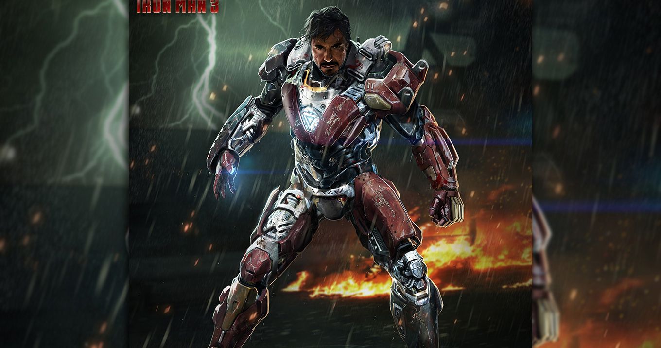
As some concept art for Iron Man 3 revealed, Tony Stark's primary Iron Man suit was almost a lot different and a lot cooler looking.
The suit, shown above, was a lot bulkier, and appeared to be a lot stronger. It is in a way reminiscent of Iron Man's Heartbreaker suit, which did make an appearance in Iron Man 3, but only as a part of his Iron Legion.
All in all, the concept shown above was a lot better than the Iron Man suit we saw in the movie.
Even if he didn't wear it for the entire duration of the movie, it still would have been rather awesome to see Tony Stark kicking butt in it. Unfortunately, this was not a concept that made it into the final film, as this particular suit didn't make it past the cutting room floor.
Worst: A Less Bulky Rhino
The Amazing Spider-Man 2 included a rather horrible narrative, but had a lot of cool character designs that fans certainly appreciated.
Among these cool designs was the Rhino, who wore an enormous mechanical suit in the final scene of the movie.
This scene was probably the one that irritated fans the most, not because of his design, but because the scene was cut short, leaving fans anxious to know how the fight played out.
As it turns out, Rhino's enormous mechanical suit was almost a lot less enormous, and was instead similar to the Green Goblin outfit we saw in the movie.
While it's a cool design, it is certainly not as intimidating as the giant suit from the actual end of the movie.
It's quite possible that the concept art shown above was instead created for the Sinister Six movie that was supposed to follow The Amazing Spider-Man 2. The rhino suit has a green tint, which matched the color scheme of both the Green Goblin and Vulture suits shown at the end of the movie.
Fortunately, this concept was scrapped in favor of the larger outfit. Had the Sinister Six movie actually happened, and had this outfit been selected, the movie would have seriously suffered as a result of every costume looking horrendously similar.
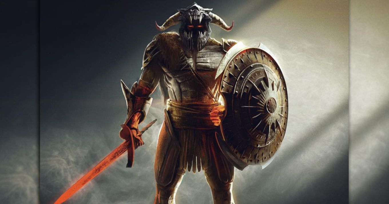
Best: Ares, But Now With Less Sauron
While Wonder Woman was a truly great, and arguably revolutionary, addition to the DCEU, there were a few DC fans who had issues with the film's third act.
While the climactic final battle was certainly cool to watch, it at times felt generic, with the design of the villain Ares not really having any distinguishing features from other movie villains. He was almost the spitting image of the Lord of the Rings villain Sauron.
Concept art of Ares' original design revealed that he was supposed to look a lot more classic in nature, having some Viking-looking armor and a horned skull helmet.
This was in a way reminiscent to Ares in the comics. While the comic book version of the villain usually didn't wear a skull helmet, there was a skull design at the top of his metal helmet which this design is clearly based off of.
All in all, this outfit for Ares could have made the third act of Wonder Woman stronger. The armor is similar to the Amazon's, which would have driven Wonder Woman's entire story arc home during the film's final fight.
Unfortunately, the outfit we did see looked a lot darker and more metalic, which may have looked cool, but did not fit the narrative as well as this suit would have.
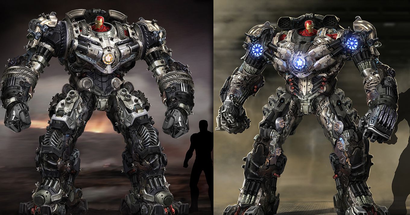
Worst: A Silver Hulkbuster
After the suit was cut from Iron Man 3, Avengers: Age of Ultron brought finally Marvel fans the famous Hulkbuster armor.
While some people had issues with Age of Ultron, almost everyone will agree that the Hulk vs. Hulkbuster fight about midway through the film was the movie's best moment. However, as some concept art revealed, this enormous fight almost looked a lot less cool.
The concept art shown above revealed two different designs for the Hulkbuster that appeared a lot more technical than the version we got. While they looks kind of cool showing all the gears and wires, they would not have looked as interesting on screen.
The smooth armor and red and gold paint job of the Hukbuster suit was part of what made it so cool, and the concept art shown above gets rid of all of that.
The silver designs make Iron Man's Hulkbuster look more like a Transformer (or more accurately, a Decepticon) than an actual Iron Man suit.
It truly is a good thing that these designs were cut, as they really could have taken away from the quality of the Hulkbuster fight.
However, the glowing blue arc reactors of that design on the right are rather cool looking, and it's a shame that that specific part of the design couldn't be integrated into the suit that we got.
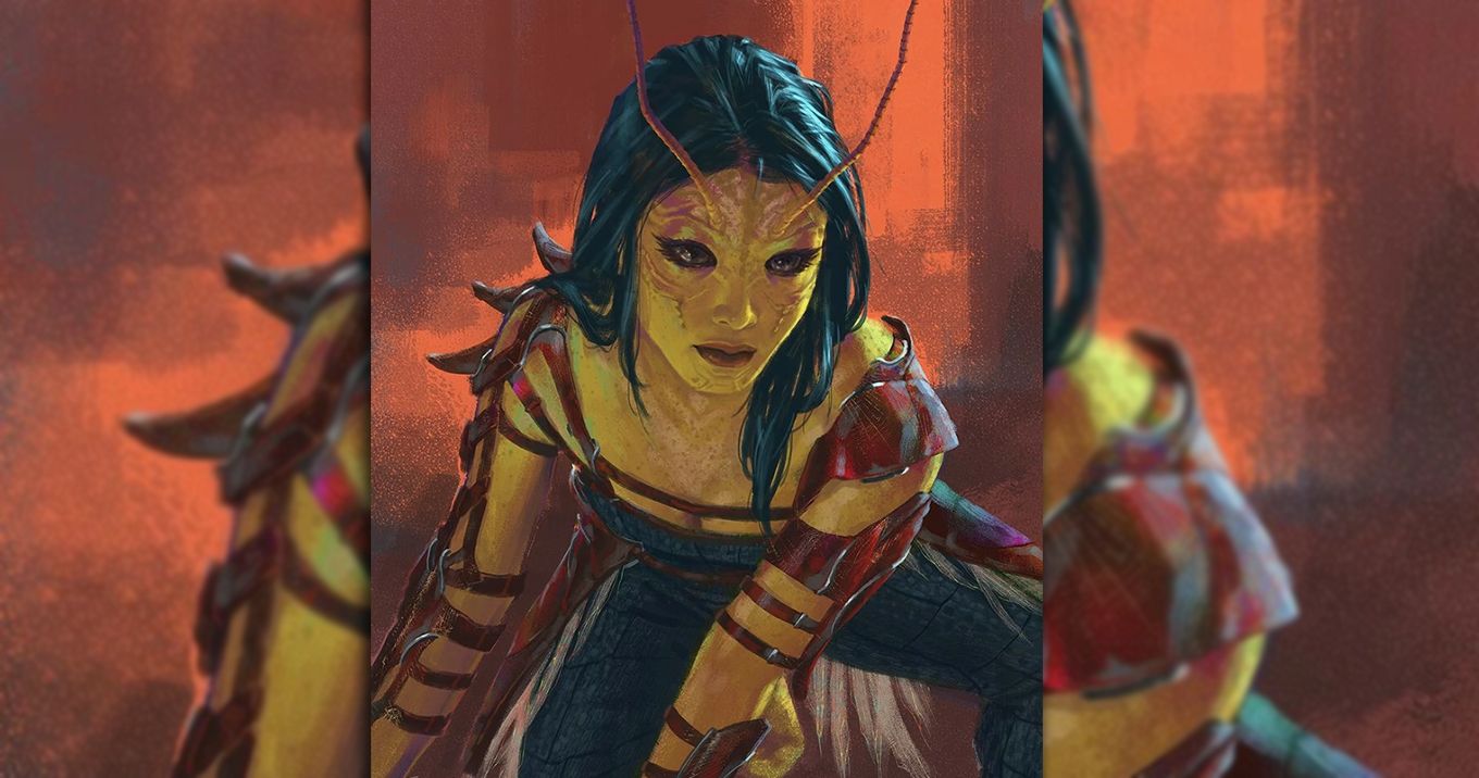
Best: A More Detailed Mantis
Last year's Guardians of the Galaxy Vol. 2 introduced audiences to the newest member of the Guardians of the Galaxy, Mantis. Mantis ended up being a humorous addition to the galactic team of heroes, surprisingly becoming one of the best part of Avengers: Infinity War.
As some early concept art of the hero revealed, however, Mantis was almost a lot better of a character, at least in appearance.
The concept art shown above not only shows an entirely more complex costume for the alien superhero, but a much more detailed facial structure.
This design is a lot more interesting than the simplistic appearance Mantis ended up having in Guardians of the Galaxy Vol. 2, and it's quite possible that Marvel fans would have appreciated this version of the character a lot more than what we got.
The most likely reason for this design being scrapped was because of how difficult it would have been to make.
While the Guardians of the Galaxy already has some complex make-up designs, specifically with Drax, this would have added even more difficulty, and surely have cost Marvel quite a bit more money. In addition, the costume itself would have been very difficult to create and to put on.

