The Star Wars saga is in constant expansion and evolution, including the opening font in the preface cards. The Star Wars universe is one of the most extensive and beloved media franchises in entertainment, covering not only films and TV shows but also video games, comic books, novels, and even theme parks, most notably the immersive themed area Galaxy’s Edge at Disneyland. Still, the franchise is mostly known for its films, known as the Skywalker saga.
Star Wars fans all over the world are currently preparing for the final entry in the sequel trilogy and the closing chapter in the Skywalker saga: Star Wars: Episode IX - The Rise of Skywalker. Because of this, fans are looking back at the original and prequel trilogies and how much these have changed over the years. The original trilogy, for example, has gone through many changes thanks to the different versions there have been of it, and those changes extend to details such as the preface cards.
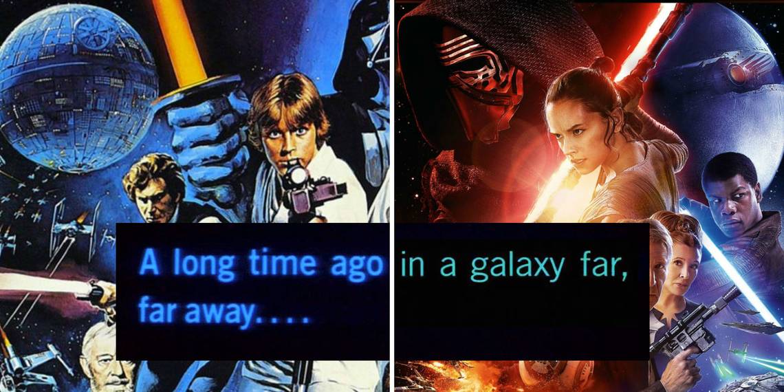
Every Star Wars film begins with a now iconic card reading “A long time ago in a galaxy far, far away”, but what many probably haven’t noticed is that these have been changing too in every special edition and re-release there has been.
The Evolution Of Star Wars’ Opening Font

The Twitter account Star Wars Visual Comparisons pointed out the changes the opening font in the Skywalker saga has gone through since 1977, with the release of Star Wars: A New Hope. The original trilogy was released between 1977 and 1983, and the prequels from 1999 to 2005, with the original trilogy going through remastering in 1997 and 2004, the last one in order to create consistency with the prequels. The font had a makeover in 1997, which basically cleaned up the preface card to make it look more polished. The Clone Wars, however, had a different font style, closer to that of Star Wars: Return of the Jedi in 1983, with a wider “o” and the serif on the “g” shorter and lower.
The current look of the opening font is thanks to the 2004 remaster. This version replaced the preface cards of the original trilogy with the one in Star Wars: Episode II - Attack of the Clones, but the ones in Star Wars: Episode I - The Phantom Menace and later in Star Wars: Episode III - Revenge of the Sith are slightly different as they are smaller. As for the ones from the sequel trilogy, they use a different font in an attempt to recreate the one from Return of the Jedi. The differences are very subtle, but they are there. It’s also worth noting that the color of the font has changed from blue to aqua to a more greenish-blue.
Once Star Wars: The Rise of Skywalker is out on home media and fans can have the full Skywalker saga at home, it wouldn’t be surprising if Disney comes up with yet another version of the original trilogy (and, possibly, the prequels too) with new changes to the font to finally make them all look the same – or at least more similar than they currently are.
