Over the years several Pokémon have received a bit of a glow-up after moving to 3D character models. Due to limitations in graphics in the earlier Pokémon Red and Blue versions, certain Pokémon are almost unrecognizable from their modern counterparts. While most of the original sprites for the game are great, there are several that don’t quite stand up to the test of time.
Ever since the series moved to modern graphics, however, players realized that every Pokémon would have to be reimagined for the new 3D world. There is certainly debate on whether or not all Pokémon designs have been improved by moving to 3D models, with fans on both sides of the debate. Some of the first generation of Pokémon benefited more from the jump to modern graphics than others.
The original sprites were designed to be faithful to the 2D artwork of the games. For fan-favorite Pokémon like Pikachu and Charizard, the designs were great. Even though Pikachu has slimmed down a bit since the early days of Gen 1, its model is still beloved by fans. For the Pokémon below however, the move seems to fix a bit of an ugly Ducklett situation, able to better convey the Pokémon’s design and breathe life into beloved Pokémon with modern graphics.
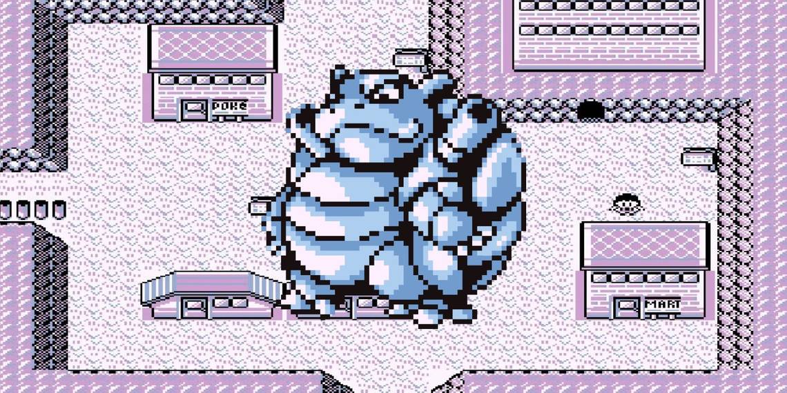
Gen 1 Pokémon Improved By Modern Graphics: Blastoise

While not the worst on this list, the original sprite model for Blastoise is a little off no matter where players look. It has tiny little shoulder cannons, not coming out of the back of its shell as shown in the 3D model. Just from watching the show or even looking at the box art of the original Pokémon Blue players knew that something was wrong when it came to Blastoise's in-game design, not to mention Blastoise’s gigantic shell taking up so much of the sprite’s shape. It does nail Blastoise’s cocky smile, the same smile players have when they know their friends all picked Red because of Charizard but Blastoise has the type advantage against it.
Gen 1 Pokémon Improved By Modern Graphics: Gastly

Gastly might have one of the worst original sprites from the first couple of Pokémon games. It looks like someone slapped a vampire’s face on top of a spray paint splatter. With newer 3D models of Ghastly, it at least has a defined form. That form may just be a glowing black ball, but there’s at least some type of body to it. Gastly may be the Gaseous Pokémon, but it benefits from a little more definition.
Gen 1 Pokémon Improved By Modern Graphics: Geodude

The original sprite model for Geodude is weirdly unsettling. It’s too smooth, nothing like the rocky modern 3D models. It’s almost like someone polished down a Geodude so it closely resembles a ball. Also, it’s giving a thumbs up in the Pokémon Red and Blue version of Geodude’s sprite, which seems a little too friendly. 3D versions of the Pokémon are more focused on showing off its rocky, muscular arms.
Gen 1 Pokémon Improved By Modern Graphics: Golbat

Golbat's Pokémon design is rough, there's no way around it. 90% of its body is mouth and the rest of it is weird. Standing at an awkward angle, Golbat's eyes don't even rest on its head properly. It does have a terrifying pair of teeth, though it doesn't offset the goofy looking tongue flapping out of its mouth. Thankfully, modern interpretations of Golbat in Pokémon games have toned down the mouth situation while still still making it feel imposing and fearsome.
There are plenty of other Pokémon who have had improved character designs through the various games, though they might not be as interesting as these. Sprite work is an amazing art, but earlier entries into the Pokémon series were clearly not able to capture as much detail as modern games are capable of.