Paramount's logo is one of the most iconic images in all of film - but few people know its true origins. Most moviegoers are familiar with the logos of various Hollywood studios. From Disney's grandiose castle backdrop to the outer space view of Earth courtesy of Universal, every movie begins with a slew of logos for the various companies involved in the production, and the biggest are legendary.
Of all these major movie houses, perhaps none are more iconic than that of Paramount Pictures. Its majestic view of a massive mountain encircled by a field of stars is intrinsically linked to memories of classics like The Godfather, Chinatown, and Raiders of the Lost Ark, as well as modern blockbusters like Transformers and Mission: Impossible. The first Paramount logos were inauspicious, but in 1914, the mountain and stars made their debut and cemented their place in film history.
Related: Horrifying Hollywood Production Stories
In some ways, the Paramount logo can be seen as the logo of Hollywood itself. Like Hollywood, it has evolved as the generations have rolled on, and will likely continue to change in the future. But how did it all start? How was the logo originally created, and how has it changed over the years?
The Mountain Has Been Redesigned Several Times Over The Year
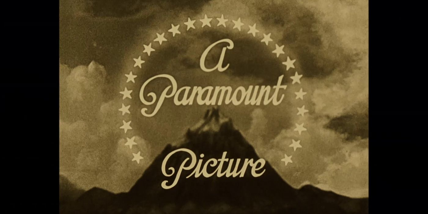
The Paramount logo may have changed over the past one hundred years, but its core foundation, the mountain, was present all the way back in the beginning. The exact origins of the logo are shrouded in mystery and are now firmly in the realm of Hollywood legend, but it's commonly accepted that the original mountain was based on the ranges seen by William Wadsworth Hodkinson during his youth in Utah, though the identity of the original artist seems to be lost to the ages.
Originally, the mountain was a charcoal drawing, but was redesigned in 1951. This new version is seemingly based on Artesonraju, a peak in Peru's Cordillera Blanca mountain range. Jan Domela was the chief matte painting artist for Paramount, and he painted the version of the mountain which would define the company for decades. The next major revision came in 1975, when the detailed matte painting was replaced with a more minimalist interpretation, rendered entirely in stark shades of blue.
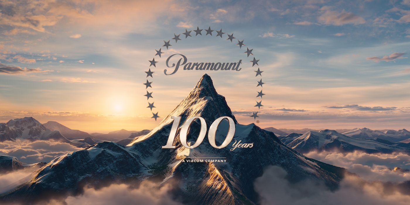
For the 75th anniversary of the company in 1987, artist Dario Campanile was commissioned to paint a new representation of the mountain, which would serve as the basis for a new version of the logo. This iteration was created entirely through cutting-edge CGI graphics. In 2002, the logo was redesigned once more, this time pushing the location of the mountain further away from the peaceful lake and growing it to the scale of a glacial peak, poking through the clouds with lots of snow and a somewhat more steely finish, complete with more spirited camera movements to accentuate the scale of the peak.
The Stars
Aside from the mountain, the other key element of the Paramount is its stars. Originally, there were twenty-four stars, one for each of the actors Adolph Zukor had signed to prominent contracts with the studio. This symbolic gesture lost much of its meaning as the old-timey studio mentality of long-term actor contracts began to simmer down, although the stars still remained in the logo. Curiously, the number of stars changed from twenty-four to twenty-two in the 1970s, though the reasons behind this change are unclear; it was probably just an aesthetic choice.
Initially, the stars were as static as the rest of the logo, and then they were made to fade in after the mountain appeared. But as technology became more advanced, the stars took on a more dynamic role; starting with the 75th anniversary logo (which actually debuted in December 1986, not in 1987), the stars would fly into view from behind the camera before encircling the mountain. In the latest iteration of the logo, one of the stars briefly skims the surface of the pristine blue lake, making ripples on the water before it reaches its spot on the mountain.
The Future
While the core imagery of the Paramount logo has been set in place since 1914, the logo itself has gone through numerous revisions, and it's only a matter of time before a new twist emerges. After all, the current logo has been in use since 2014, so it's a safe bet that changes will occur sooner, rather than later.
Next: Paramount Dumping Cloverfield Paradox On Netflix Was A Smart Move


