The Marvel Cinematic Universe spans an incredible 22 films and has been around for over a decade. It has become the highest-grossing movie franchise in history. Part of its success comes from the formulas it has developed. Larger than life characters full of wit, huge action pieces, and a likable cast are all MCU staples.
One aspect they've also figured out a formula for is their posters. Nearly every one of them features most of the cast thrown together creatively. We're here to look at all 22 posters and rank them based on creativity, color schemes, and how it ties into the movie it represents.
Thor

The fourth MCU film was one of the earliest to feature the main cast surrounding the star. Unfortunately, that means they hadn't perfected it yet. The shot of Thor holding the hammer is kind of awkward and the faces lined up over him lack emotion or any insight into the character.
Ant-Man

Ant-Man is one of the most fun installments into the MCU. Because of that, the fact that it has such a drab poster is even more disappointing. Not much in the way of color and it seems like they tied to put too much onto this poster. They wasted space including two meaningless henchmen of the villain.
Thor: The Dark World

Poor Thor. His sequel is often considered the worst of the 22 films. The bland nature of the film lines right up with the generic poster it has. This one is another case of way too much going on. It wins some points because it manages to make the villain, Malekith, look somewhat intimidating.
Captain America: The First Avenger

Another early entry where the poster style hadn't been figured out yet. While this suffers from a bit too much going on again, there's one aspect that holds it back from being higher on this list. All the fire surrounding the characters doesn't make sense. Fire was barely a part of the movie so including it so prominently on the poster is an odd choice.
RELATED: 10 MCU Moments That Prove Captain America Was Always Worthy Of Mjolnir
Spider-Man: Homecoming

Though Tom Holland and the MCU's take on Spider-Man is widely considered to be the best live action version, the poster certainly isn't. The photoshop job looks cheap and you have to question the need to include two shots each of Spider-Man, Iron Man, and the Vulture. It makes everything cluttered. At least everything isn't centered, allowing it to look different from most of these.
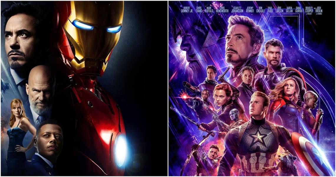
Iron Man

The one that started it all. While it doesn't do anything special, there's also not anything flat out wrong with it. You get the four most crucial cast members, a hint of the villain, and it never beats you over the head with anything. Iron Man being the most significant entity is precisely how it should be.
Captain America: The Winter Soldier

One of the best movies in the entire MCU, Captain America: The Winter Soldier has a solid poster. It's not generic and makes sure that Cap is front and center, with Black Widow and Nick Fury just behind him. The biggest problem is how little the Winter Soldier is. Considering the film is named after him, he should be more prominent.
Iron Man 2

The first MCU poster to truly showcase how much goes on in these movies. It features four main characters and two superheroes at the top. However, what puts this ahead of others is the awesome shot of Whiplash at the bottom. He looks imposing and it's a nod to the raceway fight, which is the most iconic scene from the movie.
Avengers: Age of Ultron

A case where a ton is happening but it all works. Kind of the opposite of the movie itself. The six core team members are front and center, but new additions Scarlet Witch and Quicksilver get some love. Vision appears but is mostly kept in the shadows, which is cool given how he ends up revealed during the film.
Black Panther

A classic "include all the cast members" kind of poster. What separates this one is how it showcases the insane level of talent in Black Panther and the inclusion of Wakanda at the bottom. One of the coolest things about this movie is the incredible city of Wakanda. Including it on the poster was a great decision
Guardians of the Galaxy Vol. 2

Everything that defines the members of the Guardians of the Galaxy is included on this poster. It's vibrant, fun, and has a sense of togetherness. While a lot is happening, it comes across as the kind of thing you enjoy the more you look at it. You keep finding little tidbits from the film, making this a great poster.
The Avengers

It sounds crazy now, but there was a time when seeing just a handful of superheroes in one place was hard to believe. The poster for 2012's The Avengers was a sight to behold for comic book fans everywhere. Iron Man, Thor, Captain America, Hulk, and the rest of the gang do battle in New York with Stark Tower in the background. Even without great photoshop work, it's classic.
Captain Marvel

We've reached the top ten. There's something about the MCU posters that shy away from including most of the characters. It makes the hero stand out. The poster for Captain Marvel showcases Carol Danvers on her own, which is a perfect choice. Throw in some dynamite color contrast to show how she's split between two worlds and you've got something special.
Guardians of the Galaxy

Take everything mentioned about the poster for the sequel and apply it here. The original is not as colorful, but it still plays up the team atmosphere that is so important. If you didn't know these characters coming in, this kind of poster is just off the wall enough to make you intrigued.
Avengers: Endgame

There's a lot to love about this poster. The purple tone is perfect with Thanos looming over everyone. New addition Captain Marvel is prominent, but she doesn't take over. Most importantly, only the heroes who survived Avengers: Infinity War are included so we don't know if the rest of the crew comes back. Also, it's the only poster to feature Mark Ruffalo as Bruce Banner and not the Hulk.
Doctor Strange

Another poster featuring just the core hero and nobody else. It makes sense because no other key MCU characters appear in Doctor Strange. The shot itself is cool, but the surrounding images look beautiful and feature the twisty kind of effects that made this film so unique.
Avengers: Infinity War

Seeing seven heroes on the poster for The Avengers was crazy. Avengers: Infinity War took that to a whole new level. Never has this many comic book characters been featured in one place. A poster that includes over 20 characters genuinely let you know the scale of this movie. Thanos as the biggest of them all is fitting.
Iron Man 3

When Shane Black took over as director for Iron Man 3, he made a film much different from the rest of the trilogy. The poster embodies that. This is not a heroic look for Tony Stark. He's beaten, battered, and alone. The only thing surrounding him are the other Iron Man suits he created. A great visual that fits the theme of the film.
Ant-Man and the Wasp

Another case where doing something different makes for a cool poster. The diagonal red and yellow stripes show how much of a team effort this movie is, playing off both Ant-Man and the Wasp. A lot of characters get included, but keeping the rest of the poster white makes for a clean look.
The Incredible Hulk

2008's The Incredible Hulk is kind of an outlier from the rest of the MCU. Edward Norton plays Hulk and it misses a lot of the core elements we're used to from MCU movies. The poster is certainly different but in a good way. Hulk takes up most of the shot, showing how massive he is, while a sad Banner plays a much smaller role. Fitting for the story