The first major consideration that most producers have to make when adapting a superhero comic book into a movie is how the costumes will look. The average superhero or supervillain has a brightly colored costume, as they look more impressive in an artistic medium, but those same costumes don't always translate well on film.
The X-Men movies did away with the colorful costumes in the first movie by replacing them with black uniforms. The original Spider-Man trilogy kept the Spider-Man costume mostly intact, but the Green Goblin and Doctor Octopus were reworked and made to look less goofy.
The Marvel Cinematic Universe has made an attempt at modernizing and recreating many classic costumes on the big screen, which has had mixed results. It's easy to make the modern Iron Man costume look cool, but it's a much harder job to make someone like Batroc the Leaper with his lame purple and yellow outfit look like a credible villain.
You have to give the numerous creators behind the MCU credit for making a genuine effort to make the heroes and villains look cool on the big screen while still paying homage to their roots, but it doesn't always work out for the best.
We are here today to determine which characters from the MCU benefited in the wardrobe department when they arrived in Hollywood and which ones wore costumes that needed to stay in the comic books - from the witch who dumped the one piece to the Asgardian warrior who needs to find a metal suit of armor.
Here are the 10 MCU Characters That Look Worse On The Big Screen (And 10 That Look Way Better).
Better: Hawkeye

The sequel to Infinity War doesn't yet have a title, but there are rumors that it's going to be The Last Avenger. You know what that means? It's Hawkeye's time to shine, so Thanos better watch out. Hawkeye doesn't get much respect in the MCU, as he doesn't have any powers and uses an antiquated weapon in combat.
The one way in which the creators of the MCU showed Hawkeye some love was by giving him a decent outfit that paid homage to his comic book costume by giving it a purple tint.
Hawkeye's comic book costume consists of bright blue and purple clothes, topped off with a mask, which was meant to reflect his carnival background. The movie version of Hawkeye has a different backstory, so it made sense to give him a more appropriate outfit for his profession.
Worse: Ego

It was always a strange idea to use Ego, the Living Planet in Guardians of the Galaxy Vol. 2, but these were films that were filled with strange ideas, so it could have worked. The problem with using Ego is that he was mostly represented by Kurt Russell, rather than as a giant talking planet.
Kurt Russell is a great actor and he certainly looked cool whenever he appeared on the screen, but why cast him as Ego, the Living Planet and only show a few seconds of Ego's giant face? It seems like a waste of an opportunity and makes you wonder why they bothered using a talking planet as a character if they weren't going to utilize him properly.
Better: Scarlet Witch

When the fans discovered that Scarlet Witch was going to be added to the MCU, they anticipated that her costume would receive an overhaul, as her original outfit consisted of a one-piece bathing suit/corset combination, a pair of bright red boots, and a silly looking headdress.
The movie version of Scarlet Witch dumped the headgear and put on a red leather jacket. Scarlet Witch also added a skirt and boots combination or a pair of pants to the overall outfit. The redness of her costume was also toned down, giving it more of a crimson shade of red than scarlet. The new design for Scarlet Witch actually resembled the one that appeared in X-Men: Evolution years earlier, where she also added pants and a leather jacket to her outfit, though this version of Scarlet Witch had more of a goth aesthetic going on.
Worse: Malekith

Thor: The Dark World has some of the most exciting visuals in the MCU, but the story itself is incredibly forgettable and has little impact on the overarching narrative of the series. Malekith is a prime example of the misfires of Thor: The Dark World, as he looks like a rejected design for a Stargate villain and has no screen presence as an antagonist for the gods of Asgard.
The version of Malekith that appears in the comic books has a far more colorful and interesting design, with a two-tone face that was distinct enough from Two-Face to avoid a lawsuit from DC/Warner Bros.
It's hard to shake the feeling that Thor: The Dark World was just a paycheck to all involved with its production and that no one really cared about telling an interesting story, with the terrible design of Malekith and his generic army being a result of this apathy.
Better: The Vulture

The producers of Spider-Man: Homecoming had an easy task when it came to redesigning the Vulture, as they could hardly make it any worse. The version of the Vulture that appears in Homecoming has a cool Rocketeer and World War II fighter pilot vibe going on, which was further improved by the high-tech gadgets he used in battle.
The comic book version of the Vulture is just Mr. Burns wearing a costume that makes him look like he is running late to a Furry convention. Spider-Man never had much trouble fighting an old dude in a green bird suit, so the Vulture needed some improvements in order to be turned into a credible threat in the MCU.
Worse: Whiplash

If you ignore the TV shows set in the MCU, then Iron Man 2 would likely be considered the worst part of the franchise. We could spend all day complaining about the problems with Iron Man 2, but we're going to focus on Whiplash's appearance instead. The costume worn by the comic book version of Whiplash likely couldn't be replicated on the big screen, as it looks like an outfit worn by a circus performer.
An attempt at recreating the comic book version of Whiplash would have been an improvement over the movie version, however, as he looks like a homeless man who found some cyber gear. The armored version of Whiplash wasn't much of an improvement, as the outfit was just a derivative of the one worn by Iron Monger in the original Iron Man.
Better: Yondu

It would have been distracting if Zoe Saldana had worn the original Gamora costume in Guardians of the Galaxy, as most of her body would have been on display, but she could have certainly pulled off the look. Michael Rooker may have struggled with Yondu's original costume from the comic books, as it was essentially the same as Gamora's.
Yondu's original outfit consisted of two belts leading to some massive shoulder pads, which only a speedo and a set of boots being worn beneath a massive golden belt.
There is probably a contingent of Michael Rooker fans who would love to see his sixty-three-year-old body squeezed into such a tiny outfit, but they would have been far outnumbered by those who would have walked out of the cinema.
Worse: Quicksilver

The costumes that Quicksilver has worn in the Avengers and X-Men comic books haven't exactly been the height of fashion, as he has mostly sported skin-tight lycra with a lightning bolt across it and a haircut that wouldn't look out of place on an anime character.
Those costumes still would have been an improvement over the outfit that he wears in Age of Ultron, though, as he is dressed like he is going to the laundrette and is wearing a mixture of the only clean clothes he has left. The Age of Ultron Quicksilver is wearing Soviet Union era jogging gear, which is one of the many reasons why we prefer the version that appears in the X-Men movies.
Better: Baron Zemo

The version of Baron Zemo that appeared in Captain America: Civil War was an amazing subversion of what the audience may have anticipated about his debut. This version of Helmut Zemo managed to almost destroy the Avengers without using any superpowers or gadgets, as all he needed was his intelligence and his drive for revenge.
The comic book version of Baron Zemo wears a striped black and purple outfit that ends with a balaclava and golden plates on his head, which would have looked silly no matter how much it was altered. There is actually concept art for Helmut Zemo that shows him wearing an outfit that is closer to the one worn by Baron Zemo. The design of the outfit had been changed to match the aesthetic of the MCU but it still looked pretty dumb, so we're glad it was shelved.
Worse: Grandmaster
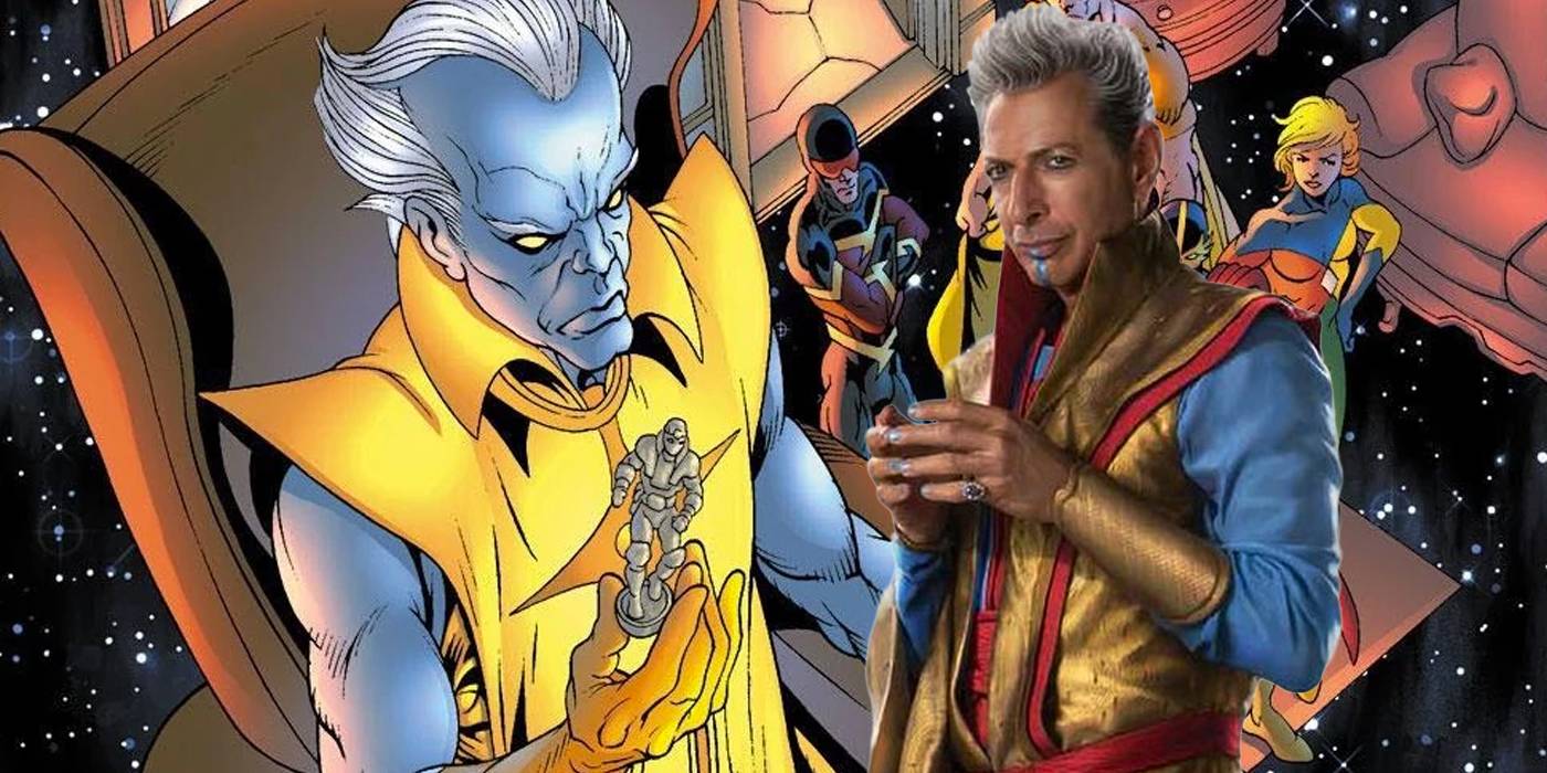
The MCU has become so big that many major actors in Hollywood have appeared in at least one of the movies for a cameo role. The problem with including well-known actors in MCU roles is that their fame can eclipse their part.
This was one of the problems with casting Jeff Goldblum as the Grandmaster in Thor: Ragnarok, especially as he is wearing a goofy outfit that wouldn't look out of place in The Fifth Element.
It's hard to see the Grandmaster as anything but Jeff Goldblum wearing a silly costume. If they had given the Marven Cinematic Universe version of the Grandmaster the same blue skin as his comic book counterpart, then it may have at least distracted from the Goldblumness of his performance.
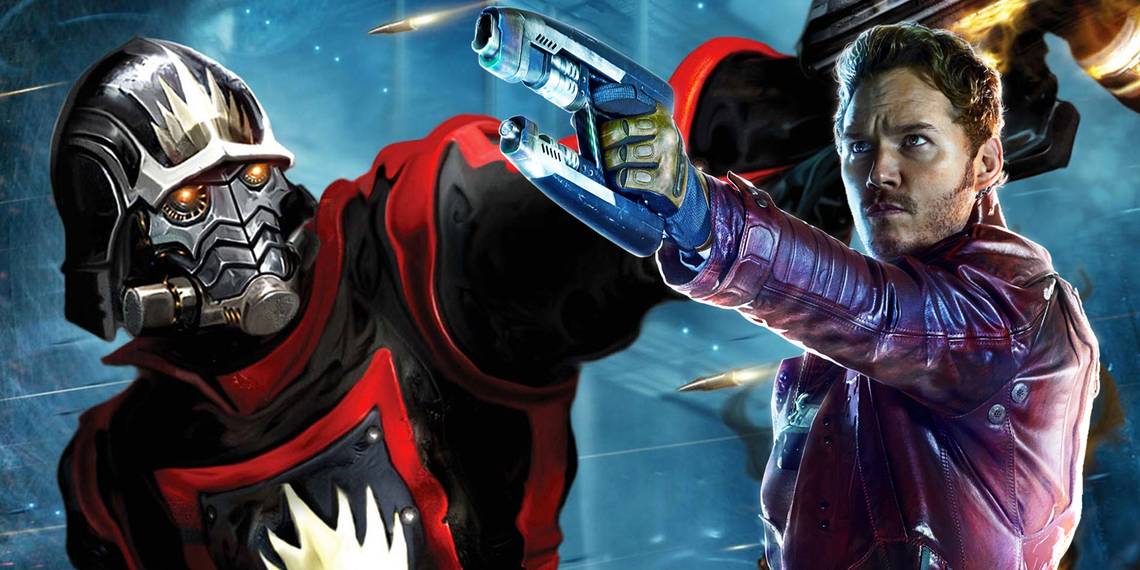
Better: Star-Lord

Star-Lord debuted in 1976, but he didn't become a prominent character until the Annihilation crossover event, when the Marvel universe was invaded by Annihilus and all of the cosmic heroes (and some of the villains) had to team up to stop him. The outfit that Star-Lord wore during the Annihilation: Conquest event seemed to use a Raygun Gothic design, which took the form of a futuristic police uniform, topped off with a golden helmet.
Star-Lord's costume made him look like a character from The League of Extraordinary Gentlemen and it wasn't a terrible look for him, but the space rogue/Han Solo outfit was far more fitting for the more light-hearted version of the character that appeared in Guardians of the Galaxy.
Worse: Rhomann Dey

The Nova Corps is essentially a copy of the Green Lantern Corps from the DC comic books. It wasn't until the Annihilation event that the Nova Corps (or rather, the last surviving member) became an important part of the Marvel universe. The version of the Nova Corps that appears in the MCU is far less powerful than the ones from the comics and they have all been given generic space uniforms with a lit-up Nova symbol on the chest, rather than the more fantastic outfits that they originally wore in the comics.
John C. Reilly played Rhomann Dey in Guardians of the Galaxy. Dey had purple skin in the comic books, yet he looks just like a regular guy in the movies. This is further confused by the fact that Dey's wife and child have purple skin.
Better: Ulysses Klaw

Andy Serkis is a terrific actor and an all-around awesome guy. We're glad to see that he found so many roles after The Lord of the Rings and he has been great in both the MCU and the new Star Wars movies.
There wouldn't have been enough CGI in the world to save Andy Serkis if he had worn the original Klaw outfit in Age of Ultron and Black Panther.
Klaw's original costume was a skin-tight red outfit that was topped off with purple underpants. This may be one of the most displeasing color schemes to the eye and it would have ruined Age of Ultron/Black Panther if Andy Serkis had been running around wearing it, even with a big metal claw on his hand.
Worse: Proxima Midnight

It's a common trope in movies for the villains to have a female member who exists for the sole reason of fighting the female heroes. You can't help but feel that this was why Proxima Midnight was added to Infinity War, as she mainly fights Black Widow, Okoye, and Scarlet Witch throughout the movie.
Proxima Midnight is one instance where they should have deviated more from the comic books. The reason for this is that Proxima Midnight looks just like a female version of Ronan the Accuser from Guardians of the Galaxy, even down to the creepy face paint. They also should have kept Proxima Midnight's original helmet, which was far cooler than the goat horns that they gave her in the movie.
Better: Falcon

Falcon is an important character in both the Captain America and Avengers comic books, which meant that he was guaranteed to appear in the MCU at some point. The producers of the Captain America and Avengers movies had a tough job on their hands when adapting the Falcon's outfit for the big screen, as the comic book version has always worn a terrible costume. Falcon's costumes have always been somewhere between the Vulture and a member of the Village People.
The costume designers did a tremendous job of adapting the Falcon's costume and turning into a high-tech military uniform that managed to pay homage to the original outfit while also looking distinct and impressive in its own right.
Worse: Starhawk

You can't help but get the feeling that they just didn't try when it came to designing the look for Starhawk in Guardians of the Galaxy Vol. 2.
The outfit worn by Starhawk in Guardians of the Galaxy Vol. 2 is little more than a pilot uniform with a few minor science fiction accessories added on, like the yellow gauntlets and glowing orange bands.
This makes Starhawk stand out during his initial showdown with Yondu, but for all of the wrong reasons, as he is surrounded by colorful science fiction characters and he just looks like Sylvester Stallone had agreed to show up, but refused to spend more than ten minutes in the makeup chair.
Better: Crossbones

Captain America doesn't have many iconic villains outside of Red Skull, so his catalog of minor villains was mined for use in the MCU, which is why Crossbones was given a prominent role at the start of Captain America: Civil War. The MCU version of Crossbones is one of the best adaptations of a supervillain costume in the series, with the bone design being turned into spray paint on his armor.
The original Crossbones from the comic books is very much a product of the late '80s/early '90s in his design, especially with the crossed cartoon bones on his chest. Crossbones looked like he was wearing a Jolly Roger muscle shirt and the producers of Civil War somehow managed to make him look threatening.
Worse: Dormammu

Dormammu is one of Doctor Strange's oldest foes and is one of the few mystical entities in the Marvel universe that can go toe-to-toe with him in a magical battle. The comic book version of Dormammu looks like Ghost Rider if he hit the gym and he has mostly worn armored black robes that are befitting of a powerful evil sorcerer.
The movie version of Doctor Strange was all about visual spectacle and Dormammu was no exception. The problem was that they did a little too much with Dormammu's appearance, as he looks like a cosmic magic eye painting that is constantly swaying backward and forwards. It's almost hard to take Dormammu seriously because he's just too bright and colorful.
Better: Gamora

There is no denying that most female superheroes and villains in Marvel comic books wear revealing costumes and are always framed as if being viewed by the male gaze. This was mostly a result of the fact that most comic book fans are male and the artists and editors want to appeal to their audience as much as possible.
Gamora is a notable example of having her costume totally changed from the transition to the big screen, as her outfit in the comic books was essentially two belts and a pair of thigh-high boots, with the occasional skin-tight bodysuit thrown in for the times when she wanted to be extra conservative in her appearance.
It would have been extremely distracting to see Zoe Saldana running around wearing Borat's mankini, so she was given an outfit more befitting of an intergalactic outlaw.
Worse: Heimdall

It was always going to be a tricky prospect to show the realm of Asgard and its divine inhabitants on the big screen. The final result wasn't always perfect, but the creators of the Thor movies did a great job. One consistent problem that the Asgardians had came in the form of their costumes. The Asgardians who wear armor always look like their outfits are made from cheap-looking pieces of plastic, which is something that extends to Thor himself.
The biggest victim of the fake plastic armor syndrome was Heimdall, whose brown and gold color scheme made him look an updated version of Goldar from the Power Rangers TV show. Heimdall was able to trade in his cheap-looking armor for a cool, Viking inspired set in Thor: Ragnarok... but was then squashed by Thanos in the first five minutes of Infinity War.
---
What do you think? Are there any other MCU characters that look worse or better on the big screen? Let us know in the comments!