Concept art is an artistic rendering of costumes, sets, and/or character designs that will potentially be used in films. While fans see the finished product on the big screen, the concept art is often released in a collected Art of Making book, so the truly dedicated can see what could have been. For superhero movies, hardcore fans snap these books straight up. We want to imagine alternate versions of for our favorite films. Sometimes, we like what we got in the finished product better. Other times, however, the unused concept art has us drooling and wishing for re-shoots of the film with that concept being used.
Whatever thought process the creatives behind the scenes went through to make these decisions will mostly remain unknown to us. Even so, we still have the unused concept art for these films. One company with an especially vast collection of unused concept art is, naturally, Marvel. After all, Marvel properties come from an artform in and of itself. It makes sense that all that concept art would be pretty awesome to see, especially with the updates to things that are classic in comics, particularly the costumes.
While, overall, we’re pretty happy with what the studio has given us over the years, there is still some art that makes us wish we could have seen something different in films long past. Then there are other designs that make us happy with what we got in the movies.
Here are 13 Marvel Concept Art Better Than The Movies (And 7 That Are Worse).
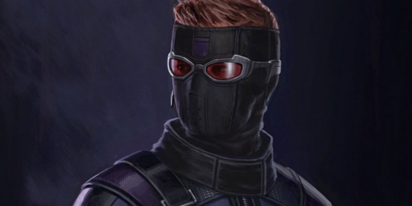
WORSE: Hawkeye – Captain America: Civil War
For the most part, Hawkeye (Jeremy Renner) tends to have relatively simple costumes. There was something nice in that simplicity because Hawkeye’s costumes in the comics tend to be theatrical and bright purple. He grew up in the circus, so you need to expect a little theatricality in his costumes. In the MCU things were a little more streamlined, which worked. The purple was a bit darker, and there was freedom for arm movement. It looked like something that would realistically be worn by the character.
This concept for his Civil War costume by Andy Park wouldn't have made Renner too happy, as it would cover his entire face. It honestly gives us more “Winter Soldier” than Hawkeye. Ultimately, they went mask-free and that was a good thing.
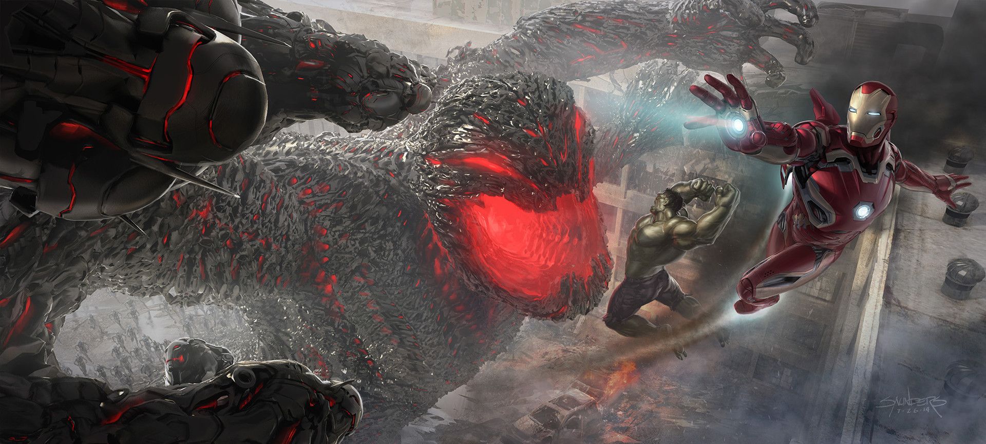
BETTER: Ultron – Avengers: Age of Ultron
We definitely feel a bit cheated out of a kaiju-inspired Ultron (James Spade) in Avengers: Age of Ultron. In this concept drawing from Phil Saunders, we see exactly that. Chasing after Iron Man (Robert Downey Jr), this Ultron is gigantic and even more alien-looking. The Hulk (Mark Ruffalo) is poised to smash into Ultron’s enormous, gaping maw.
It’s a dynamic action shot. Honestly, a bit cooler than the team having to fight multiple Ultron copies, though it looks like there may be some of those down below. This alien, giant version of the title character would be pretty cool to see in the film.
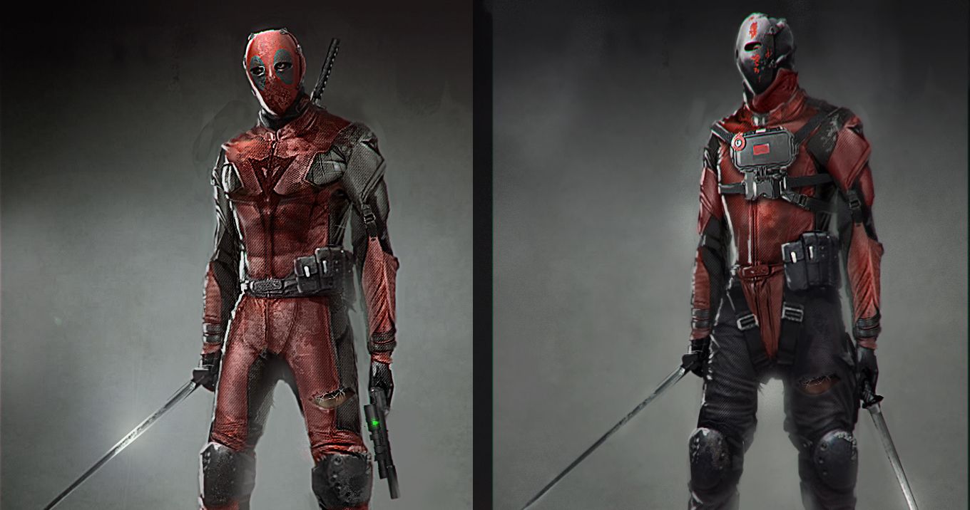
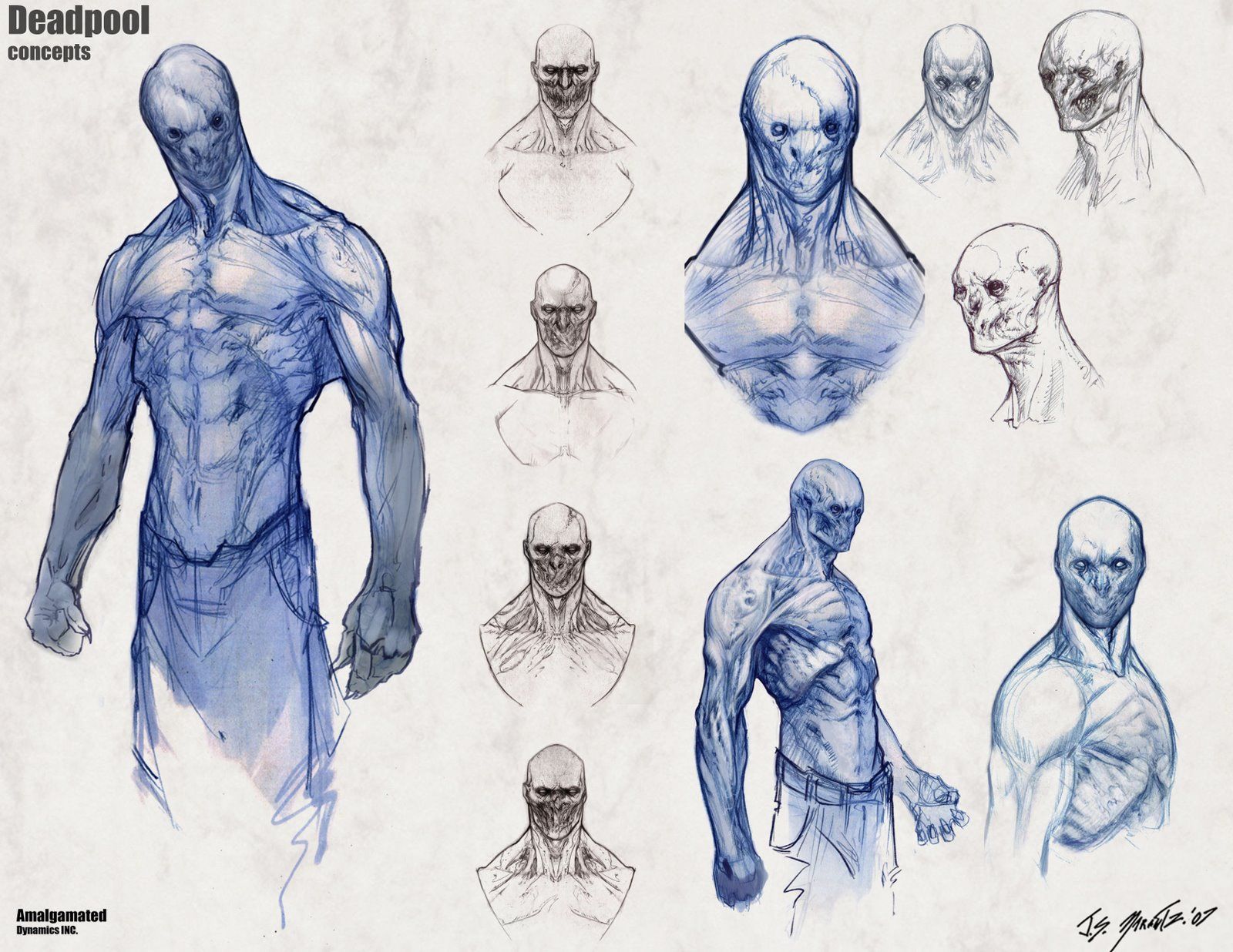
WORSE: Deadpool - Unused Deadpool Film Pitch
The more we learn about previous stabs at Deadpool, the more like a miracle that the 2016 film seems to be. Back in the day, there were attempts to get the film off the ground. One came from the director of Kick-Ass 2, Jeff Wadlow, who had a pitch for a Deadpool film and had Kelton Cram do some concept art for it back in 2013.
Cram said that the film would have seen Wade face off against The Marauders and would have had a “gritty, more realistic tone.” The design on the left is definitely more recognizably Deadpool, though there is something unsettling about seeing his eyes. The one on the right just looks kind of off. Either way, we got the Deadpool movie we wanted in 2016 with an accurate costume.
BETTER: Dormammu - Doctor Strange
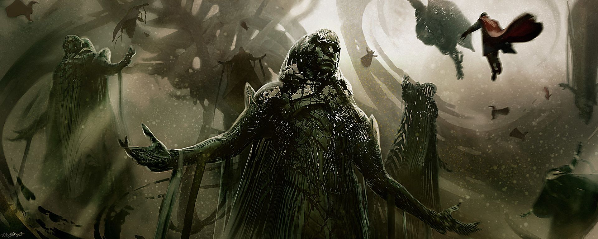
While 2016’s Doctor Strange had some majorly trippy imagery, the villains were a little on the lackluster side. The “final” big bad was the classic Dormammu (Benedict Cumberbatch). The final version of the character was meant to be some sort of funhouse reflection of Strange himself, but it didn’t really come across that way. He was just kind of a swirly mass.
In concept art from Jerad Marantz, we see Dormammu with a little more of a humanoid form. The character is shown to be more of a crumbling statute, like he’s trying to hold onto human form but can’t. It’s a rather interesting concept and would have been awesome to see on film.
BETTER: Hulkbuster – Avengers: Age of Ultron
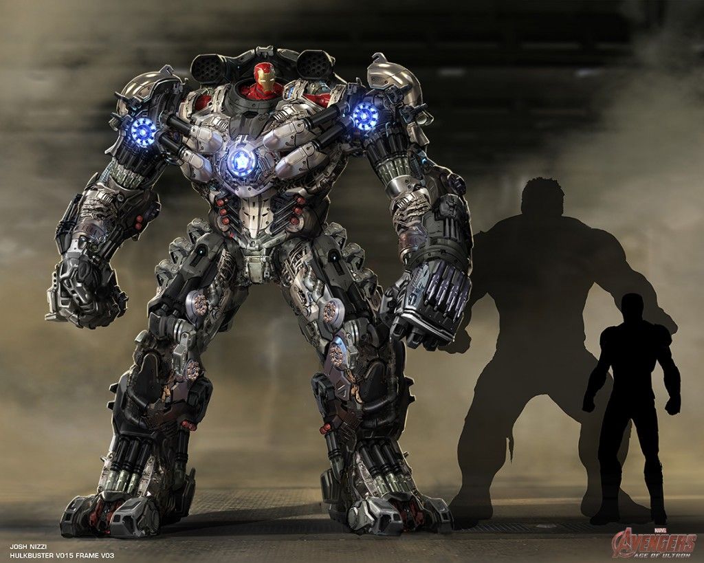
One of the better moments of Age of Ultron was when the Hulkbuster appeared on screen. Piloted by Tony Stark, the armor delivered some serious damage to a frenzied Hulk. While it definitely looked cool, it also just looked like if Iron Man and Juggernaut were mashed together.
An earlier draft of the Hulkbuster, from Josh Nizzi, looked more like a piloted mech. Tony, in his Iron Man suit, would just slot in at that top, as the head, and control the huge armor that way. It’s actually gives a nostalgic Megazord sort of vibe. If the Megazord had a very tiny head, but it still looks pretty cool. Though, given Infinity War, it’s probably a good thing Bruce had the dome protection of the Hulkbuster they went with.
WORSE: Ant-Man – Ant-Man
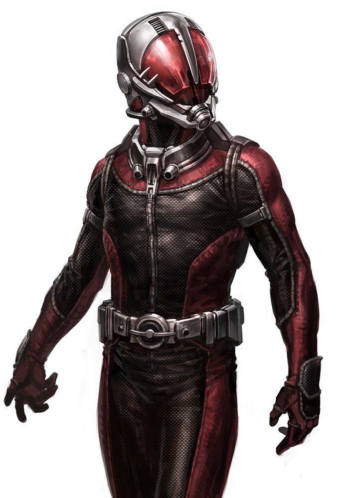
2012's Ant-Man, starring Paul Rudd in the titular role, was a minor success for Marvel Studios. Peyton Reed's film had some great little character moments and featured creative uses of the character’s powers. The costume definitely had a great retro vibe to it, especially with the helmet Scott Lang sports when he takes on his heroic identity.
However, it almost looked very different-- and not really for the better, either. In this concept art from Andy Park, we see Ant-Man with a helmet design that invokes more of a Yellowjacket vibe. Something about that overabundance of red paneling on the face just doesn’t look quite right.
BETTER: Baron Zemo – Captain America: Civil War
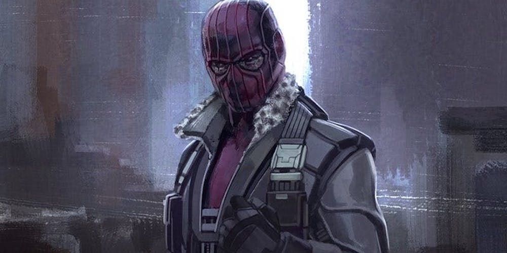
Zemo (Daniel Bruhl) managed to tear apart the Avengers in Captain America: Civil War, which no villain had done before in the MCU. At least his reasons for doing so made a lot more sense than Thanos’ (Josh Brolin) “destroy half the universe so resources can be shared” plan.
As opposed to his dramatic purple commando look from the comics, Zemo spends the movie dressed as a normal guy, even posing as a doctor. A lot of the more ridiculous villain costumes don't translated onto the big screen. This concept art by Andy Park definitely shows shades of the tough military man we were told about in the film. It would have been nice to see more of that.
BETTER: Jean Grey – X-Men: The Last Stand
X-Men: The Last Stand is definitely in the bottom rung of Marvel films, especially where poor Jean Grey (Famke Janssen) is concerned. The Phoenix Force saga deserves its own movie, not to be lumped in with the whole mutant “cure” plotline as it was in The Last Stand.
Still, even a bad film can have great concept art. This one shows Jean as Dark Phoenix, seeming like the embodiment of energy taking humanoid form. It wouldn’t have translated well with 2006 technology, but it would still be so cool to see on screen. Let's hope X-Men: Dark Phoenix takes some inspiration from this.
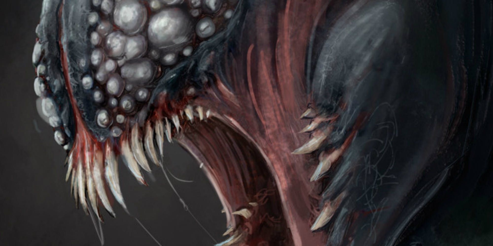
WORSE: Venom – Venom (2018)
2018's Venom has definitely solidified its place in superhero movie history as a surprise hit. The character has always been a little unusual in its design, especially when it comes to that iconic Gene Simmons tongue of his. It’s a part of Venom’s charm at this point.
Oh boy, could this symbiote have looked a lot less charming. If you have that phobia of small holes clustered together or of eyes, then this fan concept art from professional artist Ian Joyner may leave you seriously freaked out. There are a lot of eyes that serve to make him look more insectoid.
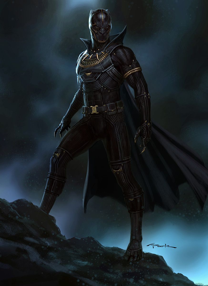
BETTER: Killmonger – Black Panther
Erik Killmonger (Michael B Jordan) is one of the best parts of the Black Panther movie, which is the highest of compliments. The character definitely had a sense of style and swagger as well as extreme drive. That swagger carried over into his Black Panther costume, which had gold incorporated into it. It stands in contract to T'Challa's (Chadwick Boseman) simple design, which fits in with his own quieter and more self-assured personality.
In a unused piece of concept art from Andy Park, we see a much more kingly suit for Killmonger. It ratchets up the gold and the comics influence in the costume.
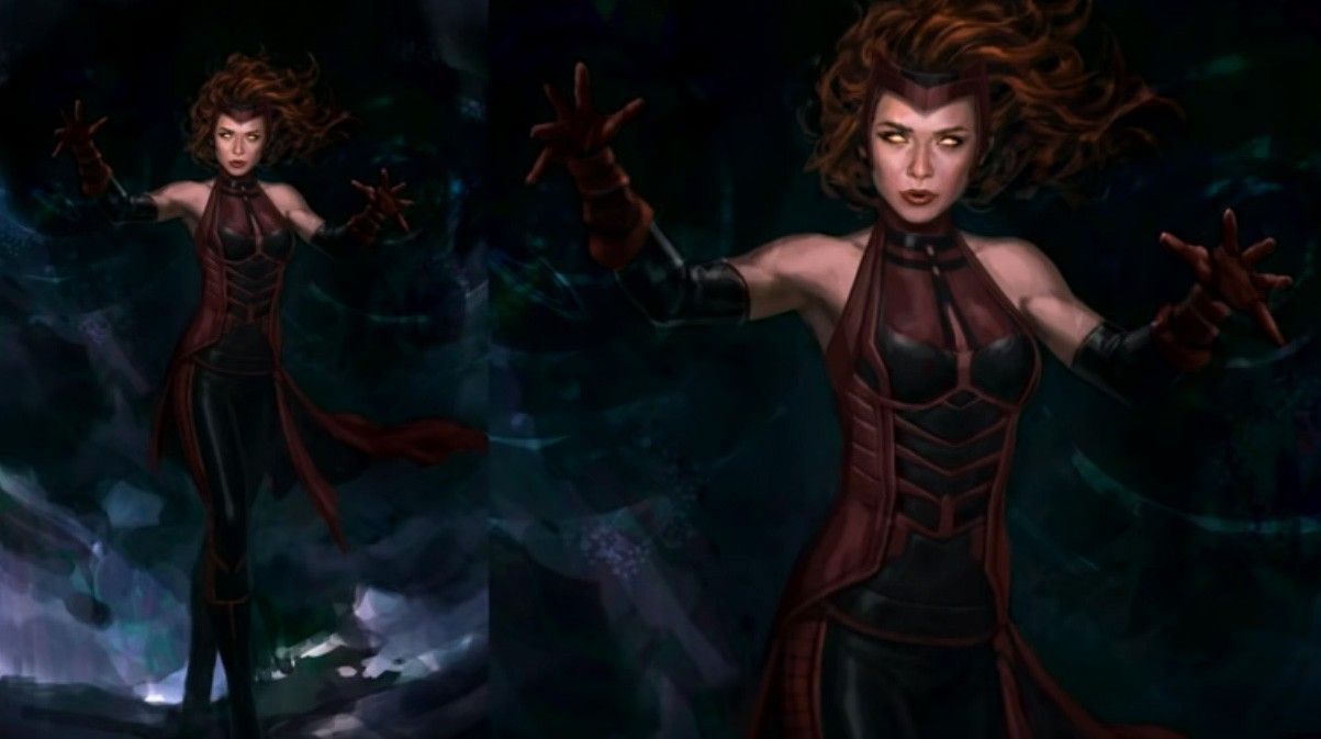
BETTER: Scarlet Witch – Age of Ultron
Like Hawkeye, Wanda Maximoff (Elizabeth Olsen) also had a comics costume that wouldn’t translate the best to film. There is the actor’s comfort to consider when wearing said costume as well. While Wanda’s cinematic costumes tend to be streetwear or a slick red leather trenchcoat, attempts were made early in the design process to incorporate some of her more traditional wear-- particularly that red “M” shaped headband she rocks in the comics.
From Andy Park, this black and red costume of Wanda invokes her comics costume a lot more than what we saw in Avengers: Age of Ultron. The headband is there, and it has a nice color balance.
WORSE: Deadpool – X-Men Origins: Wolverine
X-Men Origins: Wolverine is famous for how badly it depicted Deadpool. It’s was one of the easier jokes that had to be made in the first Deadpool film. If anyone deserves a chance to give the metaphorical finger to this character design, it’s Ryan Reynolds, who played the role in both films.
What can we even say about it? It’s really unsettling. He looks like Eugene from Preacher and Sloth from The Goonies were combined into one. They were adapting a character famous for his fast-talking ways and got rid of his mouth. It seems like no one read the comics before making this movie.
BETTER: Wasp – Captain America: Civil War
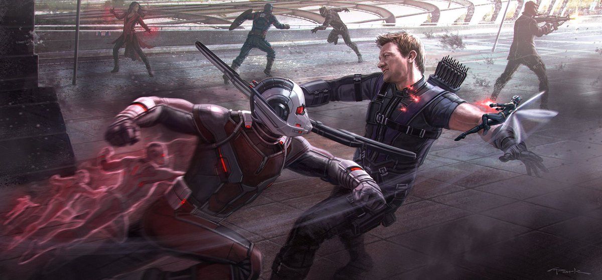
Wasp (Evangeline Lilly) spends a good chunk of 2018’s Ant-Man and the Wasp angry at Scott for not bringing her along in Civil War. While it made for some good conflict between the characters, early drafts and concept art for the 2016 film did show Wasp in the action. It looks like Ant-Man and the Wasp were on a different side in early drafts as they are fighting Hawkeye.
Even so, it’s definitely a very cool design. The wings are right on, but she does seem to have a darker color scheme then the 2018 film had. Her stingers looked great and, hey, it’s always great to see the dynamic duo of Ant-Man and Wasp fighting together.
BETTER: Steve Rogers – Avengers: Infinity War
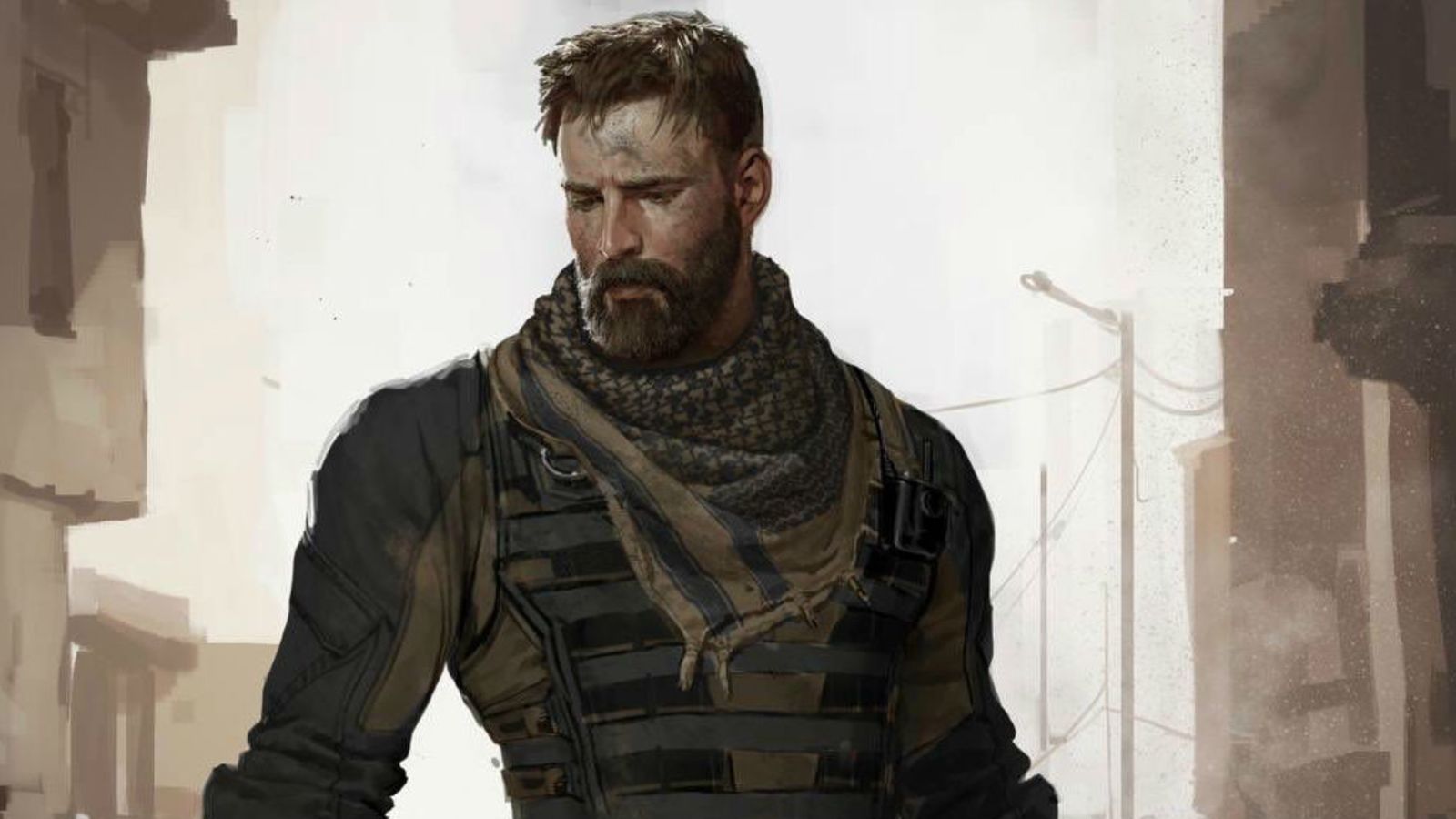
Fans were waiting to see Steve Rogers go full Nomad in Infinity War. Why we probably weren’t going to get the, admittedly, fantastic costume of yesteryear, we were expecting something. Instead, his costume is a distressed version of his old Captain America one, minus the star and the patches and a darkening of the stripes. It’s not bad, but we wanted something new.
This concept art is a Nomad look for Steve that seems to strike a good balance. The lighter brown patches and the black could be a less flashy homage to the black and gold look of the classic Nomad costume. Sure, it doesn’t have the navel slit or the cape, but it still looks different.
WORSE: Zola – Ant-Man
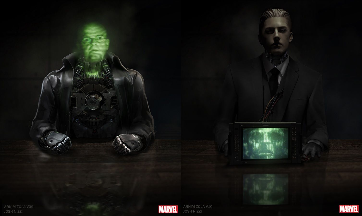
Apparently, Zola (Toby Jones) was supposed to appear in a flashback scene for Ant-Man. The scene, ultimately, was cut, but we do have some concept art from it. These John Nizzi designs are interesting. The one on the left looks like a proto-Iron Man with a holograph for a head. The one on the right seems like it is trying to invoke MODOK. With the very fake mannequin head on top added with the TV coming out of him, he looks more like the Kraang from Teenage Mutant Ninja Turtles.
These versions that were attempted just look so horrifying in comparison to what we got in Captain America: Winter Soldier. The execution is interesting, but we’re not really feeling it.
BETTER: Iron Man – Avengers: Infinity War
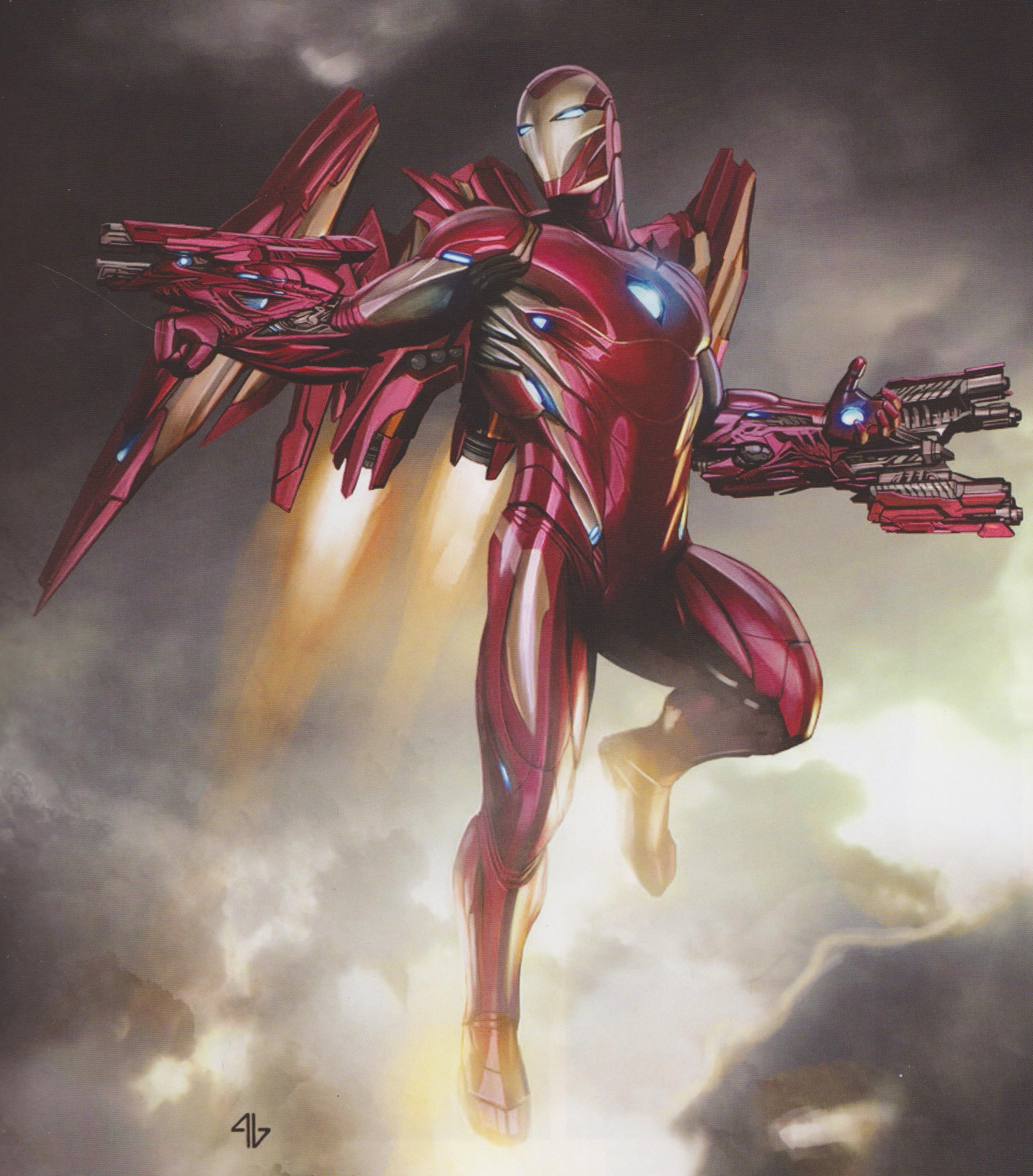
Tony Stark had some pretty cool armor in Avengers: Infinity War. It was the MCU’s version of the Bleeding Edge armor. Out of the many, many different iterations of the armor that fans have seen over the years, it is definitely the slickest. Tony tends to get better with each subsequent version of Iron Man.
This concept art definitely looks a bit cooler. There’s something about the jetpack on his back that makes him look like some kind of mechanized angel. Plus, everything just flows beautifully together. The guns may be a bit much, but overall it balances everything perfectly.
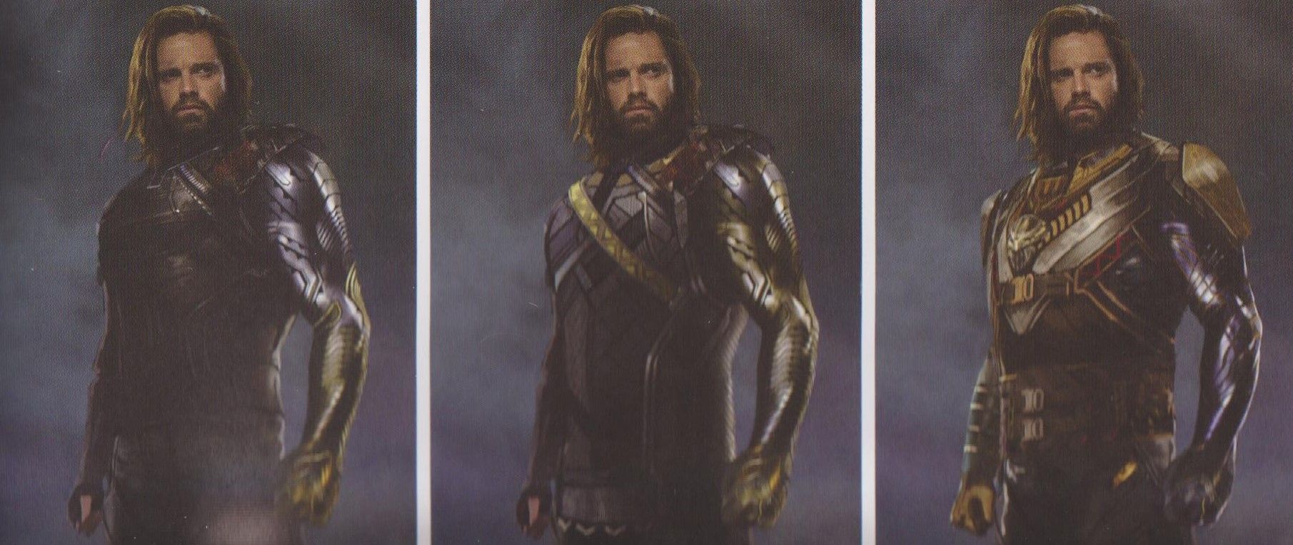
BETTER: Bucky Barnes – Avengers: Infinity War
In the post-credits scene of Black Panther, fans learn that Bucky Barnes has taken on a new moniker: “White Wolf.” In the comics, the White Wolf isn't so nice. His costume is a little boring as well; essentially a white version of the Panther costume with a cape.
With Bucky (Sebastian Stan) in the role, so to speak, it would have been nice to see an update of the costume. We didn’t get it. Instead, Bucky wore an updated version of his clothes in The First Avenger, which is a nice full circle nod. Still these concepts show an interesting take on the White Wolf, with a lot more Wakanda influence in it. It looks pretty visually striking, especially the middle one.
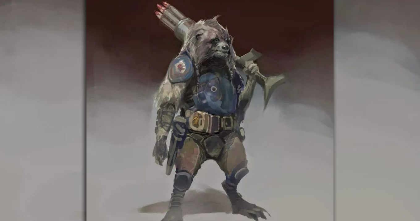
WORSE: Rocket Raccoon – Guardians of the Galaxy
This early concept art for the first Guardians movie shows a very different looking Rocket Raccoon (voiced by Bradley Cooper). It’s hard to point out what, exactly, is so off-putting on the design. The weird braided pigtails that the character is rocking are definitely one part. The other is definitely the excess of fur the character has, especially hanging off his arms. It just doesn’t look entirely right.
It’s the overall look of the concept that has us cringing. There’s just something off-putting and wrong about it. Some of the times, there is just a visceral “no” reaction in your gut.
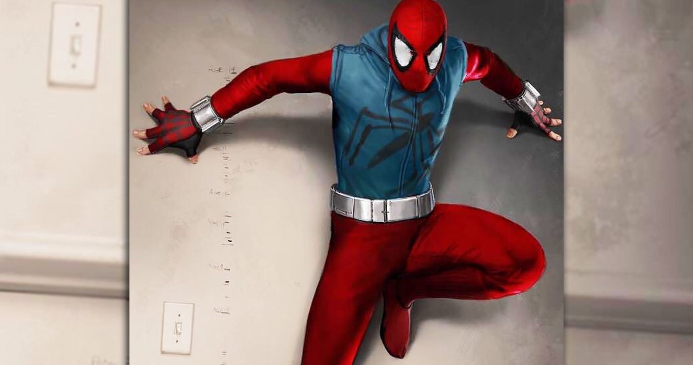
BETTER: Homemade/Scarlet Spider - Spider-Man: Homecoming
One of the cooler aspects of Tom Holland’s Spider-Man is that his costume looks like something a high-school kid with a limited budget would make. While we’re still not a hundred percent sold on how the goggles look, it does show how clever Peter Parker is in the MCU. An early concept version of his homemade costume, however, invokes a classic comic storyline. We’re talking about the Clone Saga and the Scarlet Spider.
An early version of the DIY Spidey costume by Ryan Meinerding looks more like the Scarlet Spider getup that Ben Reilly wore. It would have been a cool shout-out to see it in action. Who knows? Maybe the MCU’s third Spider-Man movie could be an adaptation of Clone Saga.
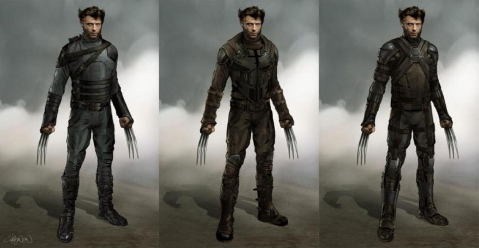
BETTER: Logan - X-Men: Days of Futures Past
We never really saw Hugh Jackman don the classic black and yellow Wolverine costume during his run as the character. The closest we got was a black costume with yellow piping. That probably comes down to comic to film translation over anything else.
These designs for his “future” look in Days of Futures Past from Phillip Boutte Jr, don’t have that classic character design, but they make sense for the future world that the X-Men are trying to change. Even though these are more function than fashion, there are still some interesting design choices. The ones on the far right and in the middle have kneepads worked in. There not much color, but clearly the character’s fighting style was considered.
---
Which piece of Marvel fanart is your favorite? Let us know in the comments!

