Just because someone is a professional, it does not mean they are immune to making mistakes. Doctors commit malpractice and auto mechanics can miss what’s ailing a car. An all-star level baseball batting average still means that they miss seven times for every three times they hit.
So, realistically, we cannot expect every single costume redesign left to comic book professionals to be a success.
We aren’t sure what the recipe for a bad costume redesign is-- sometimes it’s trying to be too current or modern, occasionally it’s being too out-of-touch with the times, and other times a costume redesign is so disgustingly bad that it looks like the artist lost a bet.
However, there are tons of great ideas out there. Time and again, we’ve been blown away by the designs of amateurs (or artists who just aren’t working on the book they’re designing fan costumes for). Sometimes boldness is what’s needed when we don’t realize it, and sometimes a great design calls for delicate subtlety.
In either event, we would like to bring to your attention just how dramatic the results can be. We will dive into some of the all-time worst Marvel designs that actually made their way to a published comic book (to our astonishment) to show that not everything Marvel is magic.
We will also showcase some of our favorite fan designs out there-- costumes that we hold out hope will someday make their way to the page, or help to influence future costume designs. Many of the designs come by way of the brilliant Project: Rooftop, helmed by comic artist Dean Trippe.
Here are the 8 Incredible Marvel Character Designs Better Than What We Got (And 7 That Are Awful).
15. Good: Captain America

We don’t know if this is supposed to be Sam Wilson, Isaiah Bradley, or someone else. Frankly, we don’t even care. What we have here is a complete home run of a design.
What artist Victor Newman has created is a completely battle-ready Cap. With the red, white, and blue and the stars we know what hero this is supposed to be. While the shield doesn’t look like the boomerang vibranium discus that we’re used to seeing, this pointed shield looks more capable in a fight.
There have been many successful attempts at making the Captain America look jibe more with the character actually being a soldier, but never has the tactical armor looked more believable. We applaud Newman for only including a splash of Old Glory in the outfit, making Cap a less visible target.
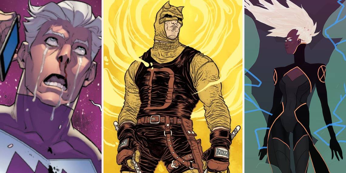
14. Bad: Quicksilver

Pietro Maximoff, the hero known as Quicksilver, is no stranger to makeovers. Since he first appeared in the early ‘60s, his primary costume has changed eleven times (with countless tweaks to the costumes within each change), on top of all the other one-offs and alternate costumes he’s had.
Most outfits have revolved around the idea of a lightning bolt. His most famous, classic outfit is sky blue with white accents and a white lightning bolt. On joining the Uncanny Avengers, he adopted a bolt-less speed suit with goggles that was fine and dandy.
Then the “All-New, All-Different” initiative took hold at Marvel, and Pietro quickly donned a new suit. His current outfit is a real headscratcher. The color and blocking is off, but the biggest issue is the new arrow chest logo. The arrows represent fast forward, but in the age of MP3s, the symbol is losing its meaning.
13. Good: Spiral

Spiral isn’t exactly a character who we’d describe as well-thought-up. An ‘80s hodgepodge of alien stories and magic and cybernetics gave us the multi-armed alien cyborg sorceress who has been used sparingly as a foil for the X-teams over the years. She had a brief moment as a hero in one of the X-Force books of the early 2010s.
However, this look, completed for a cool blog that attempted to page-for-page redraw the amazing Official Handbook of the Marvel Universe, makes us yearn for Spiral stories like no other get-up could.
Ramon Perez re-imagines Mojo’s main minion as a roller-disco, super hip party girl. We’re not exactly sure what sorts of adventures this Spiral would come across-- we only know that we’d hang eagerly on every last panel of a book about them. Let’s make this happen.
12. Bad: Nomad (Steve Rogers)

If Victor Newman's version was absolutely the right way to do Captain America, then this entry is absolutely the wrong way to do Steve Rogers. In the comics, following his disillusionment with the U.S. government, Steve Rogers hangs up his shield and becomes the Nomad.
We understand that the classic Cap look is wacky. It stood in the face of good taste for long enough that it became a staple of the genre. We also understand that the ‘70s were just a weird time for fashion and looks. However, we still fail to understand how this costume, one of the most laughable looks ever, got the green light.
It was very quickly adjusted for the better (but not by much)... but it took until the second costume of the second person to adopt the Nomad name (a former Bucky named Jack Monroe) until the Nomad costume got decent.
11. Good: Daredevil

The Man Without Fear has had a largely untouched, classic look for ages. The 1960s were surprisingly kind to a handful of characters. However, the horned red spandex suit that we’ve come to know and love was not actually the first costume Daredevil’d worn.
His first foray as a leading man in comics came with a yellow and red number that, although never really brought back, remains fondly remembered despite its short tenure.
This piece by notable comic artist Rafael Grampa (whose work we highly recommend hunting down) illustrates everything we want to see in a Daredevil costume.
It has a very slapped-together, homespun feel that makes infinitely more sense than the stretchy underwear that every hero seems to have. Every piece of the outfit makes Daredevil seem like a gruff and cagey fighter-- and pays homage to his boxer father, Battlin’ Jack Murdock.
10. Bad: Mandarin

We can’t have a discussion about bad costume designs without talking about Iron Man’s arch-nemesis, The Mandarin. He’s roughly had a dozen different looks since he was first introduced in the comics. A scant couple have been passable or better.
One of the worst offenders played on the stereotypes found in the style of American racism known as "Yellow Peril." Another had him wearing an armored loincloth and helmet, and nothing else. Also, yet another seemed to confuse his Chinese heritage with the samurai influence of Japan.
There’ve been so many bad redesigns of The Mandarin that a whole article could be written about him alone. However, we’d like you, the reader, to not lose your lunch… so we’ll spare you the turmoil.
9. Good: Fantastic Four

The artist, known as Mr. Walters, used his re-design of Marvel’s first family to take liberties with the team’s backstory. Walters has emphasized the pulp, science hero aspect of the Fantastic Four by seemingly getting rid of the powers of super scientist patriarch Reed Richards and Johnny Storm, the Human Torch.
Reed motors around in a hydraulic suit that seems both more competent and realistic than that of the villainous Stilt Man. It allows him his stretching ability without making him his elasticity from the comics. Johnny just looks like an adventurer with a flamethrower,which we’re all for.
The Invisible Woman is actually invisible, like the H.G. Wells novel. This is an interesting take on the power. However, the crowning achievement of the redesign is Benjamin J. Grimm. In the comics he’s a hulking rock man… but this bizarre crystalline monster in Mr. Walters’s design truly is a Thing.
8. Bad: Whiplash

If we’re going to be honest here, Whiplash has never been a remotely good character. The idea for the villain certainly stemmed from the fact that the medical condition most commonly associated with car accidents and roller coasters sounds way more brutal than it really is.
Uninspired or not, there are still ways of making the character look cool. The closest we ever got was the Mickey Rourke version from the MCU’s Iron Man 2. This look, however, is decidedly not movie-appropriate.
For a short period of time, Mark Scarlotti (as he’s known in the comics) donned little more than a leather dungeon get-up to accompany the whip. No doubt, this led to some confused feelings in young Iron Man readers.
7. Good: Doctor Voodoo

Artist James McDonald has a DeviantArt portfolio full of hero designs. For our money, the best one belongs to Doctor Jericho Drumm. Better known as Brother Voodoo (and then Doctor Voodoo), the man has over time been subject to some questionable costume choices.
Granted, much of his sartorial turmoil came from the fact that he was conceived in the ‘70s.
While he’s been through a few decent costumes (the current one not being all that hot), this costume by McDonald outpaces them all. There is a sense of danger and intrigue in the look that goes perfectly with Drumm’s voodoo powers and ability to commune with the dead.
Boy, what we wouldn’t give to see Drumm looking like this in his appearances with the Uncanny Avengers.
6. Bad: Wolverine

We’ve long accepted that James “Logan” Howlett has the weirdest haircut in comics. His costumes have been pretty good overall in spite of the spiky ‘do. However, there was a really oddball moment in Wolvie’s past when he lost his nose, his common sense, and his fashion sense.
In an abandoned part of his comic history, Wolverine went "feral" following a fight with Sabertooth. Some cockamamie story about Wolverine’s adamantium failing to keep his natural mutation from continuing further was given, and eventually that fact was taken advantage of.
Through the course of the storyline, Wolverine left the horned mask we’re all familiar with, and went toward the edgy look of a bandana wrapped all the way over his noseless face. We don’t know why, either.
5. Good: Cyclops

One of the darkest turns that a superhero ever made while still technically staying a superhero was what happened with Cyclops. While possessing a portion of the Phoenix Force, Cyclops ended the life of his mentor and father figure, Professor X.
Following the death, Scott Summers went underground with some of the more cold-blooded mutants to create a proactive, militaristic band of X-Men that were considered traitors even within the mutant hero community.
We can’t picture a better look for the grim version of Cyclops than what was dreamt up by artist John Cantrell. The outfit reads as threatening and genuinely terrifying, but somehow does not immediately seem villainous, per se.
The dark and fully shrouded costume suits the underground activities phase of Cyclops much better than the giant red "X" face ever did.
4. Bad: Hawkeye

Perhaps no hero has had as many bad costumes as Hawkeye. It is telling, as the classic and beloved Hawkeye costume is a two-shade-of-purple cornball fest. Worse, though, than his horned look (seriously, though, why did every Marvel character have horns built into their look for a while?), was his second costume.
Poor old Clint wound up adopting a costume that looked less like that of a superhero and more like a cabana boy at an Ancient-Greek-themed 1960’s swingers club.
His purple tunic was paired with no pants, and occasionally a headband. We wish that it had been paired with a trash can from the get-go. Luckily, it wasn’t all that much longer before Barton went on to his next costume misadventure.
3. Good: Storm

There’ve been very few looks for the weather witch Ororo Munroe that we’ve disagreed with. The former queen of Wakanda has looked great from the get-go.
Her original costume, her dalliance with the mohawk punk look, her Jim Lee-era grey suit (popularized by the ‘90s X-Men cartoon) have all have been terrific. She might actually be the consistently best-dressed hero of all-time.
This look by Kelly Smith, which won a competition of Storm designs on Project: Rooftop, echoes elements of some of Storm’s best looks. There are also influences, such as the high neck, that evoke Ororo’s African heritage.
This costume makes Storm look regal, refined, and like a force to be reckoned with. The best part about it is that the hair simultaneously manages to hearken back to the mohawked Storm, which looks contemporary and implies the raw nature of an actual storm.
2. Bad: Thor

It has been surprisingly easy to keep the Norse God of Thunder looking good over the decades. Slight variations on the original winged helmet and red cape ensemble have ensued; but they’ve all been largely benign dalliances.
One of the biggest missteps, the pony-tailed travesty that is Thunderstrike, is technically not Thor (but rather a way of separating the God from avatar/vessel Eric Masterson).
There was a blip in the ‘90s, which was home to more design disasters than we care to count, that saw Thor looking utterly atrocious. Known in comic circles as “Midriff Thor,” the look was an attempt at modernizing the Odinson, who’d become viewed as outdated and quaint.
The look included everything that was wrong with the decade: unnecessary straps and pouches galore, random strips of leather, spikes, chains, really big hair, and an inexplicable hairy midriff. Yuck.
1. Good: Spider-Man

So this is maybe one of the more "out there" designs that we’ve seen for Spider-Man, but we love it just the same. The artist, known as Otis, provided a backstory for this costume in that the webbing on the costume is solar-powered. The spiders crawling all over Parker are robotic, and are outfitted with recording equipment.
The result of getting rid of the blue panels for an all-red outfit is that Peter Parker seems more menacing. The different-shaped spider on the back could maybe be adjusted (or gotten rid of altogether), but otherwise this is a really strong outfit that honors the spirit of the classic while making something that feels very new and fresh.
It is worth noting that this was posted (along with a color-reversed version we don’t like as much) in 2011-- and that robotic spiders became part of the Superior Spider-Man outfit a couple years later.
---
Do you have any personal favorite fan designs? How about some vomit-inducing Marvel mistakes? Let us know in the comments!