When people think of the face of Marvel Comics, most will probably picture Spider-Man (or possibly Stan Lee). Many more, however, will picture the high stylized cinematic Marvel Comics logo that appears before every MCU film as its spins in mid-air, flashing scenes from previous Marvel Cinematic Universe movies.
While a fantastic feat of advertising ingenuity in itself, the MCU logo is still just the latest in a long line of redesigns of the Marvel Comics logo, which has been in a constant state of evolution since it switched from its original Timely Comics logo and gradually built up a brand now associated with a leader in the comic book industry. Let’s take a look back at the various designs and see how they led to the famous movie logo.
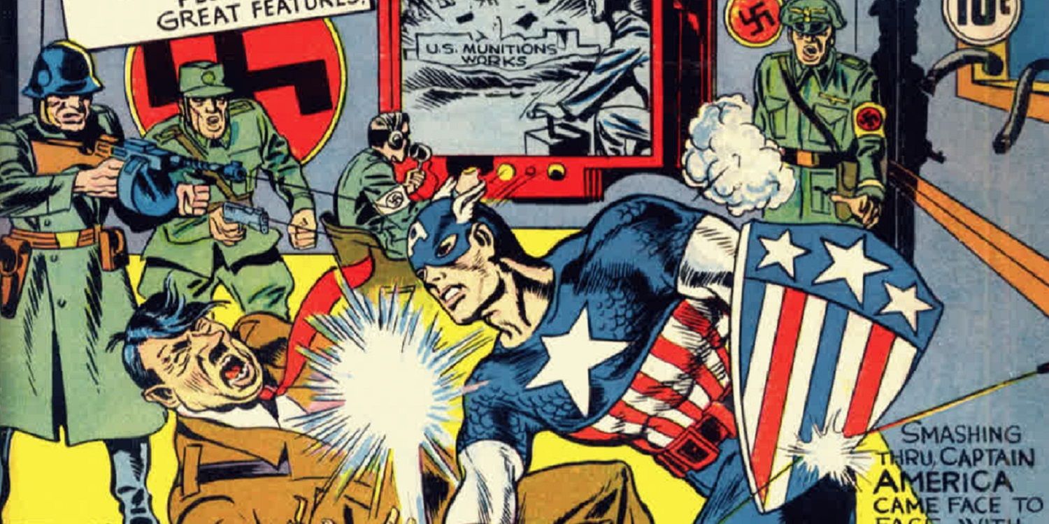
While the first Marvel Comics logo appeared in 1957, the company itself has a long history that dates all the way back to 1939 when they were called Timely Comics. Run by publisher Martin Goodman (who hired his cousin Stanley Martin Lieber as an assistant. The Timely Comics logo was a red-white-and-blue shield in the shape of European medieval “heater shields.” The design was actually almost identical to Captain America’s original shield in Captain America Comics, one of Timely’s big sellers.
Eventually, Timely Comics changed its name to Atlas Comics in the 1950s and switched its logo to a globe. By 1957, Stanley Martin Lieber was writing several comics under the pen name “Stan Lee” when the company began using its “Marvel Comics” logo – basically just a black circle on a red background with “Marvel Comics” name in white. The company hadn’t officially changed its name yet – but fans began to refer to the comics as “Marvel Comics” anyway. The early 1960s showed another version of the logo – basically just the letters “MC” printed above one another. It was very forgettable and didn’t carry the distinctive look of Marvel’s competitor “DC Comics.”
By 1963, however, the Marvel Age of comics had begun as Stan Lee, Jack Kirby, Steve Ditko, and other greats began introducing The Fantastic Four, The Incredible Hulk, The Amazing Spider-Man, and other classic comic books. The logo reflected this as it now read, “Marvel Comics Group” beneath the corner box on the covers. Surprisingly, however, the logo didn’t really go through many distinctive changes for a while. The words, “Marvel Comics Group” or just “Marvel” acquired different fonts and sizes through the 1970s and 1980s but basically looked the same.
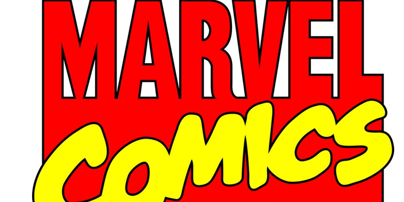
The early 1990s finally saw the Marvel Comics logo gain a stylized look as the word “Marvel” was now printed over a giant “M” while “Comics” was emblazoned across the “M” in a playful, round font. The logo continued to identify Marvel’s comic books and other merchandise well into the early 21st century.
When Marvel introduced its “Ultimate Marvel” imprint in the early 2000s, however, they gave it a new logo – basically the word “Marvel” in white within a red box. The look proved so popular it was adopted for Marvel’s other books – and eventually became the basis for the logo used in some of Marvel’s early movies – eventually evolving into the “flip book” logo of modern MCU movies. It may have taken a while, but the Marvel Comics logo has since transformed into one of the most popular entertainment logos out there – showing the importance of showcasing a brand name in the most distinctive way possible.


