The Marvel Cinematic Universe continues its expansion not only on the big screen but also in the world of streaming, with a number of TV shows coming to Disney+ in the near future. The first batch of Marvel shows will be The Falcon and the Winter Soldier, WandaVision, and Loki. The latter continues to be a mystery, although Disney has already revealed the logo for the show – which has already changed twice. Is there a reason or meaning behind Loki having three different logos?
The upcoming Marvel shows on Disney+ will be an active part of the MCU, unlike Netflix’s shows which even though they were set within the MCU, never really linked to the films. So far, the only ones confirmed to directly tie into one of the films coming in the near future are WandaVision and Loki, which will connect with Doctor Strange in the Multiverse of Madness. In typical Marvel fashion, the studio is keeping plot details of its series a secret, although the recent Disney+ Super Bowl ad dropped a couple of hints – including a first look at Tom Hiddleston in full Loki mode once again and a new look at the logo of his solo series.
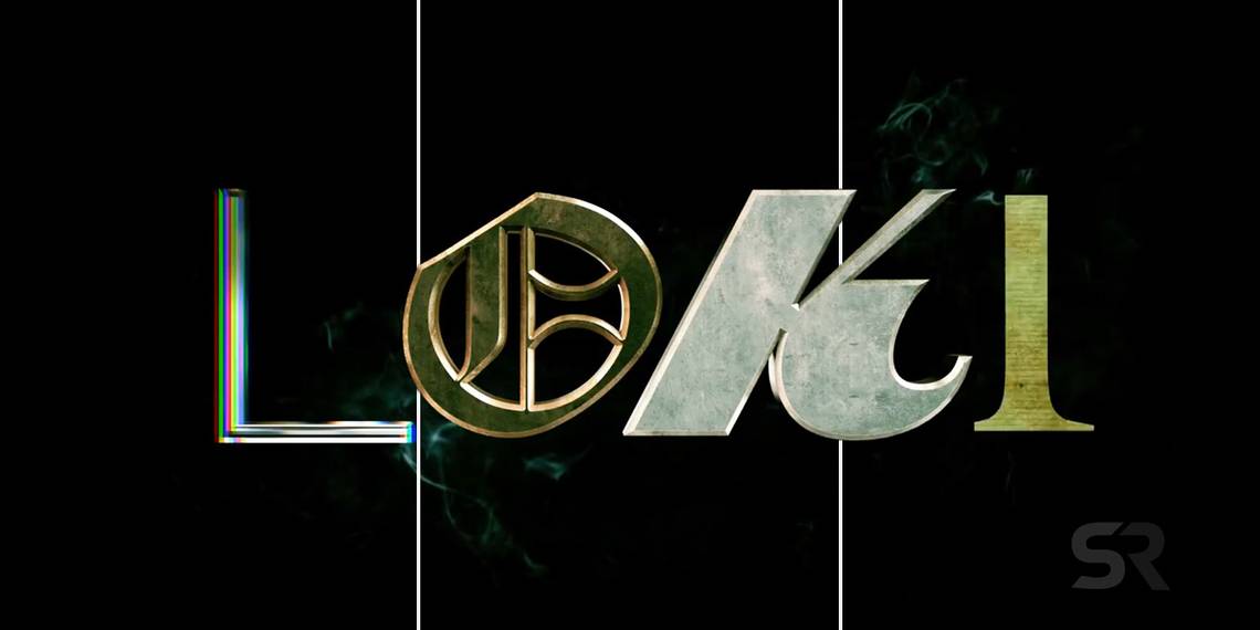
Loki’s official logo had already been revealed during Marvel’s panel at San Diego Comic-Con 2019, but the Super Bowl ad featured two more versions of it – and the letters still don’t match.
What Loki’s Different Logos Really Mean

The first Loki logo made way for a bunch of jokes and memes among Marvel fans as each letter has a different font, but it’s not because Disney’s graphic designers don’t know what they’re doing. Loki has been confirmed to include time-travel, and the different fonts are most likely a reference to the many time settings the God of Mischief could be visiting. The logo changes very quickly in the Super Bowl ad before it ends as the original one, so they are very easy to miss.
Once more, the letters don’t match, and they also look to be from different eras – for example, the “i” in one of them is made of orange neon lights, giving a 1970s vibe, and the same letter in the next logo is made of paper, with a vintage look. But aside from hinting at Loki’s adventures through time, the changing logos are a nod to the character’s shape-shifting abilities, which fans will surely see more of in the series. Producer Stephen Broussard has said that the series will have a “man on the run quality”, and with Loki seen wearing a prison uniform with the letters TVA (Time Variance Authority), taking different forms might be key to his escape and survival in different time settings and dimensions as well.
The logos might look weird to some, but it’s all part of the chaotic essence of the character, and in the end, they are the only clues there are so far about the series. Given that the God of Mischief in Loki is that from 2012, it wouldn’t be surprising if he went as far as to take unexpected forms and jump between dimensions – even if that can have some potentially dangerous consequences.