What upcoming James Bond movie No Time to Die would look like if it was made in the Roger Moore era can now be seen in a new fan art poster. With the 25th installment of the beloved James Bond franchise on its way, fans are always up for a little 007-related nostalgia.
Each new era of Bond has been a gamble of sorts for Eon, the production company behind the famed spy series. Choosing the right James Bond actor to embody the type of person that the British super agent has come to represent is certainly no easy task. Much of this has to do with the fact that what fans want to see in a 007 character changes, but also remains staunchly traditional in some respects. In fact, it seems that once Sean Connery vacated the original Bond role, every single Bond that came afterward has had not only a huge share of supporters but also a huge share of detractors. Things were certainly no different back in 2005, when Daniel Craig was revealed to be the next Bond. The fact that he had blonde hair infuriated some fans, yet today, Craig is widely regarded by many as one of the greatest Bonds of all time. This sense of fan ownership over who could or couldn’t be Bond shows no signs of slowing down once Craig steps down from the role, either.
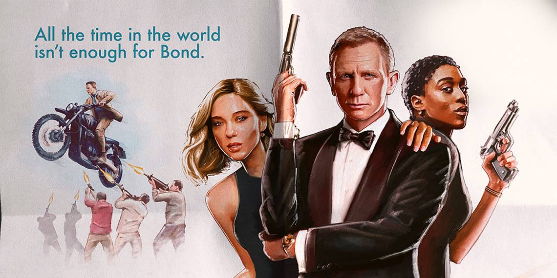
For now, at least, Craig will be back in what is likely his final appearance as 007 in the upcoming No Time to Die. And while the film has had more than its share of setbacks, delays and is most recently a victim of the ongoing issues involving the Coronavirus, fans simply aren’t going to stop focusing on Bond. There may be a seven-month setback for No Time to Die, but that doesn’t mean that other aspects of the franchise can’t be explored. In this case, Bond fan Thrice Champion has done an excellent job via their Twitter account of imagining just what a No Time to Die poster could look like had the film been released in the Roger Moore, 1980s era:
Thrice Champion’s work really nails the look of the sort of posters that Eon was using at the time to promote their Bond films. Everything down to the action scenes and (now woefully out of date) imagery of Bond girls clinging to the fearless spy are all intact here, and none of it would have been the least bit out of place in the 1980s. Although the poster wouldn’t be used today to promote a Bond film, this bit of fan art has the ability to launch Bond fans into a nostalgic stupor, possibly even prompting questions of why modern 007 posters can’t recapture a bit of this. Indeed, any Bond fan who takes the time to search through the numerous Bond posters archived online will see a huge difference in the way the series was once promoted. This, of course, is largely due to Bond’s continual evolution as a character and a film franchise, but it’s still hard to ignore how downright cool some of those older posters are.
With No Time to Die having been bumped ahead by seven months to November, fans now have even more time to form theories and opinions of what lies ahead for the fearless agent. This is a great way to pass the time, but as this recent bit of fan art proves, a little dip into the past and some carefully considered work can go a long way to celebrate what the Bond franchise was and the stylistic legacy it continues to hold decades later.
Source: Thrice Champion
