It's no secret that movie posters are generally getting worse. Gone are the days of iconic designs and instantly recognizable images. In their place are often lazily Photoshopped posters that all seem to ape each other into becoming as generic as possible. Is it any wonder why the specially designed artful Mondo posters sell out so quickly? It's because people want something worth hanging on a wall, not the uninspired terrible photo montages we seem to be stuck with. So when we say that DVD/Blu-ray covers are frequently even worse, please understand the gravity of the statement.
You would think that studios would be putting every effort into making their shiny discs look as attractive as possible to potential customers, especially in an age where physical media is on the decline and film fans may be considering going fully digital and getting rid of their collections. People often judge by covers, and releasing Superhero Blockbuster #782 with a lazy, poorly done art seems counter-intuitive. In any case, sometimes the results are so bad and the errors are so odd, they're worthy of special recognition. With the intent to name and shame some of the worst examples of covers that slipped through quality assurance, here are the 15 DVD Box Art Mistakes You Can't Unsee.
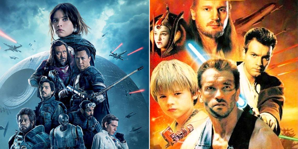
15. Rogue One

The Rogue One Blu-ray actually has a pretty decent cover, all things considered. While the cast are a little too airbrushed, it's a solid design featuring all the Star Wars hallmarks like X-Wings, TIE Fighters, and the omnipresent Death Star.
However, some diehard fans noticed something peculiar about the art. If you look closely at the space battle in the background, it appears that both the X-Wings and the TIE Fighters are shooting red lasers. As the TIEs in the original trilogy shot green, some fans were left confused. You could argue that the angles of the shots imply that the TIEs are being shot at, rather than shooting, but if that's the case, why are none of them shooting back? The trouble is that once you notice it and know it's a “thing”, you'll never be able to not see it. Granted, you probably have more important things to worry about than the color of some fictional space lasers, but the point stands.
14. They Live

John Carpenter's They Live features pro-wrestler “Rowdy” Roddy Piper as the movie's hero, John Nada, in perhaps his best role outside of the squared circle (it's a toss-up between Nada and It's Always Sunny's Da Maniac). He kicked a lot of ass, chewed a lot of bubblegum and poked a lot of people in the eye. It's a true shame he's no longer with us.
If typos and misspellings annoy you, spare a thought for UK audiences. When They Live was originally released on Region 2, the box blurb credited one “Rowdy Roddy Powder”, which while fun to say, obviously isn't quite right. Aside from a few minor punctuation errors, the rest of the blurb is fine, even spelling Piper's name correctly on the credits and special features. Luckily, the movie has been released and rereleased about 7 billion times since then, and the unfortunate misnomer was corrected on subsequent versions.
13. Groundhog Day

In case you were unaware, Groundhog Day is a seminal comedy movie about a cantankerous weatherman who gets stuck re-living the same day over and over again. It stars the always-awesome Bill Murray. Not that you'd be able to tell that from the cover of the 15th Anniversary Collector's Edition, where it appears Andie MacDowell is co-starring with a third-rate Bill Murray waxwork from a cursed carnival sideshow.
Apart from his hand and arm placement making little physical sense, the worst thing about the cover is his expression. It's a comedy, guys. Andie MacDowell gets it, going for a coy smirk, but Waxwork Bill has the deadest face possible. It gets creepier the more you look at it, especially when his haunting visage is coupled with his emotionless indication of a clock with a trapped mini-Murray inside, like he's the Grim Reaper informing us that our time has run out. Brr.
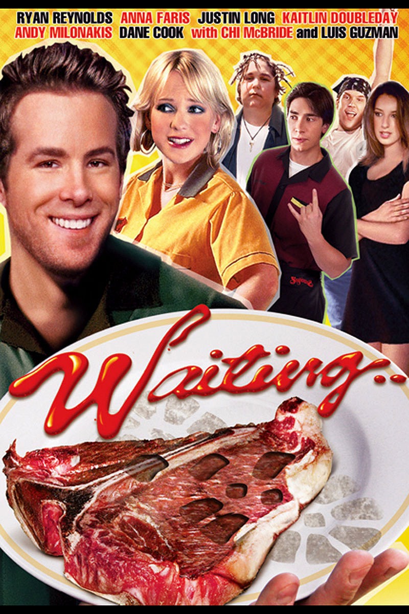
12. Waiting...

Full version here
The 2005 comedy Waiting... starring Ryan Reynolds, Anna Faris, and Justin Long, didn't get the best reviews when it came out, but judging by the 75% audience score on Rotten Tomatoes, it has its fans. The poster campaign was actually pretty creative, depicting all sorts of gross food and summing up the apathy of the movie's serving staff. It's a shame that creativity didn't extend to the DVD cover.
If you look at the full version (linked above), can someone tell us whether the baby-faced Ryan Reynolds is meant to be holding the plate or not? It certainly seems like that's what it's meant to be, but the perspective is all off. It's an eyesore of a design anyway, but the mystery waiter's hand becomes one of those things that's hard to ignore. Also, were those really the best photos you had of the rest of the cast? The lighting's all over the place, and nobody can agree on a direction to look. Let's not even get started on the direct-to-DVD sequel Still Waiting... which is arguably even worse.
11. The Longest Yard (1974)

Whilst most people reading this will be more familiar with the Adam Sandler remake, Burt Reynolds (sans signature mustache) starred in the original version of this football comedy/action movie. If we look at the so-called “Lockdown Edition” of the movie, you can at least tell it's Burt Reynolds, despite the airbrushing doing its best to make him seem unnaturally smooth.
Here's the thing though - his hands gripping the ball really don't look right. They don't seem to line-up properly with the rest of him, and it makes it look like the ball is being held by two off-screen football players. The designers may have been in a tight spot though. Have you seen the theatrical poster for The Longest Yard? Modern society just can't handle that level of '70s shirtless machismo these days, and it makes sense that they may have found themselves in a bind when it came to home media. Also, the campaign to start referring to current actors as “virile” and “that fire” begins now.
10. Live and Let Die

With a film series like the James Bond movies, there's a certain legacy that comes into play. The franchise has been going strong for 50 years, and that's a lot of cinematic history. Some of the Bond theatrical posters have become iconic in their own right. So quite why the 2015 series-wide rereleases featured the most uninspired art imaginable, with stills from the film fighting for space with a huge white banner with the movie's title, is anybody's guess. The covers range from mediocre to plain bad, but the worst is almost certainly the art for Live and Let Die.
Roger Moore looks like a Ken Doll. He's been digitally smoothed to an absurd degree, and his signature eyebrows appear to be stolen from a cheap Halloween disguise kit. The more you look at his face, the more “off” things seem. The cover may be one of the most ridiculous things about the entire package, and in a movie where the villain is literally inflated like a balloon and exploded, that's really saying something.
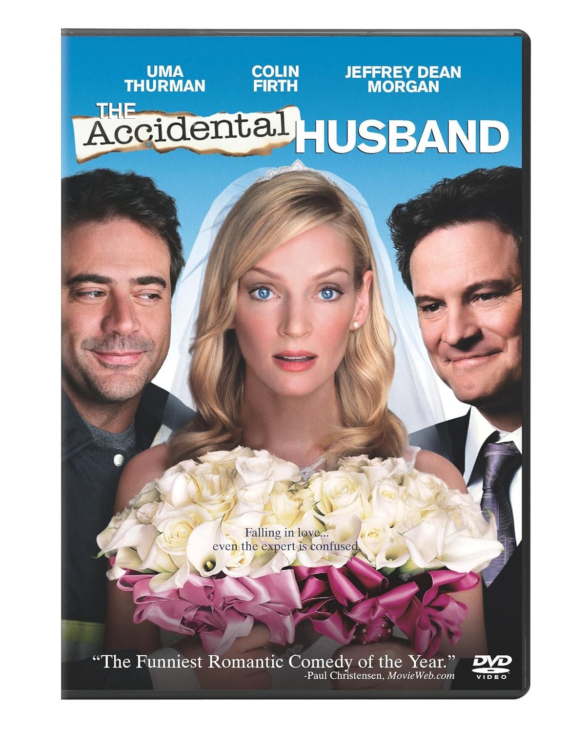
9. The Accidental Husband

Full version here
If we're talking about absolute Photoshop car wrecks, then we're going to have to discuss the dull romcom The Accidental Husband, starring Uma Thurman, Jeffrey Dean Morgan, and Colin Firth. The movie currently rocks a mighty 6% on Rotten Tomatoes, but the film's problems don't stop there. The poster campaign was all kinds of awful, with various different flavors of digitally manipulated garbage that have to be seen to be believed.
However, they arguably saved the best for the DVD cover. The vacant expression on the UmaBot 5000's face dips into the uncanny valley, but that's not our biggest problem with it. Is it us or does Colin Firth seem like he's a lower resolution than everyone else? Also, what is he looking at? Cast your eyes downwards and we have a pair of creepy disembodied arms/hands to cap it all off, holding flowers under the nose of an understandably confused leading lady. The whole cover is one big design mistake, and it comfortably earns its place on this list.
8. The Full Monty

If you haven't seen the cheeky British comedy The Full Monty, it's about a bunch of unemployed steel workers of various ages and physiques who decide to become male strippers to make ends meet. It's no Magic Mike, let's put it that way. It's a sweet and genuinely charming movie that is pretty much guaranteed to put a smile on your face. However, that smile may drop once you see the insane mess that is the movie's Blu-ray cover.
What happened here? The actors' heads have clearly been sourced from various places and haphazardly pasted on top of some stand-in bodies. Robert Baratheon (aka actor Mark Addy) has apparently incurred the wrath of the airbrush more than anybody else, but nobody walks away clean from this one. Plus, it looks like the left side of Robert Carlyle's body has deflated slightly. It's a slapdash job that manages to undersell a film that deserves better.
7. The Whole Ten Yards

Full version here
There's a strong case to be made for dud comedy sequel The Whole Ten Yards being a mistake from the ground up. The movie bombed at the box-office and was nearly universally panned by critics. The movie currently has an eye-watering 4% on Rotten Tomatoes, and it's perhaps because of this that not much effort went into the DVD cover.
Let's start with Bruce Willis and his unnervingly smooth face and creepy expression. While you're still confused from that, see if you can figure out what Matthew Perry's looking at. Whatever it is, maybe he should be more concerned with Kevin Pollak, who's crawled up and placed his Gollum-like hands on the two stars' shoulders to peek his tiny head through the middle. The perspective. The faces. The heights. They're all wrong. It's the Where's Waldo? of Photoshop ineptitude. But you notice something new each time you look at it, so that's sort of fun, right?
6. Hit by Lightning

Unless you're a die-hard Jon Cryer fan (a Cry-hard?), you've probably never heard of the 2014 black comedy movie Hit by Lightning. However, once you've seen the box art, you'll never forget it. Let's get the obvious out of the way. Why has Stephanie Szostak been left in a crumpled heap? Human necks aren't meant to bend like that. More to the point, why is she so damn happy about it?
Then there's Jon Cryer himself. He's either had his face pasted on the body of a thirteen year old boy, or he's been airbrushed to merely look like one from the neck down. Poor Will Sasso gets the worst of a bad deal, as he's apparently two-dimensional. Not only that, but he appears to be going through some kind of digestive distress. That'd certainly account for Cryer's deer-in-the-headlights expression. If that is the case, we imagine that Steph Szostak wouldn't be smiling for long.
5. Various bootleg DVDs

We couldn't do one of these lists without a mention of some of the hilarious mistranslated bootleg DVDs that have flooded the internet. But they're all so wonderfully terrible, we couldn't pick just one, so you get the monstrosity of a collage seen above. (Not featured: the incredible “Loin King II: Simba's Pride”? Not only does it have a legendary typo in the title, but the blurb has somehow included a user review that states that it's “not as good as the first one, but OK”. If only real DVD boxes contained such honesty.)
Then there's the above cover for “Star Wars: Science Fiction Perform Distinctive”, that for no discernible reason has brought Arnold Schwarzenegger into the mix. Many would argue that adding Predator-era Arnie would improve the prequels considerably, but alas - it was not to be. This Matrix Reloaded bootleg has an amazing tagline mix-up giving the sci-fi sequel a whole new twist: “The white men wanted a stud to breed slaves” (actually the tagline for 1976's Drum, fact fans!) Perhaps our favorite is “The Incredible King Hulk” which is apparently a Hulk/King Kong crossover. Is this the logical endpoint for Marvel and Universal's cinematic universes? Only time will tell.
4. Love in the Buff

Admit it. That's not how you first read that title. The sequel to Chinese romcom Love in a Puff, Love in the Buff garnered more critical praise than its predecessor and earned Miriam Yeung the award for Best Actress at the prestigious Hong Kong Film Awards.
It's a well-reviewed movie, so why pick a font that makes it look like the movie's name is “Love in the Butt”? We refuse to believe that there was nobody in the office that picked up on this crazy oversight and considered the unintentional meaning of the whole thing. Someone at Amazon Video was certainly paying attention. In their thumbnail for the movie, the word “buff” is written as clear as day and almost dominates the art entirely. It's hilarious to imagine that there may have been several people out there who sat down to watch a subtitled Chinese romantic comedy instead of their intended night's entertainment.
3. Bangkok Dangerous

Full version here
Nicolas Cage movie Bangkok Dangerous has a legendarily awful poster that was widely (and justifiably) mocked upon release. It's jam packed full of such obvious, glaring errors that anyone with a functional pair of eyeballs should be able to spot in nanoseconds. For starters, Nic's left arm seems to be reaching inside his own body, and it bends in a way that elbows certainly don't allow for.
Then there's the matter of his right arm and hand, which seems to be holding an invisible gun. It's honestly baffling how this was the final design they chose to market their movie. Surely they fixed it on DVD though, right? Nope, they've just colored him in, moved the title up to cover most of the offending gunless hand, and added some bullet holes and shell casings at the bottom. Outstanding work there guys, it really distracts from the noodle-y armed monstrosity above.
2. The Trust

Sorry Nic, we're not doing this on purpose, we swear. Anyway, although Nicholas Cage does star in The Trust, we're mostly here to talk about Elijah Wood. More specifically, Elijah Wood's second thumb on the movie poster and DVD cover. If you look at Elijah's hand, you can see that his left thumb appears to be resting behind the pistol, however, there's also what appears to be another thumb sticking up from his fist. Even worse, the original thumb seems to have only partially been Photoshopped out, leaving a mysterious stump behind.
If you look at the actual still from the movie, it makes sense. They've pasted one entirely different set of hands over the first and forgot to fully disguise the existing thumb. Once you see both thumbs on Wood's one hand, that's all you'll ever be able to see on this cover, despite some hefty competition from Nic Cage's dubious hair and Ron Swanson-esque mustache.
1. Moon 44

Full version here
Before he became famous for blowing up national landmarks, Roland Emmerich directed the 1990s sci-fi action movie Moon 44. When it came time to design and write the box art for the little-seen movie's DVD release, it was clearly the editor's day off -- and he took the office's only computer with a spellchecker with him.
The blurb at the back is riddled with errors. Alongside random capitalizations, run-on sentences, and odd punctuation, the back refers to the Global Mining “Coporation”, which doesn't exactly inspire confidence. However, the mistakes on the front cover take some beating. Firstly, Independence Day and 10,000 BC are spelled incorrectly. Secondly, Emmerich was the director on all three mentioned films, isn't that more impressive than simply being a producer? Here's the kicker, though: he was only a producer on 10,000 BC and served as executive producer on the other two. The only thing it gets right is "Godzilla". It's a shame the same can't be said about Emmerich himself.
--
Do you know of any other unforgettable DVD cover mistakes? Let us know in the comments!