Never underestimate the power of good title cards, as these can prove to be the difference between watching and skipping a movie. Blockbuster films have started taking great lengths at creating awesome titles for this purpose, and this trend has continued as the industry has evolved, with the DC Extended Universe also featuring creative title cards.
However, the series hasn’t quite managed to be perfect in this regard yet, and you’ll find a few of them missed the mark. The best turned out to be so good, though, that you might want to go back and watch these films just by seeing the title cards once again. Here are all of the DCEU ones we’ve had so far, ranked.
Batman V Superman: Dawn Of Justice (2016)
Like the case was with the film itself, its title card didn’t have a clue what to make of the tone of the movie. While it had a dark font and background, a subtle hue can be seen right by the middle to indicate a ray of hope, which is meant to represent Superman.
This half-and-half style didn’t do the film justice (pardon the pun), as there was a clear lack of identity behind it. Based on this title card, we don’t see how anyone would’ve been hyped up to see the film.
The Suicide Squad (2021)
The follow-up film to the one that promised so much and delivered so little hasn’t exactly set the interest alight. However, we can see what the intention is here, with The Suicide Squad's title card having a clear trace of bullet holes across the font.
This confirms the film will have a lot of gun-slinging and hijinks as its main theme, and yet we just can’t escape that rather bland feeling that evokes from this title. There’s a lack of vibrancy that should’ve been there, considering the director and the cast.
Wonder Woman 1984 (2020)
With a setting that is modern by the standards of the characters in-universe, and just outside contemporary history for the audiences, Wonder Woman 1984’s title card does the trick by going haywire onscreen.
The downside, though, is that it fails to inspire. The title lacks that oomph factor to make it pop out, or at least have that added flavor that would make one excited for the film’s release. For the most part, it looks like a puzzle that’s waiting to be solved but doesn’t have the desired pay-off.
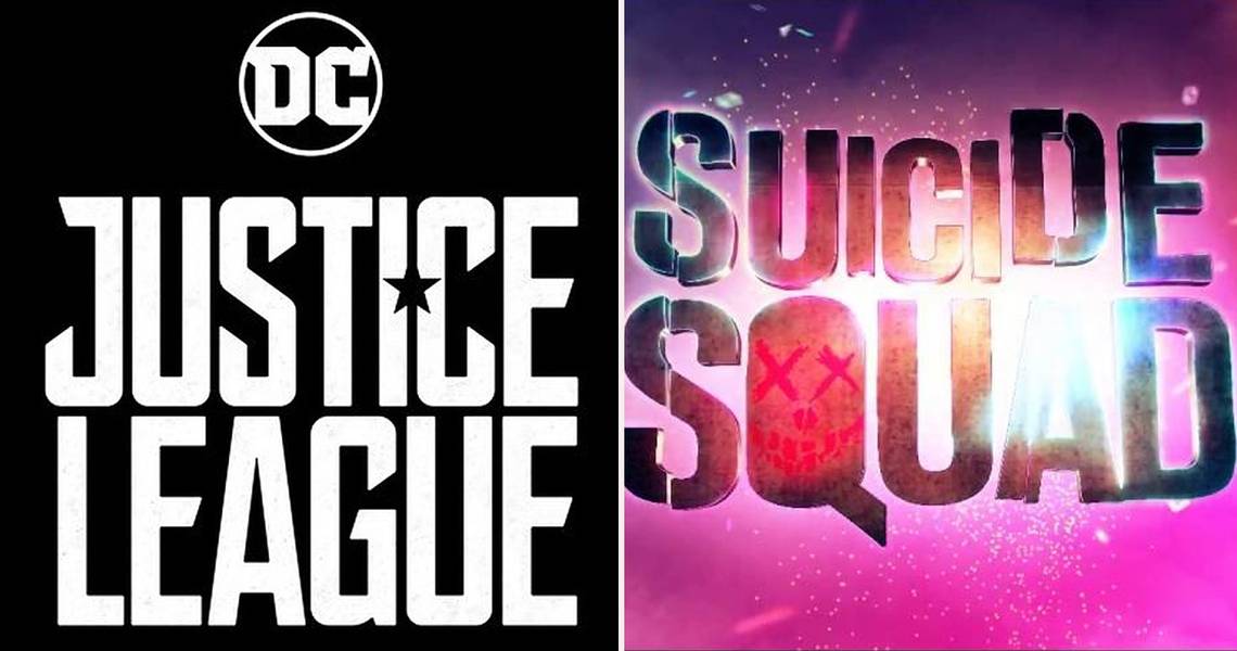
Justice League (2017)
On its own, Justice League’s title card isn’t half bad, and it has an edgy feel to it that reminds us that the heroes don’t gel well together. Still, it doesn’t reach the lofty standards that the DC Animated Universe version of the series had in its title.
This one gives off the feeling that we’re looking at street graffiti; which isn’t a bad idea, just not as grand as one might expect given that the film featured all of DC’s greatest heroes.
Aquaman (2018)
Sometimes going simple is the best course to take, and Aquaman’s non-complex title card does the trick to illustrate the film’s setting. With the character’s logo overlooking the title, and the background surrounded in deep ocean, this card was all about Atlantis.
It works very well at this, seeing as the film’s drawing strength also had to do with Atlantis being seen in full. A little bit of extra effort could have been done, however, namely with the title words which would’ve done better with some sheen or gloss added to them.
Man Of Steel (2013)
The genius here is how the title card makes sure you remember this is a Superman film as the Man of Steel words are flanked by the superhero’s logo. With the film meant to focus on what made Superman the inherently good person he was, this was a step to kill two birds with one stone.
The font - which was borrowed for Dawn of Justice as well - might be more murky than one would enjoy, but went with the theme of self-realization and the destruction seen at the end. However, with the Superman logo in view, the audience had the sense of comfort that this movie had hope attached with it.
Wonder Woman (2017)
Doing a better job than Man of Steel of portraying its protagonist’s inner and outer strength, Wonder Woman’s title card carried a firmer coloring scheme that evoked a sense of empowerment. The larger symbol of the hero looming from behind is what did the trick.
Not messing around much with the title words, these were kept in the center of the massive logo to ensure that audiences understood which character was steering the ship here, along with throwing a cloud of smoke in the background for good measure. As with some other title cards, we’d have still liked to have had some eye popping colors to truly capture the character’s spirit.
Birds Of Prey (2020)
Personalizing a title card is what brings a sense of relatability to the characters involved, and Birds of Prey did an excellent job in having Harvey Quinn-styled font in full view. Not only did the extremely large title convey the craziness of Harley, the core words also had character traits injected.
You’ll find Harley’s trademark bat, Huntress’s bow, and a host of other weapons on the title card to convey the badass quality of the heroes in the film. Plus, we get that vibrancy we’ve been talking about this whole time in this film’s title card, going perfectly with Harley’s crazed mentality.
Shazam! (2019)
When you can practically hear a title card just by looking at it, you know it’s a truly awesome one. Shazam! was one such movie that had a lot of flashy moments in a juvenile setting that appealed to youths, and this card has that sense of fun attached to it.
With the background blazing with lightning, and the title itself ablaze with Shazam’s signature thunder, the font is what completed the look, carrying a larger-than-life feel that feels like a punch to the eyes. You just know you’re in for a breezy film with no drama through this card.
Suicide Squad (2016)
The movie might have been far from the DCEU’s best effort, but Suicide Squad was a success when it came to creating hype simply through its presentation. The title card alone perhaps deserves an award for originality, being able to convey something about each character in the film.
With colors dazzling from every direction, and a thrilling but dangerous theme erupting, the Suicide Squad title card had everything from guns to explosives, and even swords on display. It’s creativity of this kind that can make people get hyped even for a movie they don’t know what to expect from, and might also be enticed into watching again purely for the appeal the title offers.