A single movie will undergo hundreds of changes before it makes its way to the screen. Ideas are constantly evolving, especially when they’re multi-million dollar projects that are the result of collaboration between over a hundred— sometimes over a thousand— people.
If something becomes too unrealistic or impractical to film and it can be replaced during the writing or design process, sometimes things have to be rushed and replaced immediately prior to or even during shooting.
Comic book movies see these problems more than almost any other type of film, as there’s not only an intense visual design process, but also a pressure to live up to the expectations of millions of fans. Concept art is a key example of this.
The concept art stage is basically the transition point from a comic book to a live-action representation. The comics themselves go through the same artistic process, but for a movie it’s all done with the goal of bringing these worlds and characters to life in a real and satisfying way.
Sometimes what winds up on the screen is the best possible version. Other times, however, some of the designs that didn’t make it to the screen turn out to be the better versions. That’s the case with these designs from DC adaptations.
For the purposes of this list, we’re only including adaptations of the main DC Universe, so no offshoots such as Vertigo adaptations will be taken into account.
With that said, here are the 15 DC Concept Art Designs Better Than What We Got.
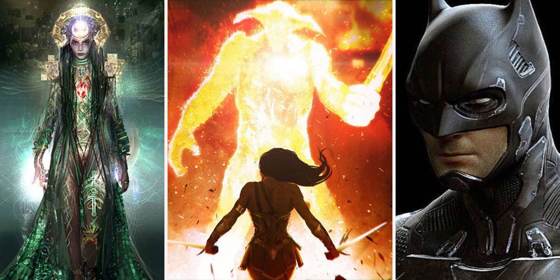
15. The Batsuit (Batman v Superman: Dawn of Justice)

While the suit that wound up in the finished film definitely suited the purposes of the movie, given that it looks almost exactly like the suit from The Dark Knight Returns, this suit strikes a happy medium between functionality and comic book accuracy.
This bears definite similarities to the Dark Knight suit while keeping the basic colors of the comic book version intact. It’s also a design similar to the Arkham games. Additionally, fans might have been delighted to get the chance to finally see Batman’s white eyes from the comics depicted on film.
Some fans complained about the bat symbol being too large in the movie, so seeing the beloved logo from the Dark Knight trilogy might have made people happy, though it also might have been one similarity too many to the previous incarnation of the character.
14. Ares (Wonder Woman)

While Ares looks very similar to his comic book counterpart during his final battle with Diana in Wonder Woman, David Thewlis is such a small and unintimidating actor that it almost doesn’t work to show him underneath all that armor. This is one instance where accuracy could have stepped aside to allow for something a little more dynamic.
However, this concept for Ares absolutely would have done that. Here, Wonder Woman actually looks like she’s battling a god. This Ares screams of strength and power as he is literally a giant being made of fire. Yes, it would have meant another big CGI villain in the third act of a DC movie, but in this case it definitely feels like it would have worked.
This Ares still conveys the essence of the character. The armor, the shape of the horns, all of it is still there. However, he’s reimagined as a thing of pure light and energy, which could have been dazzling on the screen if properly brought to life.
13. Doomsday (Batman v Superman: Dawn of Justice)

It’s no secret that fans weren’t overly impressed with the final design of Doomsday in Batman v Superman. Many pointed out that he looked much more like a Cave Troll from The Lord of the Rings than his comic book counterpart. Even if he evolved to look closer to the original version by the end of the fight, it wasn’t enough for some people.
This design for Doomsday looks much more in keeping with his comic book roots, while also having a nice sort of Nordic, Frost Giant vibe at the same time. It is, at the very least, immediately recognizable as Doomsday to people familiar with the character. That is something that it has that over the version seen in the finished film.
12. The Flash (Justice League)

This design appears to be very similar to what fans will be seeing in Justice League this weekend, but there are just one or two areas in which it looks a little better. The version of Flash in the movie has a few darker patches of gray or black material that seem to unintentionally distract the eye. The version shown in this concept art is red and gold throughout, just like the comic book counterpart.
These are very small changes, but they make a world of difference. This concept clearly shows the homemade elements of Flash’s suit without sacrificing a cool and streamlined design.
Those darker patches on the movie’s suit definitely convey an unfinished quality that seems intentional, but the concept art proves that that could just as easily been conveyed by a darker shade of red.
11. Batgirl (Batman and Robin)

Batgirl was one of many characters in Batman and Robin that fans had been waiting for ages to see on the big screen and, like all the others, they completely dropped the ball. Not only is Barbara’s origin completely changed, her design has very little in common with her comic book counterpart.
This concept art for Batgirl fixes some of those major issues right off the bat, so to speak. Here, Barbara has a cowl, which is much better than the bat-shaped eye mask she wears for most of the movie.
She also appears to have a colored symbol on her chest, like the comics, which seems like a minor detail, but an important one unless that’s actually supposed to be a cleavage window. In a movie that’s so bright and colorful, it’s a little bizarre that the bat suits are largely lacking in color themselves. This would have been a touch of comic accuracy that would also have gelled with the movie’s sensibilities.
10. The Joker (Suicide Squad)

One of the most interesting things about all of concept art for Suicide Squad is seeing that Joker was initially meant to play a much larger role in the movie. These designs show him alongside the Squad during the final fight against Enchantress, as well as sitting in the Batmobile and squaring off against Batman. That one’s especially noteworthy as Joker and Batman don’t even share a scene together in the film.
Just looking at the design elements, though, this Joker would have been very different and ultimately much better. This looks much more like the Joker of the comics. Shown here, Joker is a tall and slender figure in a dark purple suit, his most iconic outfit, yet the design smartly doesn’t step on the toes of any major design elements of The Dark Knight.
Simply put, this actually looks like The Joker, which is already something that it has over the version showcased in the finished movie.
9. Parallax (Green Lantern)

Even though the movie had its flaws in general, the design of Parallax in 2011’s Green Lantern was especially disappointing. The film’s major villain was a yellow cloud with a giant face at the center. It didn’t even look particularly powerful or frightening.
This unused concept art, however, is absolutely terrifying. This version of Parallax is still more or less a yellow cloud, but it’s smartly interpreted as a cosmic entity. There’s something Lovecraftian about it. Instead of a giant Guardian, this cloud looks like it contains The Thing.
It’s almost spider-like, too, which works for the purposes of making the villain unnerving, but also bears a nice similarity to the work of Stephen King, as there’s something about this that brings to mind the true form of It. No doubt this was scrapped because it simply would’ve been too scary for younger viewers.
8. Bane (The Dark Knight Rises)

Reactions to Bane’s look in The Dark Knight Rises were mixed. Some were not pleased that he wound up bearing so few similarities to the comic book version, while others embraced the change.
Simply showing a mask that only covers his mouth is a far cry from the luchador mask of the comics. Although, to be fair, that had already proven to not translate to the screen so well in 1997’s Batman and Robin.
Still, seeing Bane without any kind of mask similar to the comics proved to be pretty jarring. This design isn’t perfect, but it’s a step in the right direction, and would have worked well if used sparingly throughout a few different scenes. It also bears a kind of classic executioner look that would have fit Bane’s presence in the film fairly well.
7. Enchantress (Suicide Squad)

People were decidedly unhappy with Enchantress’s overall look in Suicide Squad, especially toward the end of the movie, during the final fight against the group. For a character that was supposed to come across as a dynamic, powerful threat she lacked any kind of real visual punch. These designs would have definitely changed that.
While there are differences between the three different looks shown here, each of them would have been great to see. Each gives off a sense of raw power that Enchantress seemed to lack in the movie.
Each one of them would also have been a colorful addition to a pretty dour-looking film. There would be something interesting about all of these visually dark characters facing off against a being that literally emanates light.
6. Two-Face (The Dark Knight)

It’s hard to tell from the design shown here, but this and many of the concept art designs for Two-Face in The Dark Knight were sort of pinkish in tone. From the drawing, its clear that this isn’t as charred as the look that made it into the finished movie.
It’s still skull-like and ghoulish, but this look for Two-Face would have been almost identical to how Two-Face looked in Batman: The Long Halloween. That would have been perfect, too, as that’s the book that served as the primary inspiration for the movie.
Having a slightly healed-over Two-Face would have, in some ways, been even more unsettling to look at and would have in some ways made the finale more shocking, as Two-Face at the end of Dark Knight already looks like he’s dying even before he actually drops.
5. Superman (Man of Steel)

The only problem with Man of Steel’s Superman design is that the colors are a little too muted. Other than that, it actually looked pretty good, even if it could have used a bit of red around the belt area. But this design just has something about it that would have been fantastic to see on the screen.
This look feels truly powerful. It’s literally bursting with energy and the glowing symbol on the chest would have made for an amazing visual. It would have been especially great to see it debut in the third act, but it’s understandable to think that this could have turned out less spectacular than the design.
A suit requiring that much CGI could easily have turned out like Green Lantern. It also would have looked pretty intimidating, which would have been great for the fight against Zod, but less great if this Superman is supposed to be a symbol of hope.
4. Gotham City (Batman v Superman: Dawn of Justice)

Batman v Superman doesn’t spend a lot of time on establishing a particular look or feel for Gotham. There are glimpses of its seedier places, warehouses and waterfronts and the like, but nothing that really makes it stand out as other versions of the city have before it. This art, though, projects a look for the city that definitely harkens back to the very stylized look and feel of Tim Burton’s Gotham.
This city has a moody, gothic atmosphere. It looks like a city that needs to be saved, someplace that is succumbing to crime and therefore needs Batman’s more drastic measures to keep it from crumbling.
Gotham and Metropolis need to be cities that are at odds with each other, visually and thematically. That’s especially true for a movie that decides to make the two cities neighbor each other. They need to stand out on their own and this version of Gotham would have easily helped to do that.
3. The Green Lantern Suit (Green Lantern)

It’s no secret that people hated the way Hal Jordan looked in the 2011 Green Lantern movie. It was a disaster. Just because a suit is brought to life by harnessing energy does not mean that a superhero’s costume needs to be fully animated 100% of the time.
There was no part of the suit that wasn’t CGI and it wasn’t even terrific CGI to begin with. In recent years, in the wake of performances like Andy Serkis in the Planet of the Apes prequels, some films have showcased absolutely stunning motion-capture work. That definitely wasn’t what was going on in Green Lantern.
In this one image, this concept art conveys so many things that work about Green Lantern that fans just didn’t see in the movie. Hal Jordan looks like Hal Jordan. He is instantly recognizable as Green Lantern. In addition to that, his use of the ring looks more dynamic than almost anything Hal used his ring for in the actual finished movie.
2. General Zod (Man of Steel)

In Man of Steel, there’s nothing that really distinguishes Zod from the rest of his soldiers. The invading Kryptonians all look roughly the same. They wear the same battle armor. People only know when Zod is on the screen because it’s easy to recognize Michael Shannon. This version of Zod would have gotten around that, though.
The Zod shown in this concept art has a distinctive look. Yes, it would mean another bald Superman villain and it does bear a similarity to Luthor’s armor from the comics, but it still works.
It works especially well because Zod is a man who has been trapped in the Phantom Zone for decades, waiting to get out. He’s suffered and lost his mind and these are things that fans only get to see glimpses of in the movie, but immediately come across in this design.
1. Aquaman (Justice League)

To be clear, this design actually comes from the concept art stage for George Miller’s abandoned Justice League: Mortal. But that movie can easily be seen as simply one phase in the long road to bring Justice League to the big screen, a road finally coming to an end this weekend.
There’s no reason that Jason Momoa’s Aquaman couldn’t have showcased a design similar to the version shown in this artwork, which definitely looks a little closer to the comic book version while still showcasing power and authority.
The best thing about this design is that it showcases one thing the upcoming movie’s version seems to lack: a sense of regality. Aquaman’s place in the Justice League is unique because he’s leader of his own people and always has their interests at heart. Just from this artwork, that’s immediately clear in this design.
---
What do you think? Do you wish we'd seen this concept art come to life in DC movies? Let us know in the comment!