DC Comics has been around a long time. Beginning in the early 1930s as National Allied Publications, the company has evolved from a publisher of anthology tabloid comics into one of the leading comic book publishers in the industry with world-famous characters like Superman, Batman, Wonder Woman, and Green Lantern attached to its name. Of course, every good company needs a distinctive brand and company logo, and DC Comics is no exception.
Interestingly, the company didn’t officially change its name to DC Comics until 1977 – but “DC” has been part of its logo since 1940. Let’s take a look back at the evolving looks of one of the most famous logos now synonymous with popular superheroes.
The very name “DC Comics” has an interesting backstory as it actually stands for “Detective Comics Comics.” This weirdly redundant company name was the result of a partnership between National Allied Publications and its printer/magazine distributor that joined to publish National Allied Publications’ new magazine Detective Comics – the very comic book that Batman would make his first appearance in 1939. Since the partnership was designed to publish this specific magazine, the businesses created the title “Detective Comics, Inc.” Soon, Harry Donenfield, the owner of the print-plant bought the entire National Allied Publications.
Still officially calling itself “National Allied Publications,” the company began printing its books with a simple logo promoting Detective Comics, Inc. starting in 1940. Rather than spell out the whole name, however, the logo just read “A DC Publication.” The name was placed with a circular logo that would come to represent the DC Comics brand for many years to come.
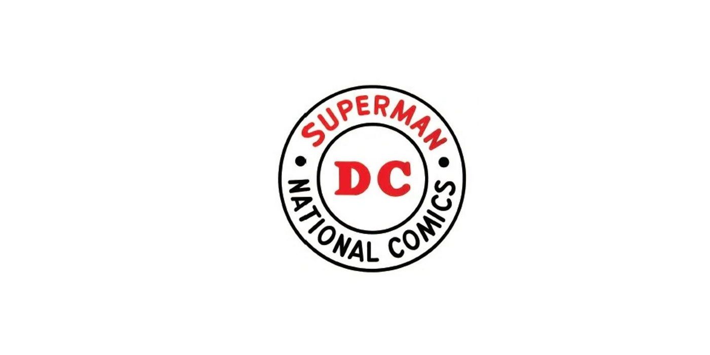
As the 1940s went on, Superman became National Allied Publications flagship character, and the company decided to reflect that in its logo. Still using the circular design, the logo now read “A Superman Publication” with “DC” in the center of the design. This was changed again in 1949 when the company altered its official name to “National Comics.” Still using the same basic design, the logo now read: “Superman National Comics.” As always, “DC” was in the center of the logo (and colored red).
By this point, comic book fans were all calling National Comics, “DC Comics” thanks to the logo. In the early 1970s, the company reflected this by removing all the other wording in the circle logo and increasing the size of the letters “DC.” The logo may have looked a bit bare, so in 1974, it was redesigned to be colored red white and blue and include the words “The Line of Super Stars” around “DC.” One prominent change in this logo was the addition of two red stars on either side of “DC” (likely to emphasize the “Super Stars” in the wording.
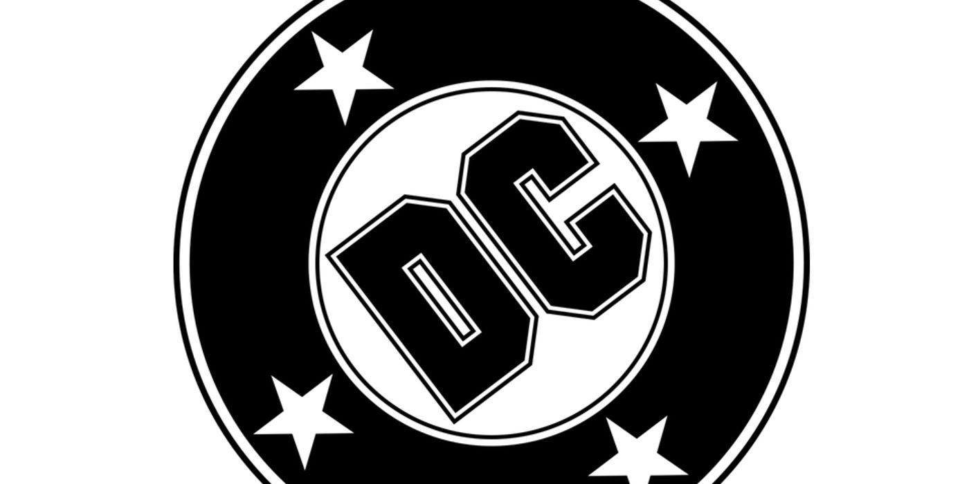
The stars gave the DC Logo a distinctive look, so when it was time to redesign the logo in 1976, the company removed all the wording but added four stars around the stylized “DC” in the center. Also in 1977, the company’s official name became “DC Comics” (as most fans knew them by that name already anyway). The new logo remained for almost thirty years, ending in 2005.
By this point, DC was making broader moves into film and live-action TV, so it may have felt the need to give itself a new look to reflect its position in the entertainment business. The new blue-and-white logo was the first to do away with the long-lasting circle, opting instead for a shooting star that encircled a more distinctive-looking “DC” insignia. Later still, the logo changed into its present form – a blockier, metallic-looking logo with the words “DC Comics” below it. Other logos - some similar to what came before, others very different - followed as DC continued to update its brand.
For a logo born out of a simple partnership, the DC Comics logo has certainly changed greatly over the decades – evolving even more than the famous “S” shield or bat emblem of its most popular heroes Superman and Batman. As DC Comics branches out into even more entertainment sectors in the future, it’s likely the logo will continue to change – although future designers would do well to remember the history of the logo and reflect that in its later designs.


