Back in the day, video game box art was one of the most important elements of a debuting game. Before the online news cycle, sometimes the only thing players would see of a game before they played it was its box. And even after gaming magazines and television, boxes were still the most important piece of marketing. As such, boxes needed to be the be-all end-all of a marketing campaign.
While the importance of boxes has lessened recently, great box art persists. While it's fun to remember the failures, such as the NES' odd box art, there have been countless successes. And like all pop culture questions, the debate over what game has the best best box art has been discussed on Reddit.
The Legend of Zelda: Breath of the Wild

The Nintendo Switch masterpiece The Legend of Zelda: Breath of the Wild has an incredible box, as suggested by Redditor Ryozin91. It features Link facing away from the camera, looking out over the expanse of Hyrule.
The art does a great job of focusing on the wide world of the game. Having Link face away from the viewer and toward Hyrule gives players the desire to jump in, explore, and find all of Breath of the Wild's secrets.
Red Dead Redemption

Among the most praised of Rockstar Games' covers is Red Dead Redemption. Reddit user MacAndCreamS says "I will always have the iconic pose with John Marston holding a Sawed Off Shotgun engraved into my memory." This pose is often called "Sean Connery is about to shoot you" and is common on covers. But there are elements of this cover that make it stand out.
Marston's weapon wielded in one hand radiates power. It's imposing and gives off a strong impression of Marston right away. But the silhouetted cowboys in the back inform the wild west theme. But they have another meaning; their approach to an unawares Marston creates a sense of foreboding. There's really great composition in Red Dead Redemption's cutscenes and on this box art.
No More Heroes 3

Redditor Time_travlr begins this thread by describing this box as "dripping with style." It's an apt description. This stylish action franchise's latest hypes up its story by placing the antagonist and hero against each other on the cover. Surrounding them is a zoom effect that conveys some serious 80s anime vibes.
The positioning of the two is also strong. While the villain is taller and takes up more space than the hero, Travis, he hunches forward. He's clearly frustrated and perhaps even nervous. The protagonist on the other side is shorter but stands tall. This lets the viewer know that the confrontation will be exciting, and really builds the hype for No More Heroes 3.
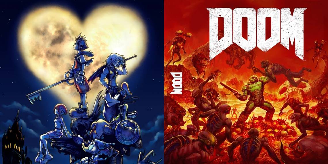
Kingdom Hearts

"Let's appreciate for a second how intriguing and beautiful this Box Art is," says PatFury. Ever since its debut in 2002, most box art in the Kingdom Hearts series was drawn by the director, Tetsuya Nomura. Nomura's art style is incredible. The darker shading lets gamers know the game is going to be edgy, but it still features Disney characters prominently.
In addition, the three main leads are positioned in ways that allude to their role in the first game. Most notably, Sora and Riku facing opposite directions shows their rivalry. The art also conveys the series wanderlust by having characters look skyward. This box is a melancholy piece that precedes many other excellent artworks in this series.
Quake

While detailed artwork can be beautiful, there are still great minimalist covers. Spongeboblovesducks nominates Quake as their favorite of all time. A simple rusted image of the staff of Satan and the title is all there is. It's an intriguing image that still fits the game's grungy vibes.
But the minimalist approach was so iconic that it never received any alternate covers. The game's sequels even kept it, just changing the stake on the loop for the appropriate roman numeral. Minimalist looks can be a blessing since they're easily reused. Indeed, in this year's rerelease of Quake, they still used this icon.
Street Fighter II

Earlier this year, the famous illustrator of 90s game art Mick McGinty passed away. Reddit user drakeekard included some of his finest in a tribute thread. McGinty was incredibly prolific during the 90s, often praised for his accurate artwork. He had worked on Kid Chameleon and Street of Rage.
But his most famous work was on Street Fighter II. Unlike the Mega Man box arts of the previous decade, the realistic proportions of this Capcom classic worked. The character art actually looked like the in-game sprites, which is great since Street Fighter is known for art and costumes. McGinty's work was a real step forward for localized box arts.
Ico

Redditor CPyP shows off the excellent Japanese and European box art for Ico. The style captures the loneliness and beauty of the game, and the two shadows making their way across such a large expanse conveys that feeling well. The art has a very surrealist feeling to it, reminiscent of Salvador Dali.
It's contrasted by its American box art, which is more generic. It features standard PS2 human renders and less contrast. People attribute the American box to Ico's poor sales in that region, proving that art has an effect. It made an artsy masterpiece look like cartoon schlock.
Phalanx

Phalanx's North American box art often appears among the worst box arts of all time. But Redditor dope_danny has a contrary opinion. They say it's more than a meme and is actually high art. Many contemporary gamers have never heard of Phalanx, but it's a space shooter that doesn't feature a single banjo.
There's actually a point to be made here. Phalanx isn't a bad game, but it's a space shooter in a sea of space shooters. But it's still being talked about it today because of its striking box art. It also implies a backstory beyond the image; the juxtaposition of the banjo man and the spaceship in the background tells its own story.
Metal Gear Solid 3: Subsistence

The Metal Gear Solid series is known for its excellent artwork by artist Yoji Shinkawa. Shinkawa's designs are shockingly beautiful, and his Metal Gear Solid concept art is full of watercolor. Shinkawa's artwork doesn't always make it to every cover, however. But Redditor cheekyphuzz points out one time where his excellence did make it there was Metal Gear Solid 3: Subsistence.
Subsistence features a shot of the main character in a salute that has meaning for those who have completed the game. It also features a stylized flower in the foreground and cracked glass in the back; signifying Big Boss' descent.
DOOM 2016 (Switch)

When DOOM's 2016 reboot first revealed its cover, a lot of people were wary of it. It looked generic, featuring a spaceman with a gun. What made it worse was that the cover was reversible, and featured an incredible cover on the inside. When the game was released for Nintendo Switch, they finally went and fixed their mistake, and made that the real box art. It's such a good box art that Redditor Takaithepanda forgot about the underwhelming one.
The cover features the Doom Slayer tackling demon hordes. The demons fill the cover, with the exception of the slayer's green armor. Despite the fact that he's surrounded, the Doom Slayer is still effortlessly defending himself. The cover conveys the hardcore aesthetic the series is known for and how powerful the game makes players feel. Another great cover that really shows how it feels to play the game.