When Spider-Man: Into the Spider-Verse was released, it represented a breath of fresh air in the spider-verse since it was the first 3D animated movie about the Wall-Crawler and featured a creative art style. While all of the previous theatrical releases featuring Spider-Man focused solely on different iterations of Peter Parker, this movie surprised fans by not only centering on Miles Morales but also bringing in other characters that previously only existed in comics.
Inspired fans have created lots of beautiful alternative Into the Spider-Verse Posters, but the officially licensed posters, taking cues from the risks and rewards of the movie's fresh new art style, are amazing in their own right.
Dark And Stylized
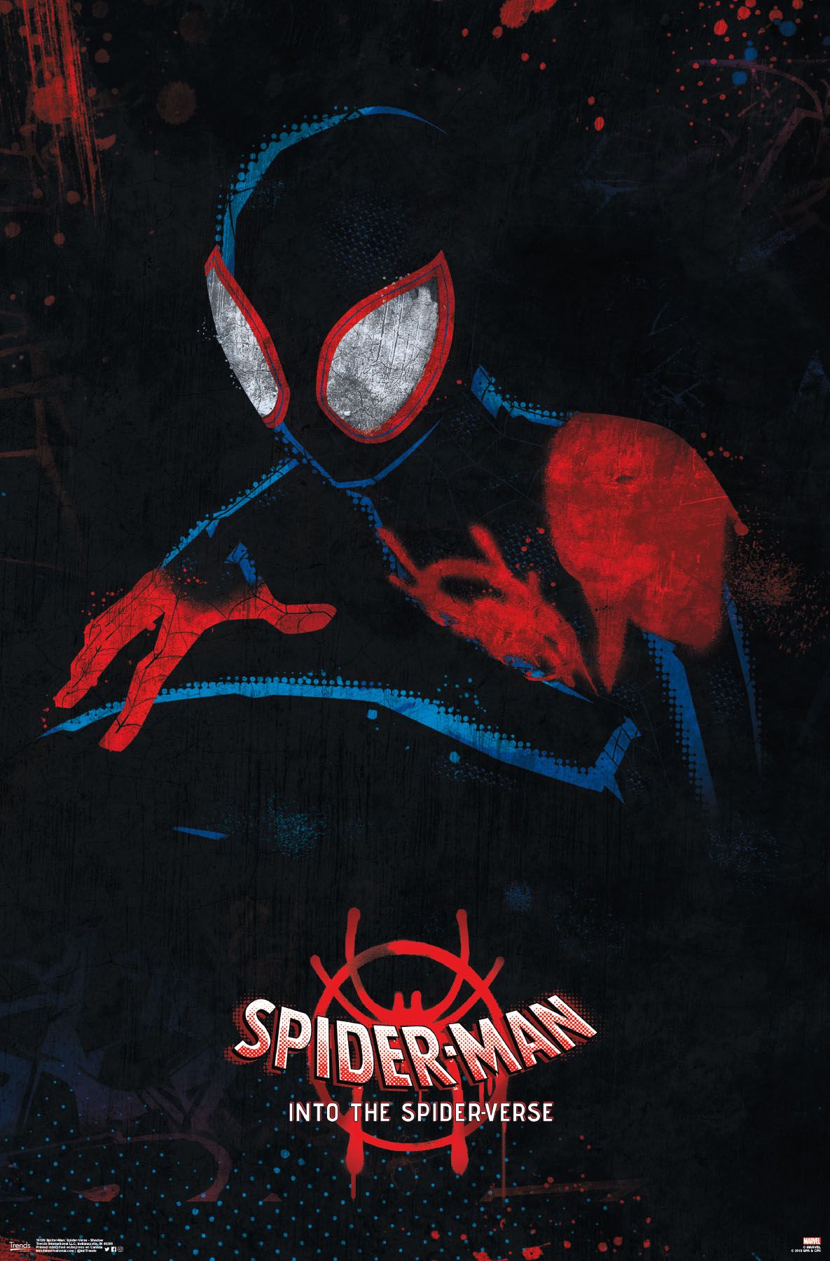
This poster takes several elements of the film and brings them together into a darkly atmospheric, mysterious poster. By placing Miles in his black and red suit on a dark background, it does a great job emphasizing the quiet, sneaky nature of spider-man and the at times sinister tone of the movie.
The dotted blue outline calls to mind a comic-book art style that's employed throughout the movie, while the bright splotches of color hint at spray-paint graffiti art, also a feature in the movie and part of Miles' personality.
Colorful Collage
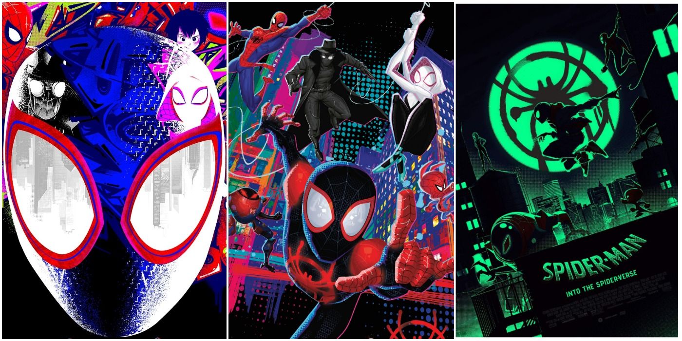
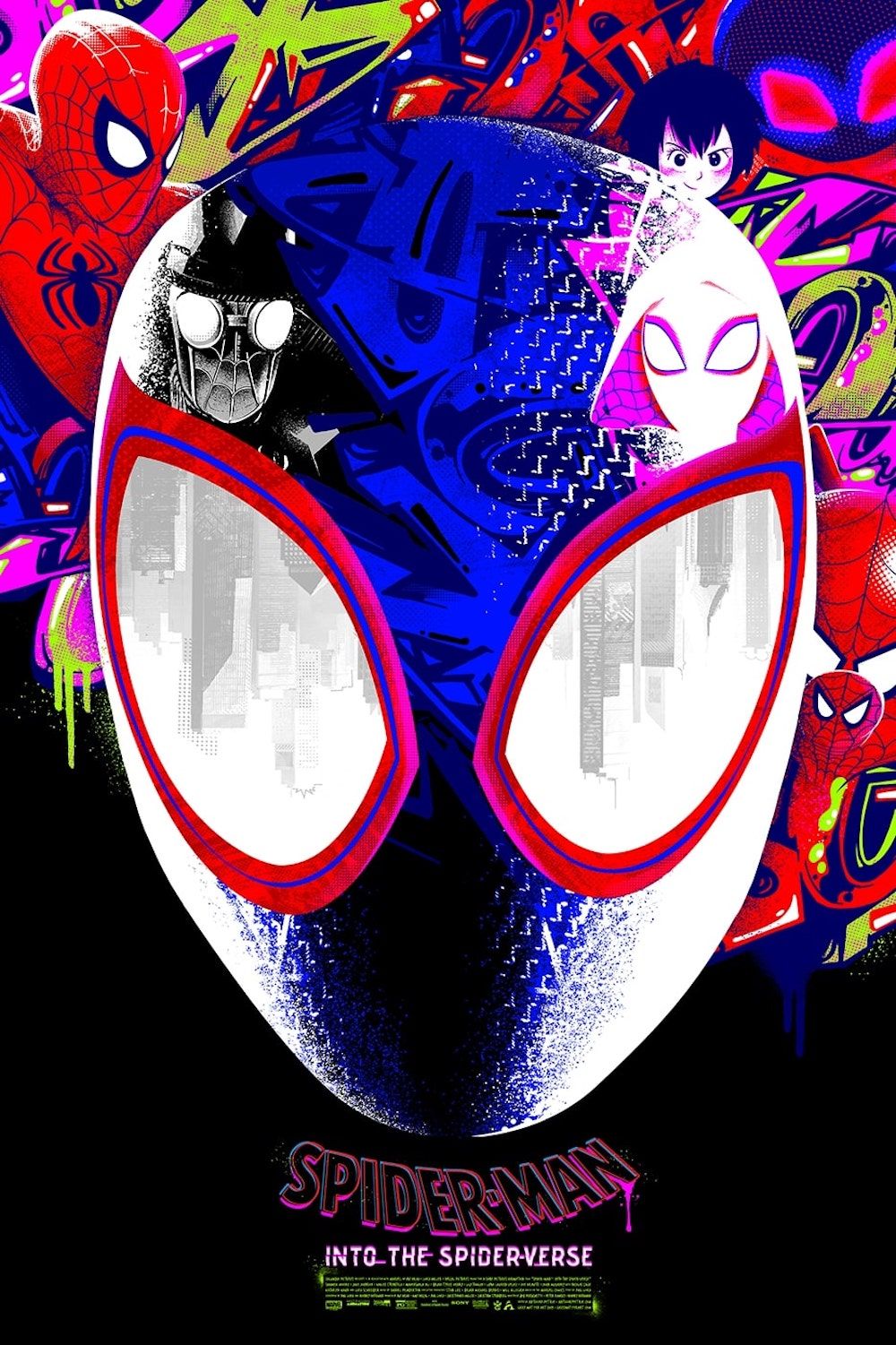
Another design that plays with the aesthetics of exuberant spray paint designs, this poster was created by Anthony Petrie. It goes beyond simply mirroring the imagery of the film. The other versions of Spider-Man are hidden in and around a minimalist rendition of Miles Morales' mask and abstract graffiti in the background.
This does a great job visually communicating that they are all sides of the same character. The upside-down skyline reflected in Miles' eyes not only looks cool but is also a nod to the scene in which he dives off of a building (and tells the viewer how much the city is part of Miles' identity).
Colorful Group Swing
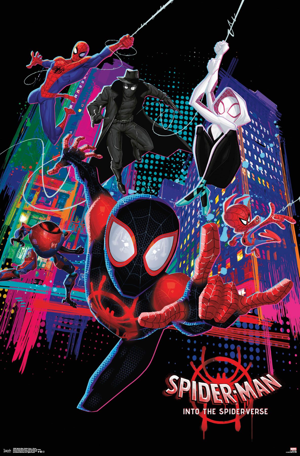
Many of the best posters are the ones that push the bright, busy art style of the movie to extremes. This one is no exception: The background is an exciting color palette of blues, pinks, and greens.
Rather than centering on one character, this poster takes advantage of the ensemble cast and shows the whole group in a dynamic mid-swing. This poster does an amazing job communicating movement and making the viewer feel like they're part of an exciting scene.
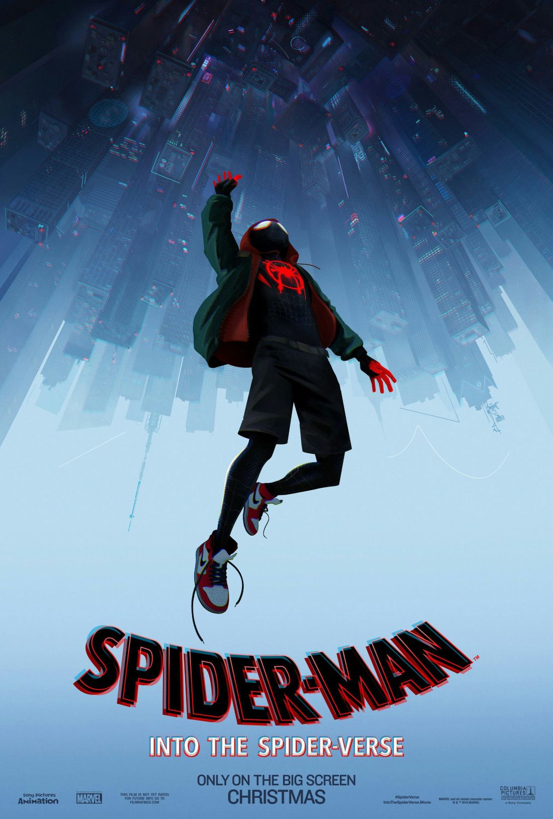
Falling Up
A simple poster that is less stylized than some others, this one is nevertheless wow-worthy. It takes one of the most iconic scenes from Into the Spider-verse and centers it, conveying the excitement and heart of the movie in one simple shot that also manages to appear quiet and peaceful at the same time.
All the focus is on Miles, and the inclusion of his sneakers, jacket, and shorts easily conveys his status as a part-time newbie superhero, part-time normal, fun-loving teenager. As one of the highest-rated coming-of-age movies on IMDb, this is an important aspect of the movie to emphasize.
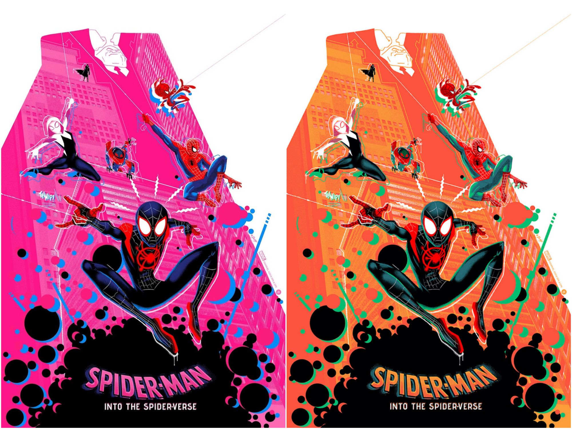
Monochrome Group Swing
This poster comes in two color versions: Hot pink and nice tangerine orange. An officially licensed design, this was designed by UK based graphic designer Doaly.
The bright, energetic backgrounds get across the excitement of the movie, and details like the offset character outlines and Kingpin's silhouette hidden within the skyscrapers only add to the fun. With everyone swinging in different directions, viewers get the sense that there are many different personalities at play among all of the Spideys.
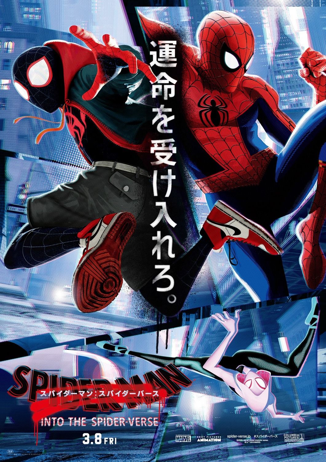
Japanese
A movie poster specifically made for Japanese audiences, this one uses a creative placement of text to invoke the parallel universe idea on which the movie hinges its plot. With Miles Morales and Peter B. Parker back to back on opposite sides of the vertical line, they are set up as clear counterparts to one another.
Miles' foot jabs across the center onto Peter's side, just like they interfere with each others' universes in the film itself; meanwhile, Gwen Stacey creeps along, almost unnoticed, near the bottom. The shattered-glass effect of the cityscape background adds to the fractured but unified image.
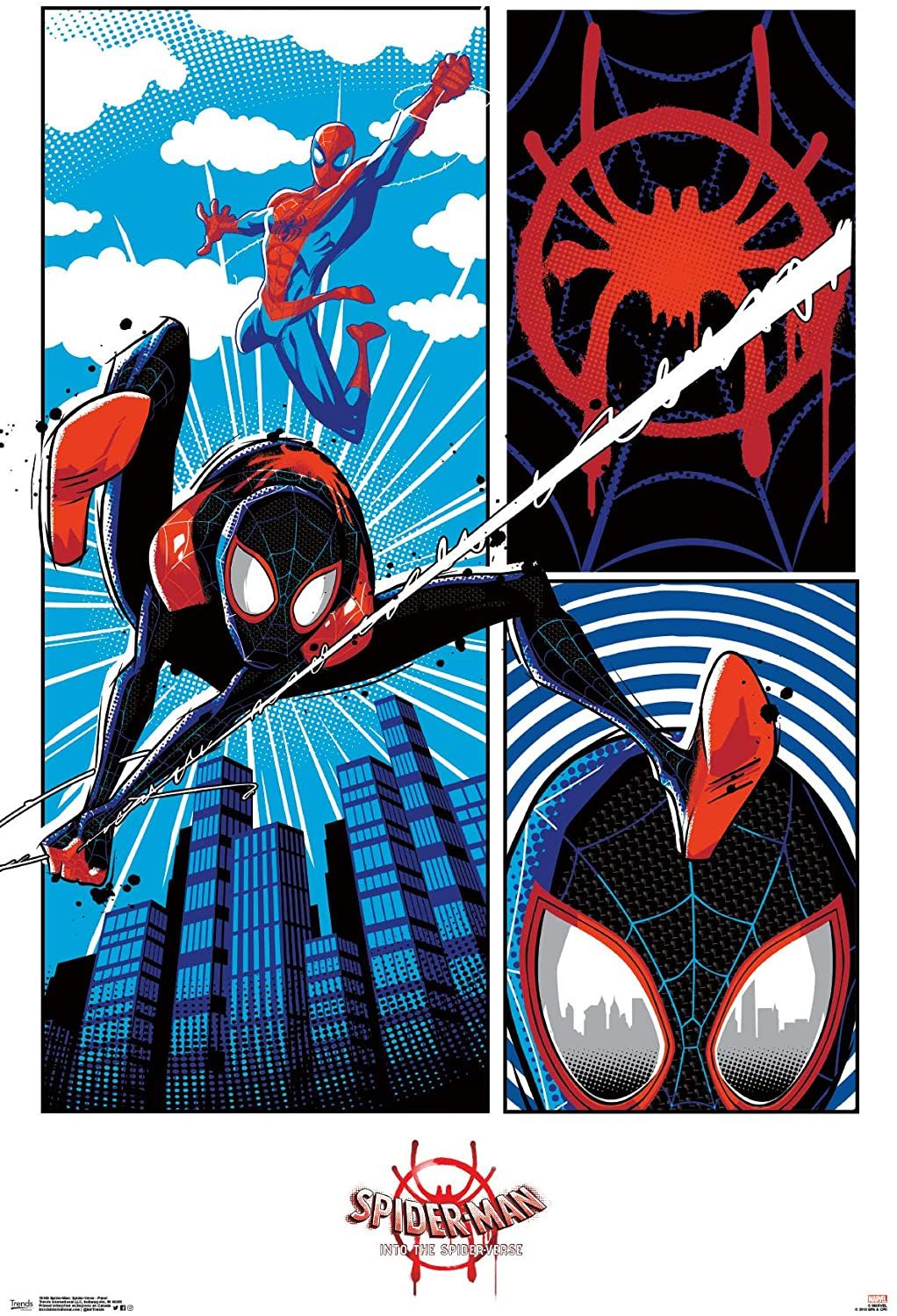
Comic Panels
This awesome poster takes advantage of the comic-book art style in the movie in the most literal way possible. It features three comic panels, one of which depicts Miles swinging through the sky with Peter B. Parker close behind him.
The other two panels are nice close-ups of Miles' suit design, a great decision since it could be said that it's the best-looking suit in the movie. The bottom right panel implies Miles' use of his spider-sense, with ripples around his head and a cool mirroring effect showing the skyline reflected in his eyes.
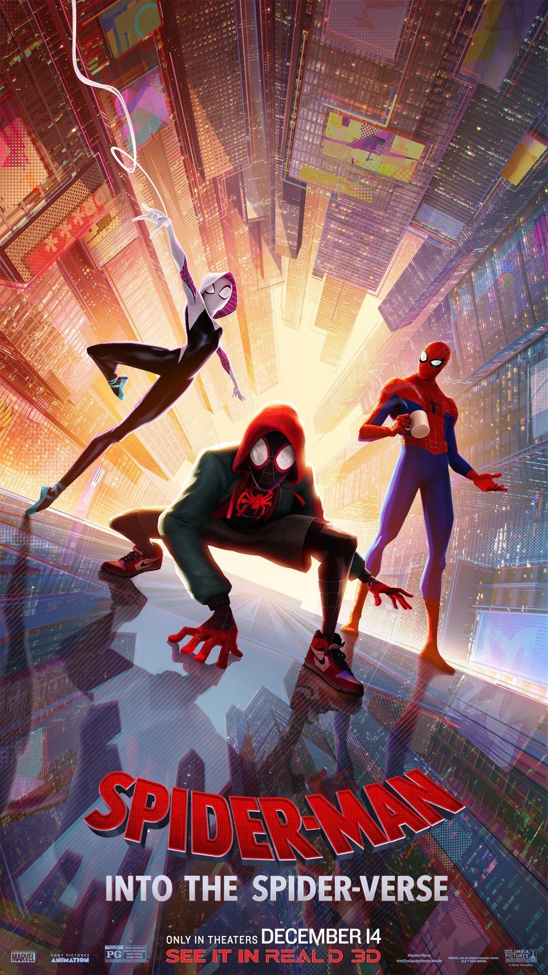
Golden Cityscape
While a lot of the movie's posters feature the spider crew swinging through the air, in this one they are standing stuck to the side of a high rise's smooth surface. Peter B. Parker holds his coffee mug nonchalantly, as is typical for the tired and cynical counterpart to Peter. A. Parker.
In contrast, Miles squats down in a more tactical stance while Spider-Gwen, as always, is gracefully on tiptoe and looks like she might bounce off the glass in the next moment. While it isn't a full group shot, Gwen is arguably one of the best characters other than Miles. In a fun play on perspective, the poster is actually looking up, with a magical, golden sunlight-like glow coming from behind the three characters and illuminating the buildings rising into the air behind them.
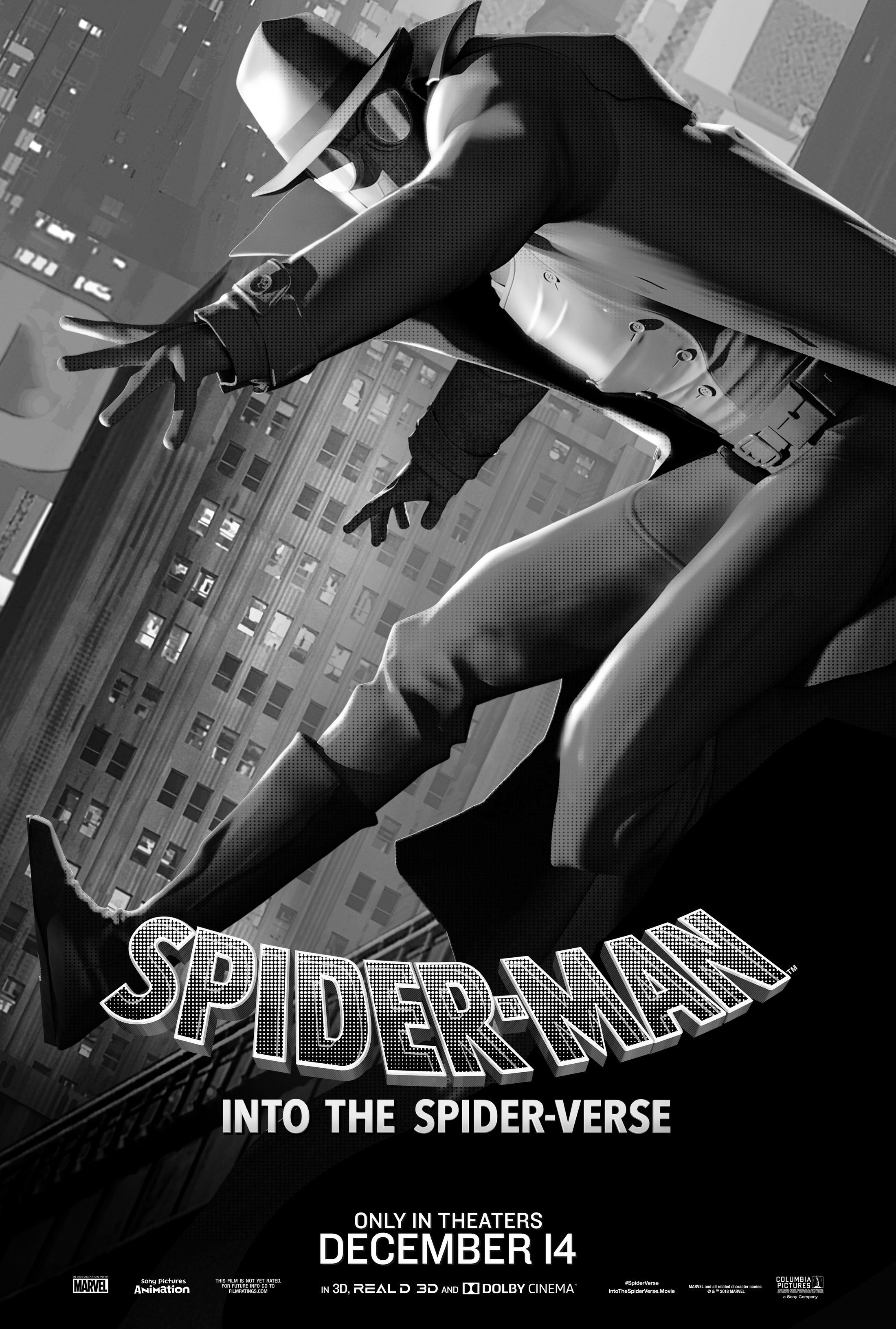
Spider-Man Noir
As part of a series of posters that focus on the other versions of Spider-Man that show up in the movie, this one is arguably the most striking. It not only draws in the viewer with a dynamic pose, but the lack of color stands out among scores of bright, flashy movie posters.
It's a creative way to evoke mystery and bring the audience into the way that the character of Spider-man Noir views the world. It serves as both a visually intriguing poster and a tongue-in-cheek joke about a character who has always been humorous.
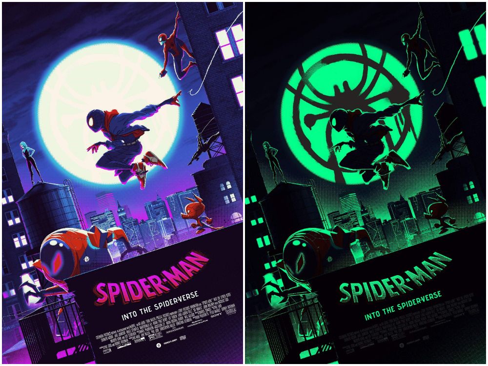
Glow In The Dark
Created by artists Matt Ferguson and Florey, this design is a two-in-one. The physical print of the poster, already an exciting and beautiful design, transforms into a whole new image under darkness.
The characters and buildings portrayed in the original are illuminated by an eerie green glow, and Miles' spray paint spider symbol is projected dramatically on the moon. For a movie about alternate realities and dark secrets, this poster is definitely on-the-nose.

