There was a time when movie posters were considered true works of art that not only generated interest for the film but also crafted stunning imagery. As the film industry has shifted and evolved (or devolved), the importance of the film poster has fallen to the wayside, giving way to Photoshopped monstrosities. Instead of getting well thought-out, beautifully designed film posters, the industry norm is now heavily air-brushed headshots that are passed off as one-sheets.
The 1980s not only gave us unforgettable films, but moviegoers and cinephiles were also exposed to some of the most iconic and eye-catching movie posters of all-time. The decade of decadence that gave us Reaganomics, Schwarzenegger action films, and timeless blockbusters also set the bar in what we should expect when it came to movie posters. These wonderfully creative posters were thought-provoking, introduced us to fantastical worlds, new Hollywood stars and moments in time that perfectly encapsulated the era and the film’s tone.
Even though Hollywood may be happy with the current floating heads craze, we’ve gone through the vast collection of '80s posters and picked out the most powerful and classic pieces that defined the decade. Sticking with the original theatrical one-sheets, here are the 15 Best Movie Posters of the 1980s.
15. BEVERLY HILLS COP

If 48 Hrs. served as Eddie Murphy’s introduction to Hollywood, then the 1984 action-comedy Beverly Hills Cop firmly cemented his place as a box-office leading man, launching him into international stardom. Considered to be one of the best action-comedies ever, it was the third highest grossing film of 1984, just behind Ghostbusters and Indiana Jones and the Temple of Doom. What makes the poster so memorable is that while the layout design is simplistic, the composition perfectly establishes the fish out of water story.
Eddie is front and center in the poster playing the role of Axel Foley, a street smart Detroit detective investigating a case in Beverly Hills. While the poster’s tag line sells you the storyline, the juxtaposition of Murphy in raggedy clothes, sitting on the hood of a beautiful red Mercedes Benz, works well, giving Eddie a renegade look. The poster is so well designed that if you remove Eddie and the copy, the image could easily be a car ad for Mercedes Benz selling the brand and lifestyle with Beverly Hills in the background.
Sylvester Stallone was originally attached to the role, and had that been the case, the sleek design would have been completely changed to fit Sly’s action persona.
14. LETHAL WEAPON

If Beverly Hills Cop is (arguably) the funniest cop movie ever, then Lethal Weapon is the best buddy cop film of all-time. Directed by Richard Donner off a Shane Black script, the pairing of Mel Gibson and Danny Glover worked so well that it established the model by which all other buddy action movies would follow.
Tag lines aren’t used as much by studios nowadays, but back in the 80s, virtually all movie posters had them, including 1987’s Lethal Weapon, which read: “Two cops. Glover carries a weapon…Gibson is one. He’s the only L.A. cop registered as a LETHAL WEAPON.” With the photo by Aaron Rapoport and art direction & design by Jeffrey Bacon and David Rene, the poster banked on its leading men, as Gibson and Glover faces took up most of the image. Using three key colors of black, white and red, the poster instantly pulled you in, selling the pair as cops.
Some could argue that the poster served as a precursor for the head posters of today, but this image sold the intensity and hard-edge of the story. Looking at the photo alone, people instantly recognize the film and characters, which were career defining for both Gibson and Glover and a game-changer for the action genre.
13. ROBOCOP

The unnecessary 2014 remake only reminded us all of how much we loved the innovative and fun 1987 original, Robocop. In the 1980s, science fiction movies would merge man and machine with stories taking on the hyper-violent tone and look of the decade. Perhaps no other film personified this bleak look into our lawless future than Robocop. This sci-fi action classic takes us to the near future, telling the story of police officer Alex Murphy, who after being critically shot and given an artificial body, is transformed into the crime-fighting android, Robocop.
The execution of this fan favorite poster is also a good pairing of technology and human skill. At first glance, the poster looks like a photograph, but upon closer inspection you can see it’s an illustration. Based on the photo by Deana Newcomb, with art direction and design by Brian D. Fox and Robert Biro, illustrator Mike Byron was able to create a highly detailed drawing of the title character. The photo/drawing combination is oozing '80s style through the use of colors and lighting, while still capturing Robocop’s strength and highlighting his cool design!
This Robocop image has been highly influential with new designers, having been used in many underground film posters, including the main image for Gallery 1988’s Crazy4Cult 2012 NYC show.
12. A NIGHTMARE ON ELM STREET

The horror industry -- more than any other genre -- is highly dependent on the marketing campaign and one-sheets. Regardless if a movie’s good or not, audiences will often watch it just solely based on the poster/key art. While most horror posters today lack creativity, recycling elements and color palates from past fright flicks, that certainly wasn’t the case back in 1984 with A Nightmare on Elm Street.
Wes Craven was blessed to have an extremely talented artist by the name of Matthew Joseph Peak do illustrations for the low-budget horror film. While Nightmare was his first film poster, Matthew wasn’t a stranger to the art-form. as his father was legendary movie poster designer, Bob Peak (Star Trek, Superman, Apocalypse Now).
Going off the script and some movie stills, Matthew created one of the most terrifying and iconic posters in all of horror. His illustration has the young heroine Nancy Thompson lying in bed in utter terror as the visage of Freddy Krueger and his bladed glove hover over her. Rich in color and emotion, Peak captured everything about the movie in just one image. The film’s massive success sparked a franchise, leading Craven and New Line Cinema to wisely bring back Matthew to create the posters of the four sequels. The collection of all five posters is likely the strongest collection of movie art in the horror genre.
11. DO THE RIGHT THING

Regarded as Spike Lee’s greatest cinematic offering, Do The Right Thing was, and still is, a controversial film that examines America’s social and economic issues, set in the backdrop of a Brooklyn neighborhood. Looking at the film’s poster, however, you wouldn’t necessarily pick up on the anger and raw emotion found in the film. The black asphalt is replaced by a vibrant blue color, giving the film a lighter playground feel, one highlighted by the young girl drawing on the floor with chalk.
While the poster seems benign, its themes and political messages are present but subdued. The overhead shot taken by Tony Barboza has characters Sal and Mookie -- played by Danny Aiello and Spike Lee, respectively -- standing on opposite sides, signifying their place and views in the world. The poster’s creative direction was done by David Sameth, while Art Simms and Tom Martin were in charge of the art direction and design. The inclusion of the child’s drawing of a cop firing a gun also foreshadows the tension with law enforcement found in the film.
With the current “Black Lives Matter” movement and police issues across the country, sadly, the movie and poster are just as powerful and relevant today.
10. SCARFACE

Iconic, simple, and imposing are the three best words to describe the poster for 1983’s Scarface. With nothing but Al Pacino as Tony Montana in the monochrome image, this poster more than any other spurred a merchandising blitz of t-shirts, baseball caps, toys, and parody posters. More importantly than that, the character and poster has been embraced by pop culture, specifically in the hip hop world. If you’ve caught past episodes of MTV’s Cribs, you've seen artists like Snoop Dogg and 50 Cent proudly proclaim their love for the OG gangsta. Tony Montana rise from nothing to a position of power is relatable one, to be sure.
Breaking down the poster, Pacino and the film’s title boldly standout in red at the top, selling the acclaimed actor. Next to his role of Michael Corleone in The Godfather films, Tony Montana is the character most movie fans associate with him. The dissecting planes split the various sides of the character, the good v. bad, and black v. white of his world. The copy for the design included a synopsis, which was a trademark with many '80s posters. The tag line of “He loved the American Dream. With a vengeance.” is as direct and sinister as the man himself.
9. THE GOONIES

Legendary artist Drew Struzan is the man responsible for sparking the imaginations of countless kids from the '80s with his unforgettable movie poster illustrations. From the Stars Wars films to Indiana Jones and Back to the Future, the man helped shape the special bond moviegoers would have with these fantastical films. His relationship with Steven Spielberg led to him coming onboard the 1985 children’s adventure, The Goonies. Directed by Richard Donner, the film follows a group of kids who embark on a pirate treasure hunt in order to save their homes from demolition. What started out as a cult hit has now become a full-fledged 1980s staple, one that has spawned generations of fans.
The magic Drew brings to film posters is on full display with The Goonies, as we find the young group of heroes precariously hanging on for their lives. His uncanny ability to capture the spirit of a film is what puts him on another level. The image design and composition for the poster perfectly sells the idea of adventure, with the Goonies in peril and the pirate treasure map almost appearing to be sucking them into its world. Any kid seeing this image in a theater or in a newspaper ad would instantly be sold on wanting to be one of the Goonies.
8. THE BREAKFAST CLUB

During the 1980s, director John Hughes had a knack for creating films that perfectly captured what it was like to be a teenager growing up in America. All of the angst, humor, and self-absorption oozed out of the characters and films he wrote, with The Breakfast Club being the zenith of high school and teenage movies.
With a simple layout, the poster had all 5 characters of the breakfast club on display, serving as a microcosm of high school life with the brain, the beauty, the jock, the rebel, and the recluse. While the copy on top tells the story of the five characters, the image itself consisting of the actors -- that would come to be known as the “Brat Pack” -- became synonymous with the decade. Photographed by the infamous Annie Leibovitz, the poster became influential in pop culture and the marketing field, becoming one of the most parodied and spoofed images in all of cinema. Many films, TV shows and publications did their version of what’s become known as “The Breakfast Club pose”, with The Texas Chainsaw Massacre Part 2 poster being the most notable one.
7. THE TERMINATOR

This film poster did everything right in selling both Arnold Schwarzenegger and the story of an unstoppable killing machine to the public. The 1984 sci-fi action classic was the calling card for both Schwarzenegger and director James Cameron, who would go on to build a strong partnership in this series and other films.
As we saw with Robocop, science fiction films in the '80s were dark and hard R’s with graphic violence and nudity. The Terminator continued the trend with a take on how machines will bring about the destruction of mankind after turning on their creators. With its bleak look at the future and packed with edge of your seat action, Schwarzenegger became an emotionless killing machine that many consider one of the most feared movie villains ever.
With art direction by George Costello, having Schwarzenegger’s name in big red letters at the top was a big gamble at the time, considering Arnold hadn’t yet become the mega action hero we all know. Sporting a black leather jacket, a cool pair of shades, and a pretty large gun, Arnold was imposing and mysterious, but he and his unique muscular look are what really sell the poster. From the hair to the cybernetic sunglasses and scowl, Schwarzenegger made you believe that underneath his skin was the grim reaper robot of the T-800.
6. FULL METAL JACKET

Film auteur Stanley Kubrick was notorious for his meticulous attention to detail in all of his productions. That also extended to his movie posters, which were the front lines of what he wanted to share with audiences. Almost all of Stanley’s movie posters turned out to be iconic works of art, namely 1987’s Full Metal Jacket. Turning to British illustrator Philip Castle, who had worked with Stanley on A Clockwork Orange, it was up to Castle to come up with a poster that conveyed Kubrick’s brutal story about the Vietnam War.
Stressing the significance of the poster working on a black and white plane, Kubrick made a couple of notes and sketches with the helmet prominently on display. Using that as a starting point, Castle’s artwork of the camouflage helmet worked beautifully with “Born to Kill” written on it, juxtaposed with the peace badge. That simple image of the helmet, along with the tag line of “In Vietnam, the wind doesn’t blow, it sucks”, helped established the ferocity of war and a soldier’s fighting spirit. Many artists since have parodied the posters design, using it to incorporate other famous helmets of superheroes, villains and Star Wars characters. Speaking of...
5. STAR WARS: THE EMPIRE STRIKES BACK

The Star Wars universe has an impressive collection of one-sheets, considering all the sequels, prequels, special editions and rereleases the franchise has had. At the top of that list, however, has to be the poster for the 1980 The Empire Strikes Back. While Tom Jung and Tom William Chantrell created iconic posters for 1977’s Star Wars, George Lucas and 20th Century Fox tapped renowned artist Roger Kastel to create the one-sheet for the much anticipated sequel to the original space opera blockbuster.
Prior to taking on the challenge, Kastel was famous for having illustrated the iconic poster for Steven Spielberg’s Jaws. This one was dubbed the Gone with the Wind-style poster, with Han's embracing and near-kissing Princess Leia reminiscent of the pose between Rhett Butler and Scarlett O’Hara. The poster places our heroes in a cold, frosty setting with Darth Vader looming over them. The rich visuals and blending of colors gives the icy Hoth environment a watercolor texture, that really makes the characters standout.
Even though it’s the American style-A poster, it had a short theatrical life, as it was eventually replaced because the image foolishly omitted Lando Calrissian himself, Billy Dee Williams. Tom Jung returned to create the replacement B-version.
4. BLADE RUNNER

John Alvin, the man who designed and illustrated the movie poster for 1982’s Blade Runner, is a true poster artist, renowned for his work in fantasy, horror and sci-fi. While many studios at the time had entire publicity and art departments working on one-sheet campaigns, Alvin was a one-man shop that did it all. With his traditional style, he designed more than 120 film posters, including E.T., Batman Returns, Beauty and the Beast, and Gremlins.
With Blade Runner, Alvin was tasked to bring a modern film noir thriller to life. Based on Philip K. Dick’s novel Do Androids Dream of Electric Sheep?, director Ridley Scott created one of the most influential (and arguably greatest) pieces of science fiction to ever grace the silver screen. Hand-painting the illustration, Alvin created a feast for the eyes as he split the poster into two distinct styles. The top half is very much inspired by pulp dime novels, with gun-for-hire Rick Deckard (Harrison Ford) next to his femme fatale Rachel (Sean Young). The lower portion of the image is all about the cyberpunk style, flying cars, and stunning architectural cityscape found in the dystopian future of Los Angeles.
3. BACK TO THE FUTURE

If Blade Runner is dark, sophisticated science fiction, then Back to the Future is the fun, mom-and-pop-accessible entry to geekdom. Universal Studios and producer Steven Spielberg went back to a trusted friend in Drew Struzan to create the film poster for the 1985 classic. Struzan, known for his photorealistic style, was able to capture Michael J. Fox’s frantic look as Marty McFly trying to figure out his time travel quandary.
When fans today recall this amazing movie, the poster’s imagery instantly comes to mind, causing people to reenact Marty’s pose next to the car. In pitching the image concept to the studio, Struzan offered up various comps, with the initial one having Marty McFly coming out of a pocket watch with his parent’s faces on the front. The only elements that survived into the final poster was Marty and him lifting up his sunglasses. Additionally, the typeface used for the logo is just as famous as anything connected with the film, as it more than helped build the franchise brand.
The film’s mega success and the poster’s popularity brought Drew back to create the posters for the two sequels. Using the same concept and layout, those posters would have Marty stepping out of the DeLorean, with a new character joining him each time.
2. RAIDERS OF THE LOST ARK

Treasure hunter and archaeologist Indiana Jones was first introduced to the world in 1981’s Raiders of the Lost Ark. The dream pairing of George Lucas and Steven Spielberg brought to life one of the greatest movie characters of all-time, as moviegoers embarked on Indy’s larger than life adventures all across the world. But prior to being whisked away into this fantastical story, people became aware of Indiana and the movie courtesy of artist Richard Amsel’s timeless and swashbuckling posters.
In selling Raiders of the Lost Ark, Amsel utilized the tone and style of matinee serials of the 1940s and 1950s, as well as the pulp magazines and comics that inspired Indiana’s creation. Having risen to prominence in the 1970s with poster for films like The Sting, Chinatown and The Muppet Movie, Amsel certainly had a trademark style perfectly suited for “event’ films such as Raiders. He ended up creating two key posters for the film. The first (used for the initial campaign) features a serious Harrison Ford as Indiana Jones with his trusty whip slung over his shoulder. The second poster (used for the larger rerelease) was more fun and grand, playing up the pulp feel of the movie, with Indiana about to snap his whip surrounded by the ark and mysterious characters.
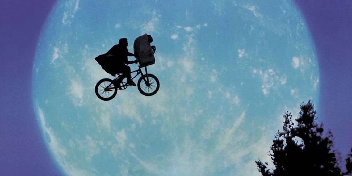
1. E.T. THE EXTRA-TERRESTRIAL

We’ve already gone over the prolific career of John Alvin with his work on Blade Runner, but the most iconic movie poster he’s ever created was his work for 1982’s E.T. The Extra-Terrestrial. The famous poster shows the cute alien’s finger touching the finger of his human friend, Elliott. The image is an obvious reference to Michelangelo’s fresco painting “The Creation of Adam”, which director Steven Spielberg himself had suggested using. Adding a personal touch to the piece, Alvin used his daughter Farah’s hand to illustrate the child’s hand in the poster.
For a sci-fi blockbuster of this size, Alvin was able to infuse the illustration with heart and childhood wonder that instantaneously grabbed the interest of audiences of all ages. Along with Alvin’s masterful work, the other key image people connect with the film is that of Elliot and E.T. flying in front of a full moon on a BMX bike. That image was also made into a poster by Drew Struzan but it was never used. As much as Spielberg loved the shot, he didn’t want to reveal it in a poster, preferring audiences experience that enduring scene in theaters. Of course, E.T. and Elliott on the bike ended up being used as the logo for Spielberg’s company, Amblin Entertainment, so it didn't exactly go to waste.
---
What's your favorite movie poster from the '80s? Let us know in the comments.