There is no escaping the iconic characters of The Avengers. Twenty years ago, few moviegoers would have known about characters like Iron Man or Black Panther, but today you'll be hard-pressed to find someone who isn't familiar with the Marvel universe solely because of hit blockbusters.
The Marvel Cinematic Universe has become so iconic and influential that sometimes even the comics change to fit the look and feel of their movie counterparts. However, things don't always start out looking so brand-friendly, especially in the early stages of concept art.
To be clear, this article is not meant to disrespect the artists or the artistic merit of their creations. Concept art takes tons of talent, and we are in no way trying to belittle that. The criticisms are only leveled at how each piece fits into their respective movies and the overall franchise, and not the artistic talents of each creator. This is all fantastic work, it just isn't always the right work.
Concept art can reveal a lot about a movie's production. It can show how passionate the creators are, or how misguided they might have been - and in this case, it's mostly the former. Despite how incredible the following artwork may look, they just don't work with the final product.
Here's 15 Unused Concept Art Design That Would've Completely Changed The Avengers Movies.
Rescue-Ready Cap

Artist Ryan Meinerding made this concept design for Captain America: The First Avenger as a precursor to Cap's full costume. It's supposed to be a military outfit that resembles his traditional look and color scheme.
While it may be a nice visual foreshadowing, it doesn't exactly scream "soldier", does it?
The design was discarded for being a bit too flashy and vibrant for a WWII soldier on top secret missions — especially with the dangerously noticeable helmet. It also bears a striking resemblance to Bucky's costume with the blue jacket and cargo pants, which is a little redundant.
In the final film, Cap wears his costume underneath his army uniform, which is way more tactical and a lot less patriotic than the concept.
This design wouldn't have "ruined" the movie, but it makes total sense for it to have been scrapped in favor of a more grounded fashion choice. This is like wearing a target on his head, anyway.
The Iron Exo-Suit

This concept was made specifically for The Avengers by artist Adi Granov. Instead of a full suit of armor, this design is actually more of an exoskeleton that leaves parts of Tony's body vulnerable.
Curiously, this suit lacks the flashy red and gold paintjob that Tony would have already fallen in love with.
The suit is especially bulky on top, and it even sports a helmet with larger eyes and a... nose? Can we call that a nose?
No information exists on what role this design would have played in The Avengers. It might have been a concept for the remote-activated suit that wraps itself around Tony in the finale, or maybe it was used as inspiration to guide Iron Man's overall design. Seeing as it isn't very protective or very "Iron Man," it makes sense that this design was dropped.
The Winter Soldier's Sniper Gear

It's hard for Bucky to not look badass, but this design choice is questionable. This is one of Josh Nizzi's many Winter Soldier designs for Captain America: The Winter Soldier. Here Bucky is depicted wearing a tactical trenchcoat, and a mask that only covers his eyes. The nighttime background and sniper rifle suggests that this might have been used for the scene in Cap's apartment — where Nick Fury is shot — and if that is the case, this concept would not have worked.
While it would have given the Winter Soldier a cool silhouette, that long coat isn't exactly subtle.
It probably wouldn't help his mobility in that rooftop chase, either. The most glaring issue is the mask (or lack thereof) as Cap and the audience could probably recognize Bucky underneath it ahead of the film's big reveal.
This design is cool on its own, but it could have easily have given away the twist.
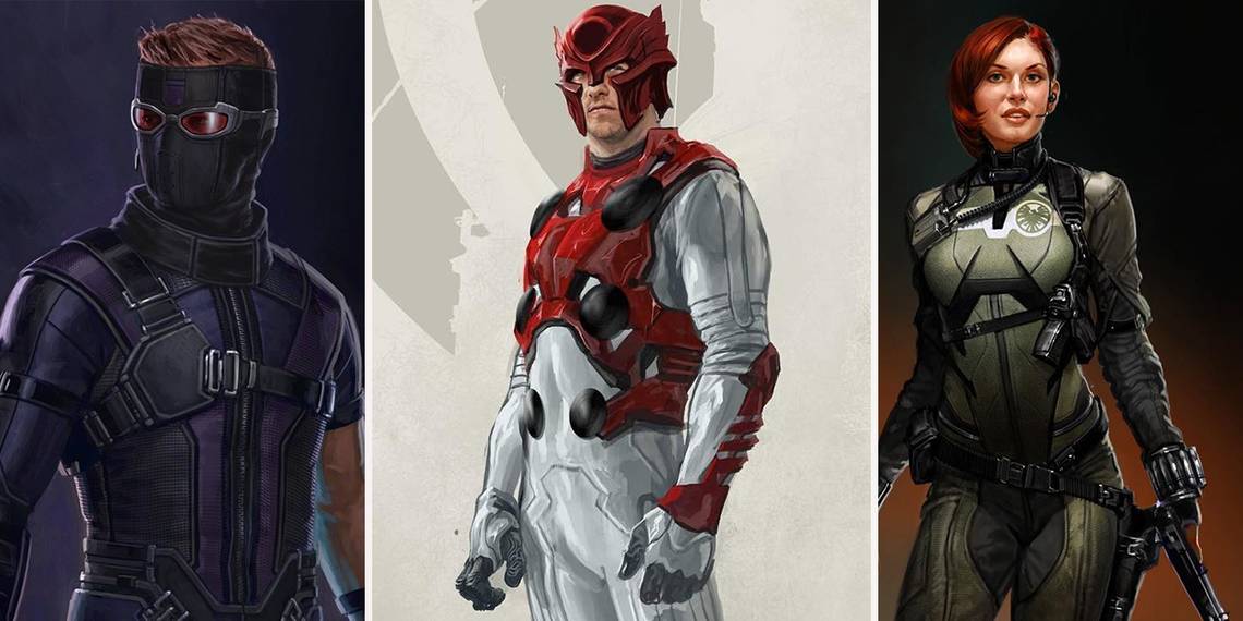
Black Widow's S.H.I.E.L.D. Uniform

It's weird seeing Natasha wear a color other than black. This concept art was an extremely early design for Black Widow, created by Ryan Meinerding for Iron Man 2.
The design itself is actually pretty cool — it looks like a practical spy outfit, and the earpiece, gauntlets, and S.H.I.E.L.D. logo are great touches.
The problem here comes from the simple fact that it doesn't look like Black Widow.
This shares few similarities with the character's look in the comics. Obviously, the films have no obligation to stick to the source material, but imagine the wrath of fans, even in the MCU's infancy, if they were introduced to a Black Widow whose only similarity to the comics was her red hair?
It's better that this was scrapped in favor of comic accuracy the first time — but nowadays, this would totally work!
The Scarlet Spider

Comic fans will instantly recognize this design. This artwork (also by Ryan Meinerding) is an MCU interpretation of the Scarlet Spider, a version of Spider-Man from the 1990s.
It's a near-perfect replication with a few touches to make it feel more homemade; the rough stitching, fingerless gloves, and high socks.
Sadly, it comes from an era of Spider-Man that many fans would rather forget.
Not only is it a bit too retro (in the cringeworthy, '90s kind of way), but it would quickly remind fans of the Clone Saga, one of the most convoluted stories in Spider-Man's history with which this suit is associated.
The final cut of Spider-Man: Homecoming went with something similar, with a swapped color palette and goggles for eyes. The changes were for the better, as blatantly reminding fans of the Clone Saga isn't the best way to reboot Spider-Man... again.
Flight Suit Falcon

The Falcon has never really had an interesting costume. Sadly, while this piece by Josh Nizzi looks cool, it only underscores the problem. For his first appearance in Captain America: The Winter Soldier, this Falcon design is a bit more advanced than what we got.
While Sam Wilson is essentially a marine with a special jetpack, this design depicts him in an armored flight suit with more aerodynamic wings and a full helmet.
Seeing as this resembles a plane more than a bird, it makes sense that this idea was dropped.
This might work as a high speed suit (no doubt for extra special superhero occasions), but as his basic outfit, it seems a little bland. To be fair, his suit hasn't seen many improvements, either.
Come on, Marvel! Just give him a red and white suit already!
Goth Scarlet Witch

This Scarlet Witch design by Andy Park is nearly identical to what is used in the final cut of Avengers: Age of Ultron, but with a few key changes.
Not only is the final design a bit less edgy (with less eye makeup and a non-tattered dress), but the color palette is swapped, making the jacket red and dress black. The character already feels like an angsty teen in the movie, so it was probably best not to play up the "goth girl" stereotype with a predominantly black design.
Although this concept is still works for Wanda's casual outfit, her look in the film resembles the comics a bit more than this.
It's also a nice hint to the long red coat she gets at the end of the movie, as a replacement for her skimpy red dress from the comics. This design isn't as radical a change as others on this list, but the changes made were ultimately for the better.
Ultimate Hawkeye

This Hawkeye design, created for his appearance in Captain America: Civil War (also by Andy Park), comes off a little silly. It's based on Hawkeye's costume from the later years of The Ultimates, which is both a dark time for comic fans as well as Hawkeye.
He was really into guns back then. It was weird.
Not only does this feature in some of the worst Marvel stories in recent history, but it wouldn't translate well in live-action.
We're obviously talking about the ski that seems to cover all of his head except his for perfectly coiffed hair. It's not like he hides his identity, so what's the mask for? Is he afraid of getting dry skin?
The rest of the suit is fine, but that mask —although it works for the comics — would look silly on a real person.
A Creepy Vision

Vision went through a lot of different looks in preproduction, but this gorgeous concept (yet again by Ryan Meinerding) is way more intimidating than what we got.
This is mostly due to the color scheme — the movie has deeper greens and lighter reds, but this concept art uses the opposite. With his outer color is so light and his inner color so dark, Vision starts to look unsettling.
Frankly, the high contrast and bright eyes almost make him seem sinister instead of innocent.
Other than that, the design is very similar to the final product, albeit with less metallic accents. It's amazing how much color can affect the entire vibe of a character. With just some slight changes in brightness, Vision could have gone from quiet and thoughtful to threatening and scary. Thankfully, this was altered.
Vision Wrecks Tony

Now this is pretty revealing. This Captain America: Civil War keyframe by Andy Park didn't make the final cut, but it shows us that Vision would have sided with Cap in early drafts of the script. This moment is actually a riff on a similar moment from the Civil War comics, where Vision disables Tony's suit by running his hand through his body.
This was likely changed for a handful of reasons. For one thing, the MCU's Vision believes human life is sacred and more closely aligns with the motivations of team Iron Man. Mainly, though, having Vision on a team that already includes Scarlet Witch and Ant-Man makes things a bit unbalanced, even if one of the latter two switches teams.
It might be a cool moment, but leaving it out better serves the story and audience by keeping the fight more evenly matched.
Gladiator Thor

This concept by Aleksi Briclot is an extremely early take on his the God of Thunder's appearance in Thor: Ragnarok.
According to Briclot's Instagram, this particular artwork was a inspired and requested by the film's director, Taika Waititi. The outfit is meant to be a callback to the art of Jack Kirby, even retaining the circular ornaments Thor typically has on his classic armor.
Since this artwork is from a very early stage of production, it's likely that this was never intended to move on as is. In the end, he was given a simpler, less vibrant design that resembles the more recent comic The Unworthy Thor — especially apparent with his short hair and dirty armor. Since he loses his father and is enslaved by gladiators, the downtrodden look is a bit more appropriate than this.
Alternate Ant-Man

It must have been difficult to make people take live-action Ant-Man seriously. On top of the laughable name, his design in the comics doesn't exactly lend itself to real-world practicality. Concept art for Ant-Man features many variations on his costume, but huge differences in his helmet.
This design (Andy Park) sports perhaps the blandest of the bunch. The art isn't bad, per se, but it resembles Ant-Man the least.
The helmet doesn't sell the Ant-theme, though it feels like the right direction. Maybe it's the lack of antennae or the large visor, but it comes off a bit generic.
This was probably an early idea that experimented with the helmet design, but ultimately it works better to play up those insect-inspired features.
Doctor Strange's Astral Form

Honestly, this is way cooler than what we got. This concept by artist Ryan Lang is a depiction of Doctor Strange's astral form. It's an amazing concept too — instead of the ghostly, transparent design from the movie, this one uses stark lines like neon lights that etch out Strange's features.
Unfortunately though, it doesn't serve the movie's interests. Doctor Strange is already a few leaps weirder than other MCU movies. In the midst of explaining magic, multiverse theory, and manipulating space-time, it also needed to make the audience understand "astral form" — a manifestation of the spirit that moves independently of the body.
A transparent ghost is a good visual metaphor, which is likely why this concept went unused.
Despite looking fantastic, the team might have thought that this would muddle the concept for new audiences.
Sinister Black Panther

Here is a concept design of Black Panther (Andy Park) designed for T'Challa's father, King T'Chaka.
A capeless version of this was used in the film's flashback scene which, despite seeming like a minor change, conveys an entirely different personality. The suit is already gold, making it gaudy and showy, but the cape and high collar create an ominous, commanding silhouette. That, along with the angry shape of the eyes, make it pretty intimidating.
For the morally gray T'Chaka, this still could have worked fine, but for T'Challa? Gaudy and sinister is not the type of king he wants to be.
While he'll likely end up with that iconic cape someday, the simpler Black Panther suit works way better for new audiences, who now know him as a level-headed, benevolent king.
Cap Decks Ant-Man

Here's another unused key frame from Captain America: Civil War, yet again by the talented Andy Park. This depicts another early stage of the script, where Ant-Man and Captain America would have been on opposing sides. As awesome as the image is, it makes even less sense than the other key frame on this list.
Why would Ant-Man side with the Iron Man and the government? He's an ex-convict vigilante whose values fall more in line with Cap's. Perhaps he had another motivation in the script, like payment or Avengers membership. In any case, this likely would have unbalanced the teams, which explains its eventual exclusion.
Imagine if it was somebody less "super" fighting Ant-Man — like Hawkeye! Now that is a match we'd pay to see.
---
Do you prefer any of this Avengers concept art? Share your thoughts in the comments section!