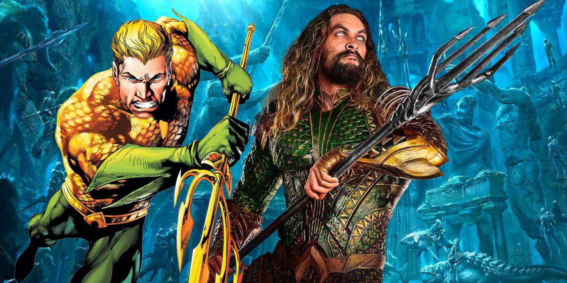
Like all great superheroes, Aquaman has changed his look and appearance many times since his first comic appearance back in 1941 – here's how his iconic logo has changed too. While fans of the Aquaman comic will know the series is often pretty serious in tone, for years the character has been treated like a punchline for comedians and shows like Family Guy. Zack Snyder helped turn that image around somewhat by hiring Jason Momoa to play the DCEU’s Aquaman Arthur Curry.
Momoa’s take helped dispel the wholesome campiness that hung over the character, and while James Wan’s solo Aquaman movie had its issues, its resounding success has shown there’s a growing fanbase for Arthur Curry. Aquaman is a character that’s been around for close to 80 years, so needless to say, he’s been reimagined by many different writers and artists in that time.
Related: How The Flash Logo Changed Over Time
In addition to the character changes, let’s look at some of the ways the Aquaman logo has evolved throughout the character's history.
Golden Age Aquaman Logo
Aquaman wasn't a true descendant of Atlantis when first introduced, with his origin involving his scientist father taking him down to the ruins of the underwater city and teaching him his superhuman abilities. He’d then use those gifts to punch Nazis and other evildoers. His classic orange and green costume is a design that even James Wan’s movie would come back to, with the famous A logo on his belt – for Atlantis – containing an actual horizontal line in the middle.
Silver Age Aquaman Logo

Aquaman’s Silver Age appearance made tweaks to his backstory, revealing his name as Arthur Curry, son of lighthouse keeper Tom Curry and Atlantis outcast Atlanna. In addition to his usual bag of tricks like communicating with sea life and surviving underwater, his suit received subtle changes, with the Aquaman logo now missing the horizontal line.
Modern Age Aquaman Logo

Aquaman’s appearance on Super Friends made the character into the ultimate dweeb, so he got something of a badass makeover during the early 1990s. His origin was tweaked again, he lost the orange armor, had his left hand eaten by piranhas and replaced by a harpoon (long story) and the storylines became darker. In addition to his bare chest look, his logo became noticeably chunkier in design.
New 52 Aquaman Logo

The New 52 Aquaman returned to the character’s classic orange and green armor, and it never looked better. The Atlantis glyph on his belt was given a nice update too, with a more intricate, prominent design.
DCEU Aquaman

Aquaman was the butt of jokes long before the role was cast for the DCEU, with few seeing how the character would translate to live-action. Casting Jason Momoa as Aquaman helped that image problem, though his underwritten role in Justice League was a disappointment. James Wan's’ Aquaman was a big improvement, meshing together various elements of his comic history.
His Justice League armor had a muted, darker look with an emblem to match, but in the final act of Aquaman, he finally receives his classic armor, which seemingly takes inspiration from the New 52 look and has a much shinier take on the Justice League logo.