Every year, even though Hollywood produces some visually stunning films like Man of Steel, The Hobbit: Desolation of Smaug and Elysium, it somehow manages to lose those visual sensibilities when it comes promotional materials for those movies - namely the posters.
We've dug through the more than 2400 posters released in 2013 and have picked out, what we believe, to be the 12 worst. See if you agree...
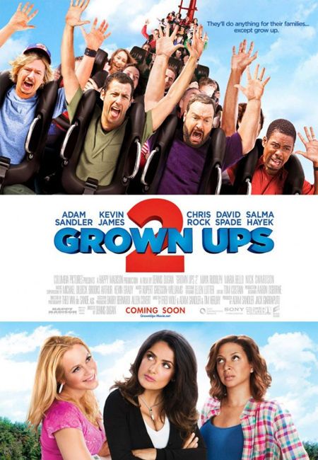
Let's be honest - no one is really surprised to see a movie starring Adam Sandler on the Worst List. Excessive photoshopping is the biggest problem with this Grown Ups 2 poster. The artist attempts to make it seem like all the stars are together, but it's painfully obvious they are not.
While it's clear that Maya Rudolph is staring up disbelief at the juvenile actions of her husband, Salma Hayek appears to be pondering why Chris Rock's arm is freakishly long and Sandler's head is just as big as the guy's in the third row behind him (look closely).
As for Maria Bello - she's not even looking in the same direction as the other two actresses, so we can't tell you what she's looking at.
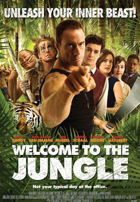
One mistake artists tend to make while creating a movie poster is trying to stick the entire cast on a single poster but then not listing the all the names of the actors ON the poster. Welcome to the Jungle is a good example of this, as there are nine people on the poster - but only seven names.
Forget for a moment that none of the scaling is correct (why is everyone's head virtually the same size?) but apart from Van Damme, Haysbert, Brody, Boone and Schaal, who are the other guys? We have one name left to chose from but two heads that need identifying.
Also, we're assuming the two women in the background are either reenacting a scene from Chained Heat or I Spit on Your Grave, but it's nice to see Richard Parker continuing to get work after his amazing performance in Life of Pi.
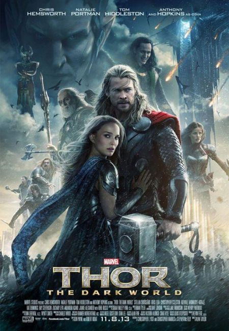
Remember what we just said about too many characters on a poster and not enough names? Well, this Thor: The Dark World poster is a glaring example of "over doing it", with its 10:4 ratio of stars-to-names.
It's really not necessary to include every single character from a movie in one poster. Make multiple posters if you need to, but artists need to stop cluttering up the space with excessive images.
This poster would have been much cleaner and more focused if Heimdall (why is he on a cloud?), the Warriors Three (plus Sif) and Malekith had been left off . They don't serve any purpose in THIS particular poster other than to say "We got'em all on there boss!"
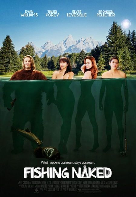
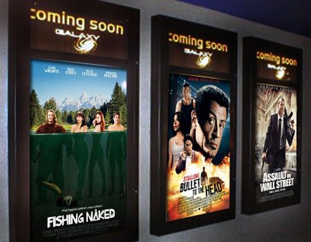
This poster for the comedy Fishing Naked is supposed to make the potential viewer think, "sex, comedy, boobs" but all we think about is, "drunken ape, fly rods, boobs" - so, at least they got one out of three.
Pretty much everything about this poster says "raunchy comedy" but not in a good way like Revenge of the Nerds or Porky's but in a "This movie will be shown on Cinemax after 2 AM or the now defunct USA's Up All Night with Rhonda Shear" kind of way.
Just poor layout and Photoshop work all-around on this one.
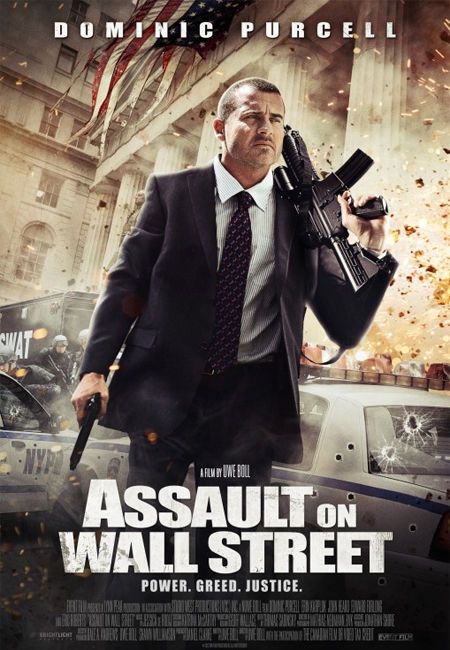
Director Uwe Boll catches a lot of flack from movie fans - not for completely unjust reasons - and movies like Assault on Wall Street and the posters that accompany them will not do much to change those opinions.
Artists of bad movie posters - especially action films - tend to put too many layers in them, which is the biggest issue we have with this particular poster. Forget for a moment that Purcell's shirt is spotless, even though it appears he just walked through an explosion, but the bullet holes on all the cars look like they were stickers bought online, then applied between takes.
Poor Dominic Purcell - he's now starred in a movie directed by Uwe Boll and everyone has this poster as proof.
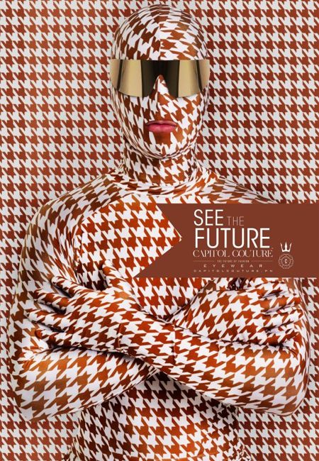
We have no idea where to start with this eye-straining poster for The Hunger Games: Catching Fire - but the houndstooth, butterscotch and cream color BSDM gimp suit seems like the logical place.
In a future where children are forced to kill each other for sport and high fashion is taken to new extremes that Lady Gaga could only dream about, this outfit seems to push the edge - and not in a good way.
It looks like one of those optical illusion posters sold at Spencers that begins moving the longer you stare at it - and those mirrored sunglasses aren't making the outfit look cool at all.
"See the Future," indeed; if that's it, then no thanks.
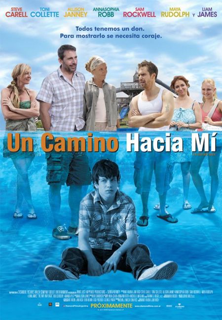
Foreign movie posters don't get any immunity from us - and this poster for The Way Way Back is no exception.
Even though they have the proper actors-to-names ratio (7:7), the poor Photoshop cutout work can't be overlooked.
Typically, foreign posters are just copied, then slightly modified versions of American posters (see the original HERE), so there's no excuse for hacking off Duncan's (Liam James) feet like he's in Saw.
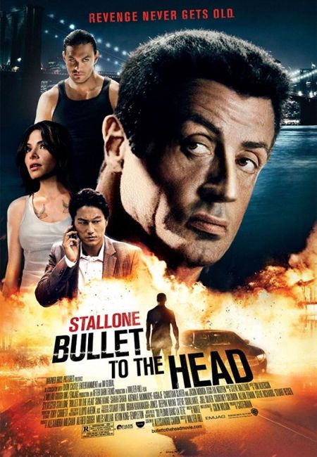
One of the first tools most amateur Photoshop artists learn to use is the "Cloning Stamp". It basically allows the artist to cover up certain areas of an image with other parts of that same image instead of doing an old fashioned copy and paste. It becomes very obvious when the technique becomes WAY overused - as seen here in this Bullet to the Head poster.
Take a look at another (slightly better) version of this poster HERE and notice that Stallone is holding a gun - then notice that gun has been poorly covered up by explosions. It was obvious before, but it becomes painfully obvious after looking at the other poster.
"Revenge never gets old"...but bad movie posters do.
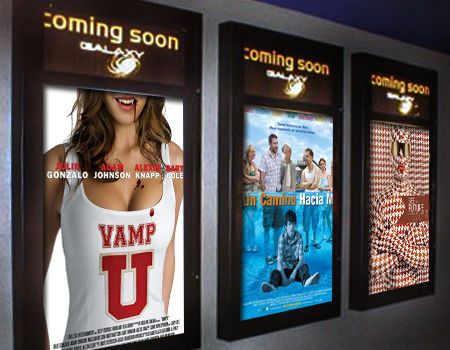
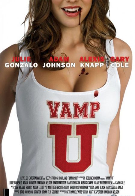
Generally, a movie poster should at the very least convey what the film it's promoting and it's not hard to figure out what Vamp U will be about - large breasted coeds who drink human blood while maintaining an AB average (see what I did there?).
Like our esteemed Editor-in-Chief Kofi Outlaw always says, "When it comes to violence and nudity, I'll take nudity in a film over violence any day" - and this film will most likely have a hefty serving of both. But why are there bad photoshopped blood spatters dripping down her face, cleavage and shirt - oh wait, it's a metaphor for something else?
It's possible for posters to be erotic without being tasteless - a concept the artist working on this piece clearly didn't understand.
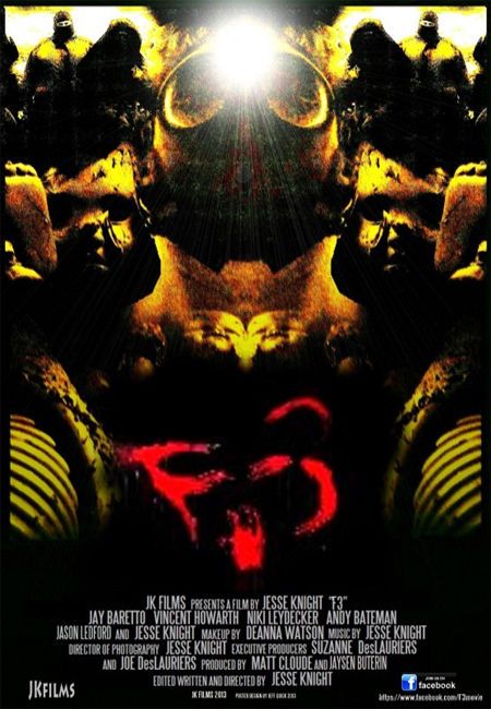
Looking at this poster we only have one question - what?
WHAT is it about? - From the image it appears this is a cross between a horror film and the Blind Melon "Bee Girl".
WHAT are we looking at? - We have never been any good at Rorschach tests so that probably explains why we don't understand this poster.
WHAT is the title of the film? - If you are going to make an incomprehensible poster for a movie, we think the title should at least be prominent - and legible - enough for viewers to see it. Best we can tell, the title of this film is "Open P, Red Tongue, Tilde Reverse C".
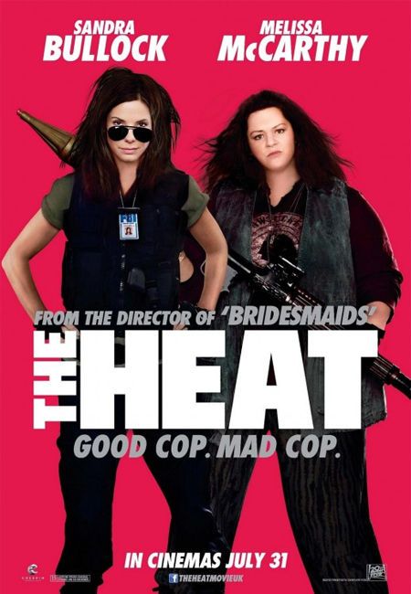
Ignoring the uninspired, dreadful, reddish-hue background in this poster for The Heat, the fact the artist took one of the funniest ladies in Hollywood and tried to digitally slim her face is unforgivable.
That image doesn't even look like Melissa McCarthy and is a big slap in the face (no pun intended) to her as a person and as a professional.
Shame on the person who made this atrocity.
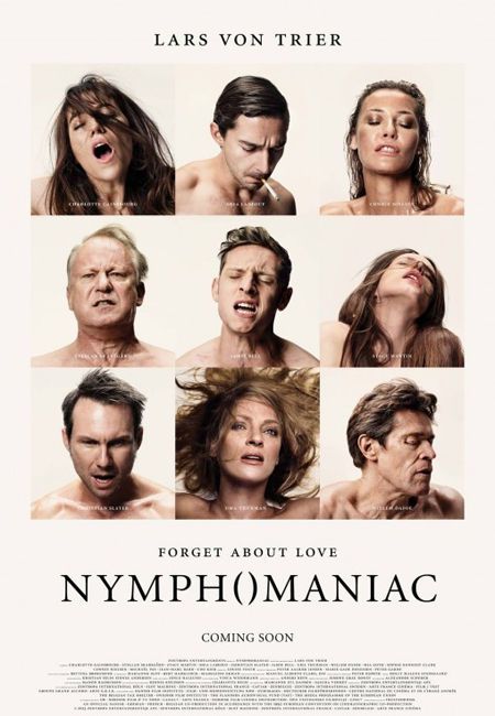
While we at Screen Rant aren't prudes (see: Kofi's statement on the Vamp U slide), this poster for Lars von Trier's art house film, Nymphomaniac: Volume 1 is the very opposite of titillating and tasteful.
For starters, the "O" in Nymphomaniac has been replaced with parenthetical symbols to represent a vagina. As if that wasn't enough, the viewers are subjected to "Oh Faces" of most of the cast in a erotic-esque Brady Bunch-type image.
There's nothing sexy, exciting or interesting about seeing Shia LaBeouf, Stellan Skarsgård, or Willem Dafoe's "vinegar strokes" (a reference for to those who watch The League) which is why we've chosen it as the worse of the year.
There were plenty of posters that could have easily made it into our worst list this year but we couldn't list all of them. Stop by the comments section and tell us which ones you think did or did not deserve to be on here.
And be sure to check out our Worst Lists from 2011 and 2012.
Follow me on Twitter - @MoviePaul - and tell me YOUR vote for Worst Poster of 2013.

