It’s a joy to look at a masterful, well illustrated comic book cover - the headlining images that make us stop to admire their art, compelling us to pick up the issue now, now, now! But it’s also fun to tear into the covers that suck. And there are so many ways that comics can do that.
Bland covers that give us no reason to read the inside. Cover scenes that have nothing to do with the story inside. Wildly inappropriate and tasteless images. Covers that aren’t even spelled correctly. Gimmick covers where the gimmick doesn't work. And, of course, artists who distort human figures into positions absurd even by the standards of comic book anatomy.
This list presents you with 15 examples of comic book cover mistakes. Several of them represent failed tech rather than failed art, such as foil-embossed covers that omitted the foil. Others fall into the category of distorted anatomy, or covers where the positions of characters create an unintended visual image. A handful of others are simply tasteless or just poorly edited. It’s not a ranking of the very worst covers, just a selection of memorably awful images.
Like the title says, once you see them you won’t forget them. Keep looking if you dare.
16. Spider-Man #400 - RIP...Nobody?

Spider-Man #400 was a landmark issue. Aunt May dies, but not before revealing that she's known for years that Peter is Spider-Man, and that she’s proud of him. It also launched the widely loathed Clone Saga. All those landmarks would be retconned later, but the creators had no way to foresee that.
To tie in with May’s death, the cover was die-embossed in the shape of a tombstone, with Spidey on the front of the stone and “A Death in the Family” underneath.
Or at least, that was the concept. If you held it at just the right angle, the cover worked as conceived. At every other angle, however, it was a silver-grey blob. Any comic cover that you can’t appreciate just by picking up and giving a casual glance is a mistake, through and through.
15. Action Comics #598 - Where does Superman live again?

According to Action #598, it's the great city of Metroplis.
Okay, spelling mistakes happen and slip by proofreaders, but come on, DC. Metropolis has only been Superman's home since 1939. It may be the most famous fictional city in the world. And even if it wasn't, "metropolis" is an actual word, and not a terribly exotic one. It spells like it sounds. And yet nobody caught it?
The issue is otherwise noteworthy for stock anti-Arab stereotypes (an arrogant Sheikh wants to slap Lois around for daring to question his manly self) and for the first appearance of DC's SHIELD counterpart, Checkmate. So it has a few more claims on comics history than misspelling Superman's hometown.
Still, that is a pretty big claim.
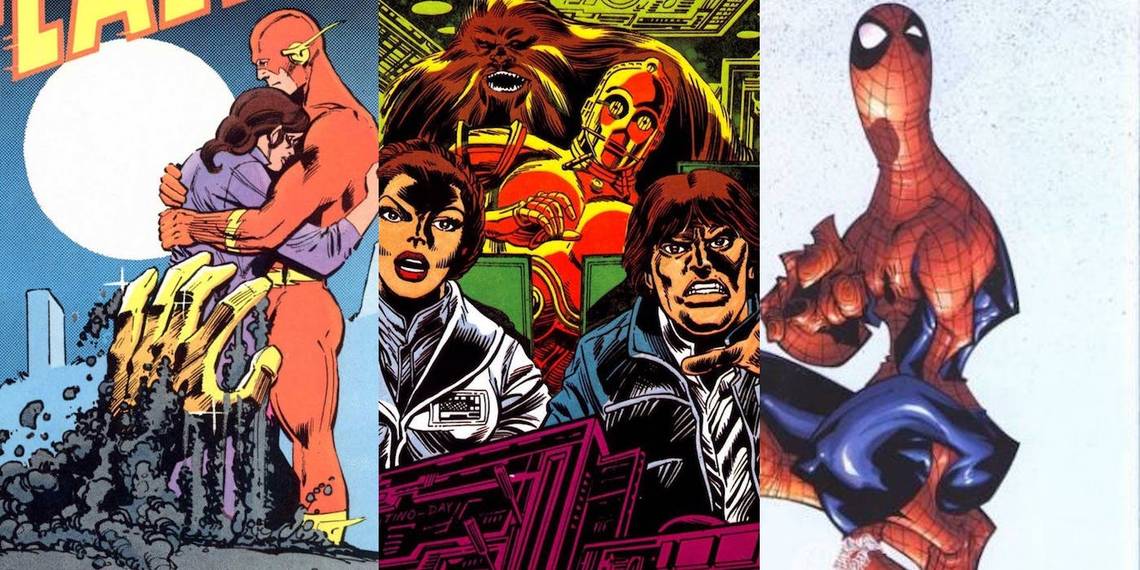
14. Flash #343 - A zombie cops a feel!

The "Trial of the Flash" storyline that wrapped up Barry Allen’s original Flash run is deservedly reviled, but it did have some good moments. Flash #343, for instance, reveals why Flash’s attorney, Cecile Horton, hates him: she believes he’s responsible for the criminal Goldface murdering her father (spoiler: no, he wasn’t).
Carmine Infantino’s cover deftly symbolizes the emotional arc, with Flash holding Cecile. It also depicts the start of a nightmare in which Cecile dreams of Goldface rising from her father’s grave to attack her. (He later attacks her for real when he busts out of prison.)
Unfortunately, combining the two creates a rather awkward visual effect. From the viewer’s POV, it appears Goldface’s big hand is feeling up Cecile’s butt. That wasn’t anything in the issue — Infantino simply got the perspective off enough to be jarring.
13. Captain America #2 - Steve grows a second face on his leg

The disconnect between Rob Liefeld’s drawings and actual human anatomy is infamous. Much longer lists than this one have been filled entirely with Rob Liefeld art errors like Captain America’s infamous man-boobs. We’ve chosen to spread the wealth around, but a list like this without some Liefeld would be unthinkable. So here’s the first of two.
In addition to the clunky composition and Captain America looking like he’s on the brink of hulking out, there’s that face randomly sprouting from Steve’s thigh. Coupled with the floating arm under his crotch, it suggests some kind of phantom phasing through Steve’s body — but no, it references a scene where Nick Fury rips the face off Steve’s wife to show that she’s an Life Model Decoy.
That scene would have made a much better cover than the hanging face from nowhere.
12. Daredevil #168 - Who cares if we misspelled some one-shot character's name?

Daredevil #168 was a major issue in Frank Miller’s landmark run as writer/penciller of Daredevil. This was the issue that introduced Elektra Natchios, Matt’s former love turned deadly assassin. She’s become a star in her own right as well as part of Daredevil’s legend, appearing in the 2003 movie and the Netflix TV series. #168 announces her first appearance, right there on the cover.
No, wait, it's not her debut, it's the first appearance of ... Elecktra. Who was that? Apparently someone who never showed up again.
It’s understandable that on Elektra’s debut, the cover letterer might not have known how to spell it. But isn’t that what editors are for? Thankfully, having her name misspelled certainly didn’t hurt Elektra’s eventual rise to stardom.
11. Wolverine #145 - The first appearance of albino adamantium

The 1990s launched us on an age of cover gimmicks — lots of variant covers, holographic covers, foil embossed covers, and more. Many of them failed not because of bad design but bad tech, but that’s not much comfort to the fans.
The cover of Wolverine #145 offers a close-up of Logan and his claws, because after relying on bone claws for a while, he finally got his adamantium back. To emphasize his claws were now gleaming metal, the claws of the cover were foil embossed to look like gleaming metal. Oops: some issues went out without foil, leaving Wolverine displaying claws of fish-belly white instead.
What happened? Possibly, the embossing process didn’t take, or perhaps the system skipped a few covers. Anecdotal reports of white claws with traces of silver foil would suggest the first possibility.
10. Justice League of America #47 - To stop a big alien, you need a big Batman

Judging by Mike Sekowsky’s Justice League of America cover image, Batman’s been enlarged to giant size to take on the Anti-Matter Man. Who has to be stopped, because if he sets foot on Earth-One or Earth-Two, the matter/antimatter reaction will destroy the planet. Of course talking to him would be too reasonable, so the heroes settle for slapping him around instead.
Despite the cover, though, the Dark Knight's no bigger on the inside than the rest of the Justice League and Justice Society. But this story came out in 1966, when the Batman TV show had made him DC’s hottest star. Put Bats on the cover, and it sold. Justice League of America would foreground the Caped Crusader on its covers through #54. The other covers didn’t inflate him to giant size, though.
9. Marvel Team-Up #105 - Power Man finds it’s not easy being green

At first glance, Al Milgrom’s cover for Marvel Team-Up #105 — one of the few MTUs that didn’t feature a Spider-Man team-up — is unremarkable. Hulk menaces innocent bystander. Iron Fist discovers the iron fist doesn’t faze Hulk. Luke Cage can’t break loose from Jade Jaws’ grip. Which pretty much sums up the issue inside — Hulk goes berserk, and the Heroes for Hire try to stop him despite some interfering hillbillies.
Keep looking though, and the problem becomes visible: Luke Cage has Hulk’s gigantic green arm thrust out of his right sleeve, his own arm sprouting off from it. That’s not what Milgrom intended, but it's remarkably convincing, like an optical illusion even when you know all along it's a trick. Come to think of it, Cage growing Hulk’s arm would have been more memorable than the story inside ultimately was.
8. The Empire Strikes Back Weekly #125 - Those are not the Star Wars characters we’re looking for

There are lots of comics covers that mangle the faces of familiar figures such as Superman or Gambit. But there’s something even more annoying about covers that screw up with real faces, like the stars of The Empire Strikes Back.
After Marvel adapted the film to comics, it reprinted the arc in the UK in the Empire Strikes Back Weekly. The cover here shows some of the cast aboard the Millennium Falcon — or does it? When did Han Solo get so pudgy? How does an android such as C-3PO get a buff, pumped chest? And is that Chewie in the back, or Alpha Flight’s Sasquatch?
If it wasn’t for the title above the faces, would we have any chance at all of guessing who they all are?
7. Hansi, The Girl Who Loved the Swastika - Happy Hitler Youth?

The cover of Spire Christian Comics’ Hansi, the Girl Who Loved the Swastika faithfully captures part of the contents inside, but the image of an Aryan girl smiling on Nazi forces is still repellent. The story inside is anti-Nazi, but it condemns Nazis more for being secularists than for the Holocaust or WWII.
Hansi is a good Christian girl who foolishly chooses Hitler over Jesus. While the Nazis are godless and antisemitic, the Russian communists are shown as much worse, raping every girl in sight after they take over East Germany. Hansi escapes, meets some Americans, and discovers they’re actually good people. After she recovers her faith, she begins to fear the U.S. is too self-indulgent. Then she hears “one nation under God” and changes her mind. It was a misfire from top to bottom, really.
6. Fantastic Four #375 - Because covers shouldn’t make your eyes hurt

Looking at Paul C. Ryan’s cover for this issue, you might assume that the Fantastic Four have entered some distorted region of space, or gone slipping between parallel worlds. But no, it’s just another foil misfire. Only it’s not technical problems this time — the foil worked fine — but the design. The foil did it’s job, but it’s job appears to be making us look away from the comic.
The multiple prismatic patterns break up the cover in a painfully displeasing way. Nor do it have the kind of symbolic significance of the Spider-Man tombstone or Wolverine’s shiny claws. Given that the FF go up against an amped-up Doctor Doom in the story inside, a shiny foil Doctor Doom on the cover would have made sense, but this? Not so much.
5. Silver Surfer #50 - How many ways can embossing go wrong?

Silver Surfer #50, showing Surfer flying through space in front of an angry Thanos, is another case of foil-fail. The foil is supposed to cover the Surfer and the logo, but many issues came out wrong. Unlike Wolverine, though, different copies went wrong in different ways.
- The foil is embossed to the right of the Surfer’s image, creating one white Surfer and a foil doppelganger.
- The foil is embossed slightly too low, extending into the lettering at the bottom and leaving part of Norrin Rad white.
- The Surfer wears no foil at all.
- The Surfer has a thick black outline like a forcefield.
- The Surfer gets foil but patches of white space elswhere on the cover show where the embossing didn’t take.
It’s more interesting than Wolverine #145, sure, but not any more successful.
4. Catwoman #0 - Why let the limits of human anatomy stop you from looking sexy?

The history of comics art distorting women’s bodies in impossible ways is long and inglorious. The Hawkeye Initiative shows how often artists sexualize women in poses we'd know were ridiculous if men were drawn the same.
Catwoman #0 is a classic example of what’s sometimes called broke back art: a sexy woman twisted into an anatomically absurd position so that the artist can highlight her butt and her boobs at the same time. The Geek Twins blog posted artists' renderings of how Selina would look from the side if she were in the cover position, just to drive home its absurdity.
The cover got enough flak that DC redrew it to make it marginally less horrible. Broke back didn’t die, though — Spider-Woman got her own broke back cover a couple of years later.
3. Peter Parker: Spider-Man #55 - Torn apart, then reassembled

Seriously, doesn’t Spidey appear to have been reassembled there on Francisco Herrera’s cover? Spider-Man looks less like a person and more like a human jigsaw that’s been fitted together by a person who's terrible at jigsaw puzzles. Anatomically, this image may be even more implausible than a broke back image, though it’s a lot less sexploitative.
Or maybe a camera? The story concerns gamblers using video cameras to monitor Spidey and take bets on his fight, so it's possible that Spidey’s image was redesigned to represent a camera. Then again, the thing under the logo could just as easily be a pig's snout inside Spider-Man’s tights with its muzzle projecting right. Inquiring minds want to know.
It’s one thing to be clever, but if you have to ask this many questions, is it clever or just confusing?
2. Youngblood #9 - A mutant arm that levitates women’s bodies

Yep, it’s the second Liefeld in the list, this time from Image Comics in 1994. It says a lot that the brunette with the gravity-defying bust is less improbable than Badrock’s right arm.
His left arm, from what we can see of it, has all the parts, albeit swelled like a freak balloon. The right, however, appears to have fingers extending directly out of the forearm with no discernible wrist or hand behind them.
Then there’s the agile blonde sitting on Badrock’s handless fingers. She’s perched quite comfortably, even though they don’t appear to be flat or even angled enough to support her. Nevertheless, she seems completely comfortable, smiling, able to pose without falling off. Does her whole body defy gravity, or does Badrock have some magnetic power over flesh?
1. Wolverine #75 - Logan’s looking blue

This time, Wolverine’s problem wasn’t foil, it was a hologram. The cover of #75 was one of the first covers to use holograms, and it seems that they didn’t quite have the trick down at the time. The hologram on the cover is supposed to show an image of Wolverine in yellow, green, or blue. Some of the blue holograms, however, didn’t work: the holographic image wasn’t 3D, and as you can see, it amounted to little more than a blue blob.
There were also reports that some copies didn’t have a hologram at all. Recalled Comics says it doesn’t appear to be an error on the printer’s part — it looks more like they were detached later in the game.
Even without the hologram, it’s a rather grotesque image, with Wolverine popping like a human porcupine. But the hologram adds a crowning touch.
--
There are lots more awful covers out there. Let us know your er, favorites, in the comments.