For those who follow the production cycle of today's blockbuster films, one of the most fun behind-the-scenes aspects is the concept art. This art is created in the early stages of a movie's development so that filmmakers can put together an idea of what the costumes, major scenes, or major characters might look like on the big screen. Sometimes, concept art that is released before a movie premieres can get fans excited about what's to come, such as Captain Marvel's costume. Other times, it offers us a special sneak peak into a sort of alternate universe where movies might have taken a different direction, such as a more complicated design of Iron Man's Mark I armor, or alternate looks for such major characters like the Winter Soldier.
In this feature, we're going to take a look at some major superhero costumes, as envisioned by real concept art developed for the films, which we believe looked way better than the finished products that ended up on the big screen. Up ahead, we'll see everything from a way cooler Green Goblin to a cinematic Galactus that isn't a giant cloud. Without further ado, here are 15 examples of Unused Superhero Movie Costume Concept Art That’s Better Than What We Got.
Green Goblin - Spider-Man (2002)

James Acheson's Spider-Man costume is a thing of beauty, which stands today as one of the best comic-to-film translations of all time. The same can't be said of the Green Goblin. While Osborn's purple, elf-booted costume from the comics would've looked ridiculous, the static mask that ended up in the movie disappointed many fans, the character saved mainly by Willem Dafoe's fantastic performance.
However, things almost broke in a significantly different direction. Videos from 2012 reveal that Sam Raimi's team did develop a fully expressive animatronic mask. What's stunning is not only that this mask perfectly captures the villain's face from the comics, but that it's also insanely creepy in all the right ways.
For whatever reason, Raimi opted out from this route. He also rejected the sinister design pictured on the right, which modified the "flight suit" concept with some Halloween-y touches. It seems unlikely that Green Goblin will be menacing Tom Holland's Spidey anytime soon, but if he ever does, we hope Marvel takes a long, hard look at these designs.
Apocalypse - X-Men: Apocalypse (2016)

Magneto is the X-Men's archenemy, but the real big bad of the mutant population is En Sabah Nur, the ancient Egyptian warlord who calls himself Apocalypse. While 2016's release of X-Men: Apocalypse faithfully recreated this villain's origins, motivations, and personality, his actual design left fans disappointed. Not that anyone desperately needed to see a big "A" on his belt, and the Egyptian touches were cool, but he looked out of place.
However, the concept art shows an Apocalypse that both looks closer to his comic book counterpart and fits better into the design aesthetic of Bryan Singer's X-Men films. Rather than the somewhat gaudy appearance that ended up in the movie, this mostly black and white concept costume was streamlined, noble, and militant, befitting an ancient mutant who adopts modern technology in his bid to take over the world.
Bullseye - Daredevil (2003)

Bullseye's costume in 2003's much-maligned Daredevil, directed by Marc Steven Johnson, could stand as a symbol for the entire movie itself: good in concept, but lacking in execution.
It's hard to pinpoint exactly what went wrong in the process of translating Bullseye's costume from concept art to finished film. Maybe Colin Farrell applied his own personal touches. Maybe it was the director's desire to make everything look slick, shiny, and like a music video. But while the concept art shows a brilliant reinvention of the comic character's jumpsuit, the costume in the movie looks like a needy, wannabe biker.
The idea of having Bullseye's "bullseye" carved into his forehead is fantastic, and in the art, it looks gritty, dark, and menacing. In the movie, the scarification was toned down to the point where it looked like a drunken adolescent mistake. Whenever Bullseye makes the leap to the Netflix Daredevil series, they'd do well to get some hints from the original design.
Juggernaut - X-Men: The Last Stand (2006)

For what it's worth, the costume that Juggernaut wore in X-Men: The Last Stand is actually a pretty good translation of his comic book look. While the open-faced helmet looks a bit too much like Magneto's, the film captured Juggernaut's size and strength, demonstrating him as a formidable opponent. However, the Juggernaut costumes from the concept art had some really cool touches, and definitely featured better helmets.
The costume on the left is basically the best case scenario of the comic book design being brought to life, and it looks awesome. The helmet is much more like the comic version, but built in a way where the Juggernaut can still turn his neck, and doesn't have to swivel his whole body around like Burton's Batman. Meanwhile, the Juggernaut on the right seems inspired by the more high-tech design of Ultimate Juggernaut. While a bit further from the traditional look, it arguably might have looked the best on screen.
The Lizard - The Amazing Spider-Man (2012)

The reptilian behemoth known as the Lizard is a classic Spider-Man villain whom fans had been anticipating seeing on the big screen for a long time, but when he finally appeared in 2012's The Amazing Spider-Man, his appearance left something to be desired. Though the Lizard has been represented for decades as a ferocious, dinosaur-like beast, the movie instead went back to the earliest depictions of him as a flat-faced, more human-looking monster.
However, early visualizations of the character show that the filmmakers at least considered bringing to life the Lizard that everyone really wanted to see. The turning point in development was most likely that it would have been more difficult to realistically depict a character with such a reptilian snout speaking in full sentences, but hey, The Hobbit pulled it off.
Superman - Superman Returns/Superman Flyby - 2006

To be fair, Bryan Singer's Superman Returns wasn't quite the same film as Superman: Flyby, but both film concepts emerged from the same extended development process, so Singer had access to all of the old Flyby concepts. For those who don't know, Flyby was the working title of the Superman origin film that J.J. Abrams was putting together back in the early 2000s, which had some plot similarities to Zack Snyder's later movie Man of Steel. Abrams ended up leaving the project, going on to direct Star Trek and Star Wars. Bryan Singer hopped on board, transforming the project into Superman Returns, a sequel to the original Christopher Reeve films.
Considering the shared continuity, it's understandable why Singer decided on a more Reeve-esque costume, complete with red underoos. But the finished product looked dated, and the concept art would have translated to film a lot better.
Doctor Doom - Fantastic Four (2005)

The problems with how Doctor Doom was represented in 20th Century Fox's 2005 adaptation of the Fantastic Four don't begin and end with his costume, that's for sure. Despite the fact that Fox possessed the rights to the greatest villain in comics, they transformed Doom from a regal, noble monarch into a creepy, sleazy businessman. All things considered, the movie Doom's costume was the only thing that remotely resembled the actual character, with a comic-accurate mask and a green color scheme.
But the Doom costume in this concept art was way, way better. While dropping the classic hood is a mistake, the rest of the costume is a vast improvement on the nondescript trenchcoat Doom wears in the film. What makes this concept art better is that it actually understands the character: it's regal, decorative, and highly egotistical, complete with royal gold lining and ornamental designs on the armor.
The Fantastic Four - Fant4stic (2015)

It's hard not to feel a sense of longing when one looks at Dave Rapoza's concept art for the 2015 movie Fant4stic. Not only is Rapoza's work more comic accurate, but it also paints a picture of the fast-moving, splashy, colorful adaptation of Stan Lee and Jack Kirby's comic book that we never got to see, since the filmmakers instead embraced a gloomy, somber aesthetic.
The bright colors are a much better fit for lighthearted characters like Reed, Sue, Ben, and Johnny, and the costumes that Rapoza designed are actually quite cool. They maintain the blue color scheme, but look a lot more like functional uniforms rather than skintight spandex jumpsuits. The rebooted version of Marvel's First Family would have been a whole lot more fun if they were rocking costumes like these.
Robin - Batman Forever (1995)

We can't be too hard on Robin's costume design in Batman Forever. Yes, the nipples, codpiece, and over-sculpted muscles all look silly compared to today's costumes, but this was in the decade before James Acheson's Spider-Man costume changed the game forever. However, for our money, the concept art pictured on the left, made for Joel Schumacher's Batman Forever, adapted Robin's '90s costume in a much more functional way. It keeps all the same design elements, but looks less artificial, and appears to be made of cloth instead of molded rubber.
Meanwhile, the picture on the right depicts concept art of Robin from Tim Burton's "Batman 3." This picture gets a lot of flack, but if you ignore the weird haircut and mask, it's an awesome design. It maintains all of the Robin trademarks, like a red-tinted chest and an R insignia, but is darker, moodier, and would've fit perfectly into Burton's gothic aesthetic.
Zemo - Captain America: Civil War (2016)

Listen, we're definitely not dissing the depiction of Zemo that featured in Captain America: Civil War. Subtle, understated, and vulnerable, Daniel Brühl's Zemo is a key element in what makes the movie have such depth, and he's easily one of the most interesting villains in the entire MCU so far.
There's just one thing he was missing: the classic mask.
Early concept art from Civil War shows that there were plans at one point to include Zemo's trademark vertical-lined mask, before the filmmakers decided it didn't make sense for the film. Still, while this Zemo didn't have any facial scars, and he very clearly wasn't an outright supervillain within the MCU, we would have loved to have seen the mask on film.
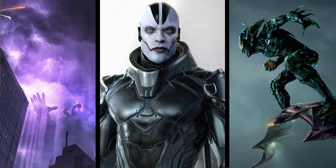
Doomsday - Batman V Superman: Dawn of Justice (2016)

Doomsday is one of the most iconic supervillains in all of DC Comics, holding the significant place in history of having been the one who finally killed Superman. Since Warner Brothers started trying to adapt the Death of Superman story arc in the 1990s, Doomsday has always been only a few inches away from cinematic glory, until he finally made his debut in 2016's Batman v Superman: Dawn of Justice. Lots of concept art was made for Doomsday back in the 1990s, but we're not here to talk about that — we're here to talk about the concept art done for this film, pictured above, which was insanely awesome.
The Doomsday concept art that was created during early production of Batman v Superman was absolutely dead-on, and could have created a monster so iconic that it would have lived on in the halls of cinematic history. Instead, we got that bland troll thing pictured above.
Daredevil - Daredevil (2003)

Daredevil has a relatively simple costume design, so making it work in live action is all about execution. On that end, the costume featured in the 2003 Ben Affleck film was unconvincing: the red leather was way too shiny and slick, and Daredevil appeared as if he'd just walked out of a kinky S&M bar. The design of the mask combined with the zipped open throat just looked weird on film.
On the other hand, early concept art by Warren Manser showed a Daredevil costume that looked more armored, similar to how the character's costume would later be adapted by the Netflix series. It looks weathered, used, functional, and like it could realistically deflect a knife without limiting flexibility too much. Plus, it's a much sharper mask design.
Teenage Mutant Ninja Turtles (2014)

Not too many people were pleased with the depiction of the titular characters in the 2014 version of Teenage Mutant Ninja Turtles. Other than their color scheme, the Turtles didn't have too much of a resemblance to the comic book characters they were based on, their faces were far too human, and the filmmakers made the odd choice to depict them as musclebound, Hulk-sized characters, rather than the slim ninja warriors that fans knew.
This concept art from the earlier stages of the film, while it also diverges from the comics, is a lot more interesting. The Turtles in the concept art are sleek, shadowy, and even a big creepy — hey, they do live in the sewers. Either way, it's definitely a lot more faithful to the spirit of the characters than the hulking designs that ended up making it to the final film.
Electro - The Amazing Spider-Man 2 (2014)

Honestly, Electro actually looked really cool in The Amazing Spider-Man 2. While the script needed work, and an actor of Jamie Foxx's caliber deserved a better written character arc, Electro was visually brought to life quite effectively, with an appearance reminiscent of Ultimate Spider-Man. Anything is better than that goofy yellow mask he used to wear in the comics.
But for what it's worth, we actually think that this piece of concept art is a way cooler design than what ended up on screen. The look featured in this concept art clearly hearkens back to Electro's costume in the short-lived MTV Spider-Man cartoon. The hairstyle is faintly reminiscent of the old yellow mask without being campy, and the way that the electricity is snaking through and out of his orifices makes for a fantastic visual.
Galactus - Fantastic Four: Rise of the Silver Surfer (2007)

Okay, we've hit the big one. Lee/Kirby's The Coming of Galactus! is one of the most iconic stories in comic history. While the 2007 movie did a great job adapting Silver Surfer, it thoroughly botched Galactus. Apparently, the studio heads got cold feet about showing a giant humanoid alien coming to eat a planet, and instead depicted Galactus as a formless space cloud, a boring idea which satisfied no one.
But at one point in development, Galactus was going to be the real Galactus.
The concept art displays the shadowy outline of Galactus's unfathomably enormous body rumbling through the city, obscured by swirling purple weather. This would have been an ingenious way to depict the character: still a walking, humanoid being, but shrouded in mystery, as if he's a Cthulhu-esque force beyond human perception. It's a shame that this Galactus never appeared on screen.
Honorable Mention: Iron Fist

Since we're specifically talking about superhero movie costume art, rather than superhero television, we're keeping this as just an honorable mention. However, it's worth taking a look.
It's hard to say if anything could have really fixed the Netflix Iron Fist series, which seems like it may have been flawed from conception, but there's no question that at least having a costume would have helped the character be a bit more interesting. Sure, Luke Cage can pull off the no-costume thing, and so can Jessica Jones, but Iron Fist without his mask just isn't Iron Fist. This concept costume could have successfully brought Iron Fist's classic look to the big screen. Sure, the codpiece would have to go. But this concept art at least features Iron Fist's very important mask, and keeps him from blending into the walls.
--
Any great costumes we missed? Let us know in the comments!