
Being a graphic medium, comic books ultimately live and die by their cover. It's a visual mission statement -- an image meant to grab the reader's attention. It provides an expectation of what's inside, while also establishing an aesthetic appropriate for the time period in which it was created.
But the best comic book covers are more than a mere mini-billboard meant to sell a product. They're an artistic statement unto themselves, with some of the best pushing the boundaries of graphic design, controversial subject matter, cultural significance or starting a stylistic trend (for better or worse).
It is to all of those above factors that this list is dedicated. We're not covering all of the most famous covers of all time (although several are included), instead focusing on covers that pushed the medium into new territory, changing the industry in the process.
Without further ado, here's our list of the 15 Most Groundbreaking Comic Covers Of All Time.
15. Captain America #1 (1941)

Captain America burst into comic books in dramatic fashion when his first issue debuted in 1941, as the legendary cover depicts Steve Rogers punching out real-life Nazi leader Adolf Hitler. It was a bold visual image for sure, drawn by comic legend Jack Kirby. But what makes the cover so special is its prescience.
The issue premiered in March of that year, but America didn't actually enter into the World War II conflict until nine months later. It proved a prophetic symbol of the United States battling one of the world's worst real-life supervillains.
Oddly enough, the image proved controversial, as there were many German sympathizers in America at the time as Captain America scribe Joe Simon recalled: "We were inundated with a torrent of raging hate mail and vicious, obscene telephone calls."
Comics would prove of great comfort to soldiers while they were overseas battling the Third Reich, with other characters like Batman and Superman taking up the cause. But Captain America had helped lead the opening charge in his own unique way, with a cover encapsulating the historic ensuing conflict.
Click here for the full cover image.
14. Shatter Special #1 (1985)

The 1980s was the dawn of the digital age, with films and television capitalizing on the evolution of computer graphics, which, while looking extremely dated today, were cutting edge for the time.
Not wanting to be outdone by competing media, comics also entered into the digital graphics arena with Shatter, an entirely computer generated comic book published by First Comics. The artwork (from a team comprised of Mike Saenz, Steve Erwin, Bob Dienethal, Charlie Athanas) was created on a first generation Macintosh computer and printed on a Dot-Matrix Image Writer.
Story-wise, Shatter was a pretty blatant Blade Runner ripoff, but visually it was unique and eye-catching for its time. And the series' first cover showed all the potential (and limitations) of computer graphic arts, its pixellated aesthetic differentiating itself from the standards of the medium. Shatter was a sign of things to come in a sense; we live in an age where digital comics are growing in popularity (even if the art remains pencil-driven in nature).
Click here for the full cover image.
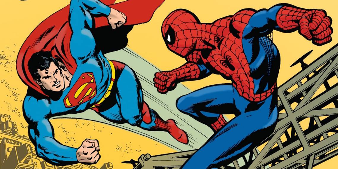
13. Superman vs. The Amazing Spider-Man: The Battle of the Century (1976)

Marvel and DC comics have joined forces a scant few times over the decades, beginning with their dual release of an adaptation of The Wizard of Oz. But it was their first superhero team-up that had fans of both companies truly geeking out.
Evolving from a potential joint film that never materialized beyond the development phase, Superman vs. The Amazing Spider-Man: The Battle of the Century debuted in 1976, and the cover (illustrated by comic legends Carmine Infantio, Ross Andru and Dick Giordano) set imaginations alight with two of the most iconic superheroes in history crossing paths for the first time. The issue was appropriately giant-sized, maximizing the impact of the historic occasion.
The plot (involving an initial scuffle followed by a mutual threat from Lex Luthor and Dr. Octopus) may have been standard issue fare that didn't elevate the medium, but the cover is an indelible imprint of a rare union between two fiercely competitive rival companies.
Click here for the full cover image.
12. Silver Surfer #50 (1991)

The 1990s were a very weird era for comics. One one hand, it was one of the most profitable decades in the mediums history, but on the other hand, it almost died due to the speculator market, when comics were bought at a rapid rate in the hopes they would escalate in value for reselling later. Of course, as we now know, that tactic backfired because valuable comics are based on scarcity, not the other way around.
But one of the chief selling points of the era were gimmicky comic book covers, full of variants (more on that in a bit) and other marketing ploys. One of the chief elements used at the time were embossed covers, and Marvel helped start the trend with Silver Surfer #50, which featured a chromium Norrin Radd blasting away from the villainous Thanos (part of Jim Starlin's prelude to The Infinity Gauntlet).
While the issue can be blamed for pioneering the chromium embossed technique that became an eyesore in the industry, at least it was appropriate given the design of the character. The same can't be said for all the copycat issues that sprang up afterwards.
Click here for the full cover image.
11. The Amazing Spider Man #96 (1971)

The first issue in Marvel's Green Goblin Reborn storyline wasn't simple escapism; it also acted as a public service announcement. After then-president Richard Nixon's Department of Health, Education, and Welfare asked Stan Lee to place an anti-drug message in one of his comic company's biggest titles, he knew The Amazing Spider-Man would have the biggest impact on young readers, and penned the script accordingly, starting off in issue #96.
Lee was surprised when the Comics Code Authority (the self-policing censor board of the comic industry) refused to put the seal of approval on the cover (penned by artist Gil Kane). Faced with abandoning a social message Lee had promised the Nixon administration, Marvel made the decision to go around the Comics Code, making it the first issue to do so since their formation in 1954.
So while the cover to Amazing Spider-Man #96 may look like standard-issue comic art of the 1970s, it's what's missing that makes it so distinctive and groundbreaking. The edgy decision would influence the industry to take more risks in terms of content.
Click here for the full cover image.
10. Wonder Woman #178 (1968)

In 1969, the times were changing, and DC Comics wanted to catch up. The counter-culture, flower power, civil rights and women's lib movement created a generational clash in the America, and comic books had to adapt to the times, or die.
Veteran writer Denny O'Neill always infused his sense of liberal social justice in all of his work, and his heart was certainly in the right place when he (and artist Mike Sekowsky) attempted a re-vamp of Wonder Woman to help connect with new readers.
Diana Prince got a whole new look beginning in issue #178, ditching her famous attire for the modern fashions of the day. The controversial cover showed her in her new garb, accompanied by the bold slogan "Forget the old, the new Wonder Woman is here!" But the new direction proved divisive -- Prince no longer had Amazonian powers. She was now a super-spy relying on martial arts skills. While a well-intentioned attempt at being contemporary, this new direction wasn't very well received (feminist icon Gloria Steinem was particularly unimpressed), and Prince would return to her Amazonian roots for good a few years later.
Click here for the full cover image.
9. Nick Fury Agent of Shield #4 (1968)

Jim Steranko is one of the most adventurous comic book artists to ever grace the medium, and his work at Marvel Comics is of particular significance. Combining surrealism, pop art, op art and other eye-grabbing visual techniques (which he nicknamed Zap-art), he left a lasting imprint upon the comic industry.
And one of his most iconic images is the cover to 1968's Nick Fury Agent of Shield #4. Featuring a four-color image of the one-eyed secret agent (decades before his Samuel L. Jackson-inspired makeover), Steranko's backdrop was a black and white photo collage, adding a layer of psychedelia to the proceedings.
This was just one example of Steranko's magic throughout the series, which broke with graphic tradition (while also pushing the boundaries of sexual content in comics) in many respects. But the cover to the series' fourth issue gave a primer of just how subversive and challenging Steranko's work could be, advancing graphic storytelling in the process.
Click here for the full cover image.
8. Iron Man #128 (1979)

Nine years after Marvel tackled drug-abuse in The Amazing Spider-Man, the company would focus on a different addiction in the Demon in a Bottle storyline. Iron Man's alter-ego Tony Stark came to grips with his alcoholism in the midst of an epic saga pitting Stark against arch-enemies including Whiplash, The Melter, and Blizzard, along with ringleader Justin Hammer of the Roxxon Corporation.
The Demon in a Bottle story arc would take place over nine issues, but it was the final installment (issue #128) that had the most striking cover: a harrowed and unkempt Stark in the midst of withdrawal, staring himself in the mirror and terrified at what he's become. Artist Bob Layton gives a detailed interpretation of Stark's agony that remains palpable, adding the grace note to Iron Man's most definitive tale.
Layton later elaborated on Demon's impact, saying "It was never our intention to do anything relevant...[It's] just [that in] that particular issue, alcoholism was the bad guy. Instead of Doctor Doom or somebody like that, it was the bottle...Alcohol wasn't talked about all that much, really, to be honest with you. Especially with kids, you know...but we treated it as we intended to, as the bad guy."
Click here for the full cover image.
7. Astonishing X-Men #51 (2012)

Marvel made waves in 1992 when Northstar, a mutant member of the Canadian supergroup Alpha Flight, came out, making him the first openly gay superhero in comics. And the comic company would mark yet another LGBT milestone in the pages of 2012's Astonishing X-Men #51, where the character married his partner Kyle in a lavish ceremony attended by a host of Marvel heroes.
The issue (written by Marjorie Liu), was written in light of New York City's legalization of gay marriage in 2011, and the story examined the cultural impact of the notable occasion upon the Marvel Universe. The issue shipped with two covers, with the variant (illustrated by Marko Djurdjevic) showing a more intimate moment of the couple preparing to kiss. The provocative image of a interracial gay wedding drew fire from conservative group One Million Moms, showing that the prejudice battled by Marvel's mutant superheroes in the comics has always (unfortunately) mirrored real-world intolerance.
Click here for the full cover image.
6. Watchmen # 1 (1986)

Before Watchmen came along, comic book covers focused on the primary characters featured in said issue, usually engaged in dynamic action, often accompanied by exposition, sound effects and a story title of what to expect.
It shows the confidence DC had in Alan Moore and Dave Gibbons' vision that the first issue of Watchmen gave no such descriptors. A simple smiley face button surrounded by blood, gave little indication of just what to expect from the revolutionary comic series, except to expect the unexpected.
But one flip to the first page showed their stroke of genius: the cover served as the first panel of the comic book, with each successive panel acting like a reverse zoom shot in a film. Each successive issue followed this same technique, with covers eschewing any characters, only focusing on a single static detail. Gibbons explained his aesthetic approach: "The cover of the Watchmen is in the real world and looks quite real, but it's starting to turn into a comic book, a portal to another dimension."
It's often been said the comic industry can be seen as before Watchmen, and after Watchmen, and this applies to comic book covers as well.
Click here for the full cover image.
5. Man of Steel #1 (1986)

While variant covers were all the rage in the 1990s, the trend actually began in the mid-1980s thanks to writer/artist John Byrne. It all started with his 1986 Superman reboot series The Man of Steel. The post- Crisis on Infinite Earths storyline promised a new (and less-omnipotent) incarnation of DC's flagship character, and for the first issue, the company wanted to take maximum commercial advantage of the event. Thus, the variant cover was born.
Whereas the original Man of Steel #1 cover featured a close-up of Clark Kent opening his shirt to bear his iconic Superman emblem, the variant (both covers were drawn by Byrne himself) features a wider shot of Kent striking the same pose while standing next to a depiction of the Kryptonian rocket that brought him as a child to Earth. It was a rather innocuous start to a trend that would dominate (and polarize) the comic industry of the following decade.
Click here for the full cover image.
4. X-Men #1 (Vol II, 1991)

1991's X-Men #1 (Volume II) holds an important place in comic book history: it's the best-selling issue of all time, holding the Guinness Worlds Record (selling over 3 million copies). And one of the primary reasons for its profit-busting record is the cover by fan-favorite artist Jim Lee.
One of the most ambitious and aggressive ploys at the speculation collector's market, the X-Men issue (marketed as a "mutant milestone") featured several variant covers (five different ones in total), but with a twist on the variant gimmick -- all four alternate covers formed an interlocking image of marvel's merry mutants in fierce battle with Magneto.
In many ways, X-Men #1 (Vol. II) signaled a death knell for the speculation market that engulfed the industry in the 1990's. After such an audacious gamble was taken, throwing down the gauntlet and encouraging fans to buy six versions of the same issue, how could anything ever top it in terms of arrogance and scope?
Click here for the full cover image.
3. Green Lantern/Green Arrow #85 (1971)
Denny O'Neill and Neal Adams run on Green Lantern/Green Arrow is well-known for tackling controversial social issues, and their two-parter Snowbirds Don't Fly was no exception. Following shortly after Marvel Comics' aforementioned 1971 anti-drug Amazing Spiderman Green: Goblin Reborn storyline, Snowbirds saw Green Arrow's teen sidekick Speedy battling a heroin addiction.
While many have speculated that DC took a cue from Marvel in this regard, Adams and O'Neill had been planning it beforehand, but it was rejected by editor Julius Schwarz because he feared censorship from the Comics Code Authority, as Adams later revealed. "We could have done it first and been the ones to make a big move..." he said. "The publishers at DC, Marvel and the rest called a meeting, and in three weeks, the Comics Code was completely rewritten. And we did our story."
And the shocking cover of issue #85 showed the most graphic depiction of drug use ever shown in a comic at the time, with Speedy getting ready to shoot up (or having just done so) as Green Lantern and Green Arrow look on in horror. It illustrated (literally) how comics could entertain and inform in a socially responsible manner.
Click here for the full cover image.
2. Lobo #1 (1965)

Lobo (not to be confused with the intergalactic DC bounty hunter of the same name) is a little-known comic that deserves more notoriety for its historical impact. The series (published by Dell Comics) is the first series with an African-American hero as the self-titled headliner: a gun-slinging cowboy doling out justice in the Wild West.
The series also bears the distinction as the first to feature a black character on a cover as the primary character, shown in heroic glory, and not as an offensive stereotypical portrayal common in comic books of the day (i.e. Ebony White in The Spirit). As one could imagine, the cover (and series) proved controversial for its era, and it was cancelled after only two issues. Artist Tony Tallarico discussed the comic in a 2006 interview, saying "They sniffed around, scouted around and discovered [that many sellers] were opposed to Lobo, who was the first black Western hero. That was the end of the book. It sold nothing."
Regardless, a precedent had been set, leading to other black superheroes who made a more successful dent in the medium.
Click here for the full cover image.
1. Crime Suspenstories #22 (1954)

Easily the most notorious comic book cover of all time, E.C. Comics Crime Suspenstories #2 helped make comic books public enemy #1 in the minds of parents in 1950s America. Presented as evidence of the moral decay of America's youth, the issue was used in the Senate Committee to Investigate Juvenile Delinquency in 1954 as exhibit A on the dangers of comic books.
Senator Estes Kefauver’s hammered E.C. Comic publisher William Gaines on the grounds that the issue (featuring a murderer carrying a woman's severed head) was indecent: “Here is your May issue. This seems to be a man with a bloody axe holding a woman’s head up, which has been severed from her body. Do you think that’s in good taste?”
Gaines' defense: “Yes, sir, I do…for the cover of a horror comic." The issue also emboldened German-American psychiatrist Fredric Wertham's "Seduction of the Innocent", a book chronicling how comics were causing a moral rot among children. In response, the aforementioned Comics Code helped crack down on content, but Wertham's crusade almost single-handedly killed the industry (and horror comics in general) for good.
Click here for the full cover image.
---
Well that wraps up our list of most groundbreaking comic book covers. What comic book covers do you think had a huge impact upon the industry? Tell us in the comments!