[Update: Check more Black Swan clips below!]
Darren Aronofsky's latest film, Black Swan, is picking up steam in its final week before limited release and a new TV spot and featurette have premiered online for it. In addition, the December issue of American Cinematographer features an interview with Director of Photography Matthew Libatique (Requiem for a Dream, Cowboys & Aliens).
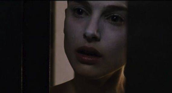
Much of the buzz surrounding Black Swan is focused on the actors; Natalie Portman, Mila Kunis and Vincent Cassel are receiving plenty of praise from those who caught early screenings, but it takes more than just performers to create a complete film. Aronofsky has found solace in the visual side of directing. For example, while some see The Fountain as a tangled mess of existentialism, it is still undoubtedly gorgeous.
Considering its theatrical nature, Black Swan could find itself in a similar predicament if it isn't universally entertaining. But it seems the filmmakers behind Black Swan see the production design as integral to the overall product as anything.
The new TV spot features some of the design work explained in the later video and interview. It definitely continues a trend of edgy clips from Portman's most challenging role of late. At one moment in the short clip, Portman appears to hiss at the camera. It has become taboo to break the "fourth wall," but if this is any indication, it should send some shivers up the spines of those in theaters.
You can check out more clips over at Bloody Disgusting.
My main concern right now is the handheld camerawork. While Libatique is an established cinematographer, the shaky-cam in this clip was a bit unnerving (possibly intentional). In his interview with American Cinematographer, Libatique explained the entire film was shot handheld, with the exception of the final dance, which utilized Steadicam. Needless to say, if you dislike shaky cameras, this film may leave you a bit queasy.
The interview explores the entire production, from development to the actual cameras used. Libatique mentions Black Swan was once called The Understudy as it made the rounds through Hollywood. Aronofsky was originally pitched the script after Requiem for a Dream, but wasn't ready to follow through on it until now. After earning critical success with The Wrestler, now is as good a time as any for the pair to collaborate again on another challenging topic.

Influences on the production design came from various inspirations. The camera and art department always work closely, especially on Black Swan. Libatique had plenty of films in mind during the shoot. He mostly collaborated with Rodarte, the fashion designers who created the movie's costume. But other film influences came from Polanski's Repulsion, The Red Shoes, The Three Colors trilogy and a foreign documentary by director Donya Feuer called Dansaren (The Dancer).
In this month's issue of American Cinematographer, Matthew Libatique also discusses the production's technical side. While it mostly explores the cameras and lighting used on set, the cinematographer explains why it matters to the viewer's experience. The film was shot mostly with 16mm film (Canon 7D was also used) to explore the seemingly European tone of the story. More importantly, Aronofsky and Libatique went with a documentary approach to filming.
"We moved the camera in as though we were documenting real people's lives. We made it a point to travel from kitchen to hallway to foyer to bedroom to bathroom, but the space really dictated the kinds of moves we could make...I shot everything documentary-style. I did all the focus pulls by hand, and we'd just look at it on the camera's monitor."
Mirrors and color play significant roles in Black Swan. Aronofsky details the reason for mirrors in the production featurette from In Contention. Note the level of detail that goes into production design and how important every corner of every room matters.
Libatique also goes into more detail on the use of colors to accent Black Swan's story. The four-color scheme of the production allows each individual tone to symbolize an emotion or aspect of the film.
"Black represents the darker side of Nina's character, white is her innocent side, pink represents her childhood and green conveys envy and ambition. For example, the pink bedroom with all the stuffed animals shows that her mother never let her grow up, and the apartment's green walls underscore the competitive nature of their relationship."
Detailed production design is a must for any film. It creates a visual palette for the viewer. But even Libatique wonders if Aronofsky goes too far at times. As one of the most visually-focused directors around, it's no secret the look of Aronofsky's films are a constant strength.

Could he have pushed the envelope too far with a movie as theatrical as Black Swan? While the excessive mirrors and colors may come off strong, even in the trailers, we should consider them in the scope of the filmmaker's story. As Aronofsky stated, mirrors play a large role in ballet, but they also help the horror aspects of the movie.
Black Swan may be a film we find difficult to label in one genre, but it definitely has some scares. The Black Swan trailers definitely promote the film's scare-inducing adjustments on reality. The question remains whether it will appeal to all crowds and not simply land as another brainy thriller for the indie crowd.
Are you planning on catching Black Swan this weekend?
Black Swan dives into limited theaters December 3rd, 2010.
Source: In Contention, American Cinematographer (December edition) and Yahoo! Movies
Update Source: Bloody Disgusting