Having pinned down the 15 Best Movie Posters of the 1980s, we now move on to the decade of the '90s. While the '80s gave us some amazing traditional illustrated posters, the 1990s was a transitional decade where studios and marketing companies started to rely heavily on photography. Prints and advertising (P&A) campaigns would key focus towards TV commercials more than ever before. Artists like Drew Struzan and John Alvin were looked as luxuries, as graphic designers and photo-illustration became the norm.
Even with this industry shift, some quintessential one-sheets were produced that are on par with the best selections from any era. Talented designers, art directors and illustrators would team together to create lasting images that not only sold the movie, but brought life to popular worlds and characters. No matter the genre from action films, drama, science fiction and blockbusters, these movie posters defined '90s entertainment while influencing many storytellers of today.
While cinephiles may be disillusioned by the poster trends and templates that started in the '90s, we embrace the rich creations that made us fans of certain movies. We picked out the best original theatrical posters, and they comprise our take on the 15 Best Movie Posters Of The 1990s.
15. INDEPENDENCE DAY

In 1996, 20th Century Fox rolled out a massive advertising campaign for this blockbuster, which included a pricey Super Bowl commercial, cross-promotional deals, various trailers and a big one-sheet push. The film’s massive success is tied directly to this cutting edge marketing plan that would be repeated and utilized by other studios going forward. The movie also made the July 4th holiday weekend perhaps the most coveted spot on the summer release schedule, one that studios still battle for today.
The movie itself is a '50s science fiction B-movie on steroids, as creators Roland Emmerich and Dean Devlin pumped it with big time special effects and action. The end result was the first true global disaster blockbuster that became one of the high-grossing films ever, making Will Smith into an A-list movie star in the process.
BLT Communications, LLC created three primary movie posters for the film’s release, with all three emphasizing the size of massive spaceships in comparison to the earth. While the teaser poster (style B) had the tagline “EARTH. Take a good look. It may be your last”, the main theatrical one-sheet tagline was: “We’ve always believed we weren’t alone. Only July 4, we’ll wish we were.” In destroying cities and national landmarks, Independence Day is now looked as the Godfather of mass destruction films.
14. SWINGERS

It’s a safe bet that had smooth-talker Trent Walker (played by Vince Vaughn) looked at the movie poster for 1996’s Swingers, he would have told it: “You’re so money and you don’t even know it!” This quintessential Los Angeles comedy ended up becoming a piece of Hollywood lore. On a next-to-nothing budget, the film was a box-office hit, launching the Hollywood careers of three mega talents in Vince Vaughn, Jon Favreau and director Doug Liman (The Bourne Identity, Edge of Tomorrow).
Written and starring Favreau, the indie hit was able to capture the singles nightlife in Hollywood while incorporating the swing revival that was occurring in the city at the time. The wonderful one-sheet is a natural extension of that party vibe, with Vince Vaughn front and center. His character serves as the M.C. of mayhem -- a sort of out of control, skirt chasing Jiminy Cricket -- wearing his shades as he offers you a martini to join.
From the matchbook logo and '50s diner font, to the tagline: “Cocktails first. Questions later”, the poster sold free-wheeling adult fun to audiences. Tod Tarhan who was the creative director at Miramax Films at the time, helped design this poster, along with the B-theatrical one-sheet that included Favreau and Heather Graham in the design.
13. PRETTY WOMAN

If you’re not a fan of romantic comedies, then this pick definitely isn’t for you. A pop-culture hit and easily a Top 5 romcom pick is the hooker turned princess Cinderella story that starred the winning combination of Richard Gere and Julia Roberts. As successful and loved as the movie is, the film’s poster is just as important to the genre itself.
Over the past 20 years, almost every marketing campaign for a romantic comedy has copied some element from the Pretty Woman poster. From the playful back-to-back positioning of the stars, to the white backdrop and vibrant pink lettering, and the title’s vertical placement, the poster has become a go-to when creating one-sheets to entice female audiences. Don’t believe us? Just take a look at the poster’s for How to Lose a Guy in 10 Days, or Two Weeks Notice, or Ghosts of Girlfriends Past. We could keep going with more examples but that would be its own article.
The film that made Julia Roberts a star and earned her an Oscar nomination went on to become a box office smash, raking in over $460 million worldwide. Fun fact: the poster features Julia Roberts’ head superimposed on the body of Shelley Michelle, as producers preferred the body double's curves.
12. THE CROW

Based on James O’Barr’s comic series, the film poster for 1994’s The Crow already had a firm illustrated history to work with and build off of. While the film is a dark visual feast for the eyes, it will always be synonymous with the tragic death of star Brandon Lee (son of the legendary martial artist/actor, Bruce Lee).
Intralink Film Graphic Design, founded by the influential graphic designer Anthony Goldschmidt, was tasked with selling the story of The Crow while at the same time honoring the memory of Brandon. The poster accomplishes just that, as out of a backdrop of darkness, a block of white light surrounds Lee as the title character. Resting at the top of the layout -- in an almost solemn manner -- is Brandon Lee’s name with the tagline “Believe in Angels” referencing both the story of Eric Draven, the tortured avenging angel, and the late great Brandon Lee.
Lee’s amazing performance, coupled with the noir fantasy world director Alex Proyas was able to build, helped make the film a cult classic hit that would spawn sequels and a television show. The film’s crow logo at the lower half of the poster has gone on to become a symbol of the character and property as well. Whoever ends up mocking up the poster for the upcoming Jason Momoa-starring reboot would be wise to take a page out of Intralink's playbook.
11. THE NIGHTMARE BEFORE CHRISTMAS

With Halloween behind us and Christmas ahead, now is the perfect time to embrace the beautiful macabre world of Jack Skellington. Tim Burton’s 1993 animated classic, The Nightmare Before Christmas, is so original and visually rich that this stop-motion musical helped revolutionize animated films, opening the doors for companies like Laika to break into the industry.
The one-sheet has reached into many facets of pop-culture, as its the foundation on which the massive Nightmare merchandise machine is built off of. The poster’s imagery is used on all packaging, for practically any item or apparel that can be sold at stores or on Amazon. The poster depicts a scene in the film where Jack Skellington is walking through a graveyard singing the song “Jack's Lament”, describing how he’s grown tired of the same old Halloween routine and has come to long for more. Jack walks out onto a curled cliff standing in front of the full moon, with a jack-o-lantern patch below. The striking image harkens back to the iconic poster of 1982’s E.T. with Elliot and E.T. on a bike flying past the moon.
The spooky yet playful poster successfully showcases Burton’s trademark gothic style, with the oddly shaped terrain, sinister pumpkins, and orange title text popping out!
10. TRAINSPOTTING

Who would have guessed that a movie about raucous heroin addicts living in Edinburgh, Scotland would strike a chord with the youth subculture?! But that’s exactly what 1996’s Trainspotting did, as audiences met the film’s manic over-the-top cast of characters, Renton, Begbie, Sick Boy, Diane and Spud. As director Danny Boyle (Slumdog Millionaire, 28 Days Later) prepares for the upcoming release of the sequel, T2: Trainspotting, the original based on Irvine Welsh’s novel is what first gained him fame and recognition in the movie industry.
As the film rolled out first in the UK and overseas, the international poster design was handled by the creative agency Empire Design, who chose to use individual character posters, stressing the importance of the film’s personalities. From the character’s poses to the numbering system pulled directly from Welsh’s book, designers Mark Blamire and Rob O’Connor knew the raw visual power these individual one-sheets would have over a group shot.
The US poster, however, was handled by Miramax Films, with Tod Tarhan once again involved. Combining the individual black and white photographs, Miramax created a group shot that still had ties to the international campaign, with the bold orange Helvetica title, to the grid “train station” layout. The tagline paragraph of “Choose life. Choose your future” perfectly conveyed the film’s provocative view on life.
9. SCREAM

Tod Tarhan’s name keeps popping up, as he was involved in creating pieces of key-art for virtually every movie that came from Miramax Films or Dimension Films (Miramax’s genre label) in the 1990s. In 1996, Dimension Films released Scream, directed by horror legend Wes Craven and based off a script from Kevin Williamson (The Vampire Diaries). The film became the face of horror movies in the '90s, reviving the slasher subgenre and horror industry as a whole, which has grown stagnant since the end of the '80s.
“What’s your favorite scary movie?” is the memorable line most people associate with this postmodern horror film. While the film’s marketing campaign didn’t incorporate that line in any of the artwork, it did have two posters that were highly influential. The main theatrical one-sheet featured a black and white photographic image of a young woman with a shocked look and a hand over her mouth, preventing her from doing what the title suggests. In lieu of blood and gore, the poster sold mystery and style.
The B-style poster kept the black and white image, but this time placed the young attractive cast, featuring the likes of Drew Barrymore and Neve Campbell, into the foreground. For the remainder of the decade, almost every horror film would copy this layout of a body-less cast staring at the viewer.
8. BEAUTY AND THE BEAST

While buzz keeps mounting for next year’s upcoming live-action version of Disney’s Beauty and the Beast, it will have to be surprisingly good to even come close to the original 1993 animated film. During the early '90s, Disney was experiencing an animation renaissance, starting with 1989’s The Little Mermaid, followed by the new mark in excellence with 1991’s Beauty and the Beast. A “tale as old as time” about an angry beast and his beautiful captive, Belle, won the hearts of viewers and became the first animated movie to be nominated for an Academy Award.
Disney enlisted the talents of legendary illustrator John Alvin to design the film’s poster. As we previously noted, his work on movie posters like E.T., Blade Runner and Gremlins made him one of the greatest movie poster artists. Disney was trying to achieve a sophisticated, timeless look with the one-sheet to attract adults as well as children. After designing a few concept art samples, Alvin captured the film’s magic and romance with the imagery of the pair’s silhouettes dancing while bathed in soft magenta and crimson colors. That simple yet compelling visual, along with the tagline “The most beautiful love story ever told” promoted the uniqueness of the film while cementing the poster as a beautiful work of art.
7. SILENCE OF THE LAMBS

If you stare at the theatrical one-sheet for 1991’s Silence of the Lambs long enough, a sense of unease and dread starts to creep in, which is exactly the design’s intention. Played by Anthony Hopkins for the first time in the film, Dr. Hannibal Lecter burst onto the pop-culture scene as one of the most terrifying characters in motion picture history. Hopkins’ masterful portrayal of the evil genius cannibal brought instant terror to audiences.
In creating a poster image that conveys the dark, unsettling nature of the film, director Jonathan Demme and the marketing team made the star of the film, Jodie Foster, the main image. The black and white photograph of Foster’s Clarice Starling is haunting to look at, with her eyes colored in red and a moth superimposed over her mouth. While the moth is a direct connection to the film’s antagonist Buffalo Bill and his insect collection, upon inspection, the moth has a skull pattern design made up of seven naked women. That image is a reproduction of “In Voluptate Mors” a photograph by Philippe Halsman based on Salvador Dali’s work.
Films like the 2005 horror film The Descent have been inspired by “In Voluptate Mors” and Lambs, recreating the same women skull pattern design for their poster.
6. FIGHT CLUB

When a movie poster can make a pink bar of soap look cool and make it work as its logo, you know the design team has a winner on their hands! Advertising firm Wieden+Kennedy was brought on board by 20th Century Fox to work on the marketing campaign for 1999’s Fight Club. When the firm first proposed to use the bar of soap as the main image for all marketing materials, Fox initially considered it a joke. But it wasn’t.
The bar of soap is actually a constant element throughout the film, an extension of Brad Pitt's character, Tyler Durden. Not only is Durden a soap maker, but the same byproducts to make the soap also make the explosives Tyler and his Project Mayhem followers use to create chaos. The symbolism behind the bar of soap is meant to tie back to the story’s themes of gluttony, emasculation, greed and consumerism. As Durden notes in the film, he takes the fat of the rich and sells it back to them with the bars of soap -- for $20 a pop.
The film’s tagline reads: “Mischief. Mayhem. Soap.”, and that's exactly what you get in the film based on the controversial novel by Chuck Palahniuk.
5. TERMINATOR 2: JUDGEMENT DAY

The poster for 1984’s The Terminator is a classic for introducing the world to Arnold Schwarzenegger and the emotionless killing machine that he brought to life. For the 1991 sequel, Terminator 2: Judgement Day, James Cameron and the marketing team had their work cut out for them in delivering a one-sheet that had to be just as good and memorable as the one that proceeded it. Luckily for everyone, they did just that, as some fans believe Terminator 2’s poster surpasses the original’s in terms of iconic imagery and appeal.
The poster’s design is a revamp of the original. Once again, Arnold Schwarzenegger is front and center, sporting a leather jacket, a large gun, and wearing those cool shades with that cybernetic eye glowing through. This time however, he’s sitting on a Harley-Davidson Fat Boy, which is prominently featured in various action sequences in the film. The placement of Schwarzenegger’s name in big bold red letters at the top is also a nice nod to the original layout.
Marketing firm The Cimarron Group oversaw the campaign for the film, where they were tasked with selling Arnold as the hero rather than the villain this time around. He was a more likeable version of the T-800, and the new poster definitely reflected that. The poster’s appeal helped the movie become one of Hollywood’s greatest action films.
4. THE MATRIX

Prior to 1999, no one had heard of bullet-time effects. That all changed with the revolutionary film The Matrix, which put slow-motion action into the forefront of action lovers' minds. The film shifted the entire industry, forcing studios and producers to rethink how action and science fiction films as a whole were made. With jaw-dropping, state-of-the-art special effects, this cyberpunk blockbuster made virtual worlds and all leather/vinyl attire the coolest thing in theaters. Directed by the Wachowskis, the film came out of nowhere to tell the story of Neo, aka ‘The One’. Believed to be the savior of humanity, Neo was destined to rescue the race from the artificial world known as the Matrix.
Keanu Reeves was (and still is) an A-list level star, so he was understandably the main selling point of the one-sheet. In similar fashion to other action stars like Schwarzenegger as the Terminator, Keanu was decked out in all black with a trench coat, a big gun and some cool shades. Other members of Neo’s team are included, with Laurence Fishburne (who also got top billing), Carrie-Anne Moss and Joe Pantoliano rounding out the group shot.
The poster’s designers also included the distinct vertical Matrix code in the background, giving the piece a futuristic tech feel. That, along with the blue & purple hues used, sold the unique Wachowski style.
3. GOODFELLAS

Oozing class, attitude and just being plain cool, the poster for Goodfellas is a go-to for any home-office or man cave. Next to The Godfather franchise, there’s probably no better mobster/gangster film in cinema history. The elegance and deadly intensity the poster gives off is right on point with the characters and story of organized crime.
The one-sheet’s layout is split into two sections, with the title serving as the divider. The top half is all about the goodfellas themselves, featuring stars Roberto De Niro, Ray Liotta and Joe Pesci. These mobsters are dressed sharp, with key lighting illuminating their faces with the darkness around almost consuming them, serving as a metaphor for the lifestyle of crime in the film. The lower half of the image has the tagline “Three decades of life in the mafia” with a body lying on a New York City street. Even though the film takes place in the '60s, '70s and '80s, the cars and sidewalk vista shown, appear to be from the '40s or '50s.
Martin Scorsese’s masterpiece was the first in his trilogy of crime dramas, followed by Casino and The Departed.
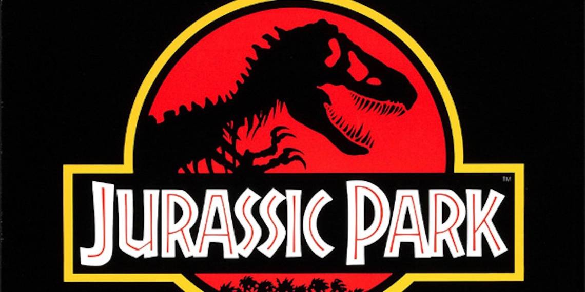
2. JURASSIC PARK

For a film that’s based on a theme park of real-life dinosaurs, it makes a lot of sense that the theatrical poster is going to look like a corporate logo.
With nothing but a basic black background and the tagline, “An adventure 65 million years in the making”, the one-sheet for Jurassic Park was all about the red and yellow Tyrannosaurs Rex stencil outline. Even though highly respected artists like John Alvin created poster designs for the film, Steven Spielberg and the team at Universal ultimately ending up going with the book jacket artwork from Michael Crichton’s novel. That simple black image of the T-Rex was created by designer Chip Kidd and was integrated into the logo for the movie poster. Tom Martin handled the rest of the logo’s design and art direction, with David Sameth overseeing the creative direction.
That logo is just as important to the series as any characters or dinosaurs found within, helping build the franchise brand globally. From the toys to the merchandise and the real-life theme park rides (how meta), the key image has become one of the most recognizable posters ever. The one-sheet has lasting appeal due to its clean and clear design, becoming timeless to wide audiences searching for adventure and thrills.
1. PULP FICTION

At the top of our list is arguably the most controversial, revered and influential movie of the 1990s, the one that cemented director Quentin Tarantino as a true auteur. Pulp Fiction is a postmodern film that combines razor sharp dialogue, violence, pop-culture references and dark humor to connect intersecting storylines of mobsters, small-time hoods and dangerous women. In order to capture the unique and innovative style of the movie, the one-sheet just had to go off the film’s title in order to do it justice. The title Pulp Fiction refers to those cheap dime novels and crime magazines of the early 20th-century, and the poster certainly reflects that.
Since the movie is a homage to those pulp stories and the genre they defined, the poster’s design was made to mimic a pulp cover, placing lead actress Uma Thurman in the role of the femme fatale. Created by James Verdesoto of Miramax’s design team, the poster’s main image has Thurman in her Mia Wallace get-up, laid out on the bed, legs crossed behind her as she seductively smokes a cigarette. The addition of the gun, pulp novel (of the same name) and lighting gives the image a cool retro appeal.
The red and yellow title block using the wood-cut style typeface, along with the 10-cent price tag and fake wear and tear, created an instant classic!
---
Did your favorite movie poster from the '90s make the cut? Let us know in the comments.